
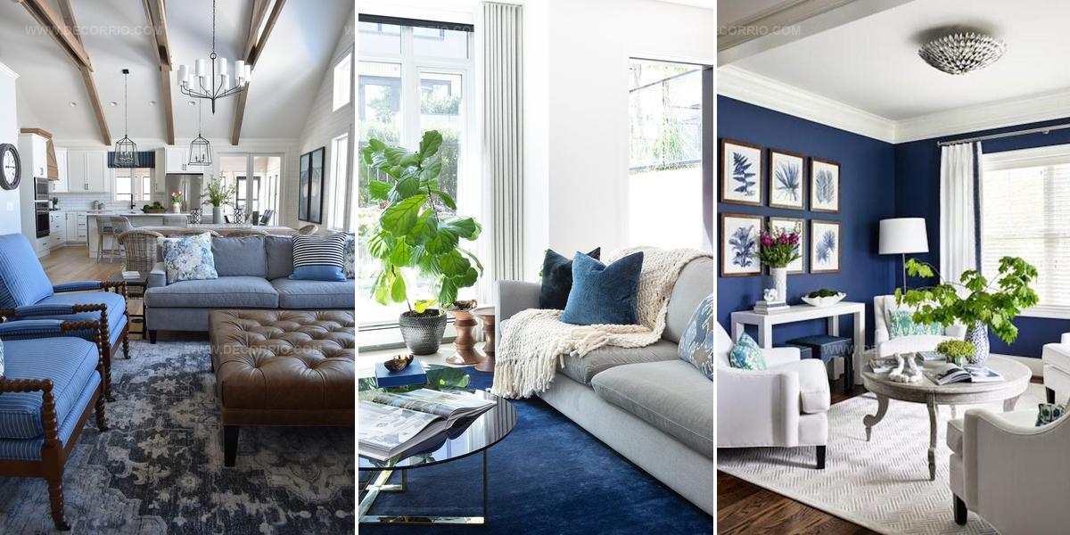
13 Blue Living Room Ideas We Can’t Wait To Copy

Blue living room ideas we can't wait to see can completely refresh how a space feels and functions in ways both subtle and dramatic.
Cooler tones bring calmness while deeper shades add sophistication, making this color family incredibly versatile for any home.
Whether leaning toward coastal vibes or modern elegance, the right palette choices work wonders.
Pairing different textures alongside various hues helps establish depth without overwhelming a room.
Small changes like accent pillows or bold moves such as painted walls both qualify as valid approaches.
Finding what resonates means considering lighting conditions, existing furniture, and personal preferences simultaneously.
So go ahead and reimagine what's possible when color becomes the foundation of comfortable, beautiful spaces where life unfolds naturally.
Deep Blue Statement Wall
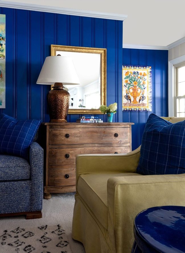
Saturated shades like Yves Klein Blue are everywhere in home decor right now, and we've noticed this intense hue showing up in everything from ceramics to lighting fixtures.
We knew this bold color was truly sticking around when we saw how stunning it looked in a real living space.
If you're thinking about painting a wall or adding pieces in this deep, rich tone, you should know the payoff is huge.
Such a vivid color grabs attention the moment people walk in, and you'll likely hear plenty of compliments from visitors.
It's a brave move for sure, but the dramatic effect you get is absolutely worth it.
Bold doesn't always mean complicated, and this approach proves that one saturated shade can do all the heavy lifting in your room.
Bright blues like this one make spaces feel energetic without needing much else to support them.
Pale Blue Canvas For Statement Pieces
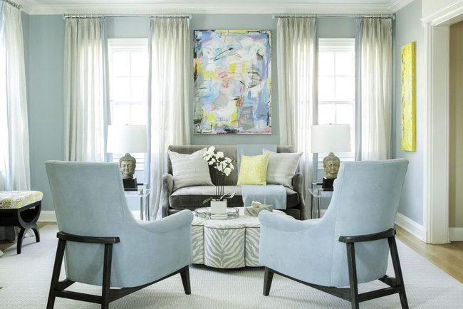
Whisper-soft blue on the walls of this living room stops you from needing bright, loud colors everywhere, and instead lets other pieces grab your attention A zebra-print coffee table becomes the main attraction when the walls stay calm and understated.
Bold wall art stands out even more against this peaceful backdrop.
Pops of citron yellow throughout the room feel fresh and energetic without overwhelming the senses.
By choosing a pale blue rather than something bold, you open up possibilities for your furniture and accessories to be the real stars.
Other decor items shine brighter when the walls provide a quiet foundation.
You end up with a balanced room where multiple elements each get their moment to shine.
Deep Teal Layers Multiple Blues
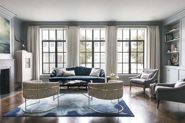
Dark teal furniture makes a bold statement when paired with a patterned rug that blends deeper blues with lighter tones, and this combination works well because blue adapts to almost any design style.
Multiple shades of the same color prevent the space from feeling flat or boring, so you get depth and interest without needing to start over.
Mixing in a few different patterns and shapes gives the room a relaxed, collected-over-time quality that feels natural and personal.
What's nice about this approach is that you can swap things out as your taste changes, and the color palette stays strong enough to hold everything together.
Adding another shade of blue keeps the look cohesive while letting you experiment with texture and form.
One sofa doesn't have to match your rug perfectly, and that's actually where the appeal comes from.
This kind of layering with multiple tones means your space can evolve and grow alongside your life without losing its sense of purpose.
Denim Blue Statement Sofa
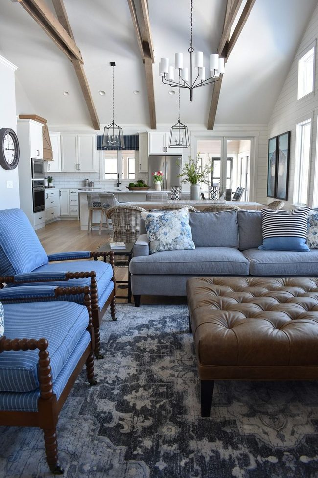
Denim's enduring appeal comes largely from its iconic blue shade, a color that feels both effortless and remarkably versatile since it truly pairs with almost everything you own.
This same logic works beautifully in your home when you bring that denim-inspired blue into your living room through a statement couch, and just like your favorite jeans do the heavy lifting in your wardrobe, this piece lets you dress up your space, mix and match styles freely, and layer in classic Americana pieces to achieve that comfortable, well-loved aesthetic.
Deep Blue Rock-And-Roll Bedroom
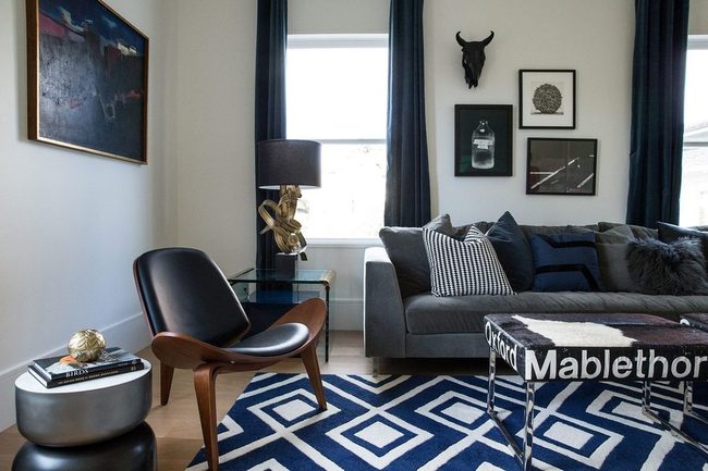
If wrapping yourself in baby blue sounds too sweet for your taste, there's another direction worth exploring.
Darker shades can feel just as warm and comfortable while adding depth to your room.
We've seen spaces pull off this look beautifully by mixing artistic touches with a rock-and-roll edge.
Deep hues settle into the room and let you exhale, even as they bring personality and attitude to the walls.
Moody tones work well when you balance them with pieces that reflect who you are.
The result lands somewhere between a relaxation zone and a space full of character.
It's the kind of room where you actually want to spend your time, and honestly, it feels like the best of both worlds.
Light Blue Meets Mixed Eras
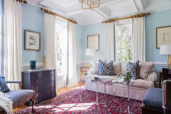
Light blue walls dominate this room and feel like a breath of fresh air, setting the tone for everything else you see there.
Modern pieces such as clear coffee tables sit right alongside bold, mixed prints that nod to different eras without feeling trapped in any single time period.
By combining contemporary and vintage elements, you get a space that feels both classic and eclectic at once.
One moment you spot something sleek and up-to-date, and the next you notice a pattern or object that brings in historical charm.
It's this back-and-forth between old and new that keeps the room interesting and prevents it from leaning too hard in either direction Your favorite finds from different decades can all live together harmoniously here.
Deep Blue Calm Strength
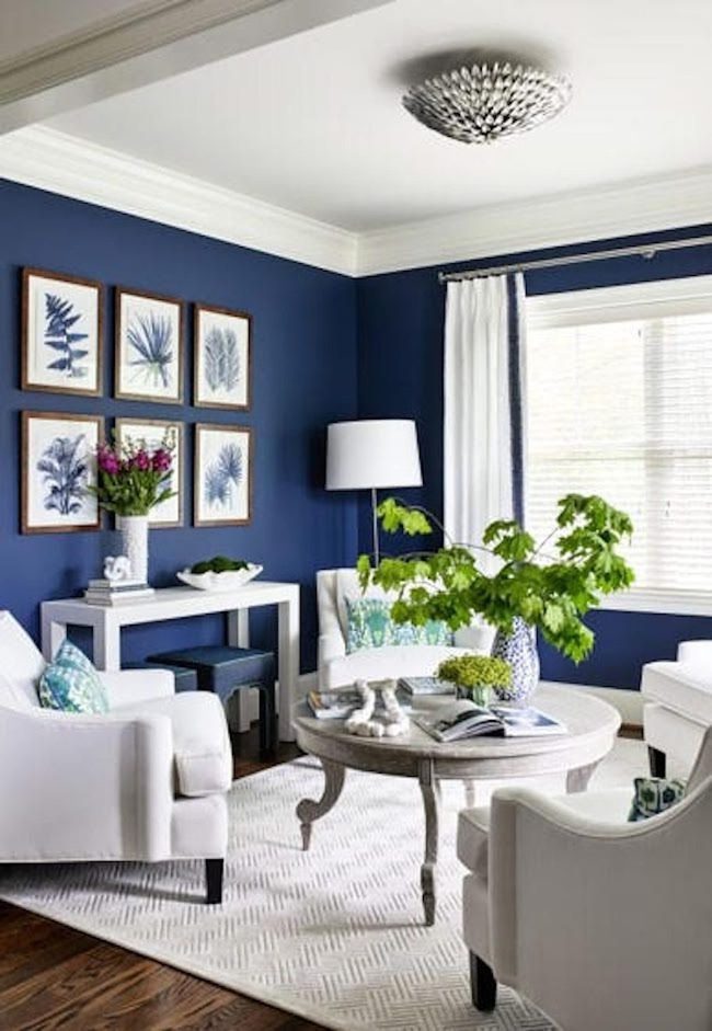
Rich blue shades might seem risky, but they actually bring the opposite of chaos to your space.
Going bold with deep, saturated blues adds real depth and drama to a room without making it feel overwhelming.
You can layer these darker tones and build an environment that feels both visually striking and genuinely calm.
Many people worry that darker colors will make their rooms feel smaller or heavier, yet blues have this special quality where they settle you down instead.
When you choose a true, rich blue rather than something pale and wishy-washy, you're making a statement that anchors the whole room.
It's easier than you'd think to balance this boldness with lighter furnishings or brighter accents.
The result is a space that feels sophisticated and peaceful at the same time, giving you that perfect blend of visual interest and relaxation.
Fuchsia Pop Navy Foundation
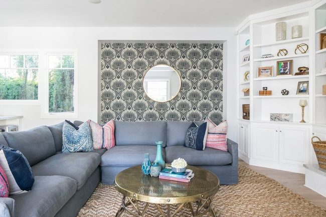
Bold fuchsia accents pop against deep indigo and navy tones in this unexpected approach to pink and blue that balances sass with serenity.
You get brightness from the hot pink shades while the darker blues keep everything grounded and modern Mixing saturated fuchsia with navy blue creates a look that's contemporary without being cold or sterile.
If you want to try this palette yourself, start with navy as your base and layer in pops of bright pink through accent pieces like throw pillows or artwork.
Even small touches of fuchsia can shift the whole mood and make a space feel fresher and more interesting than standard color schemes.
Deep Denim Walls Elevate Muted Palette
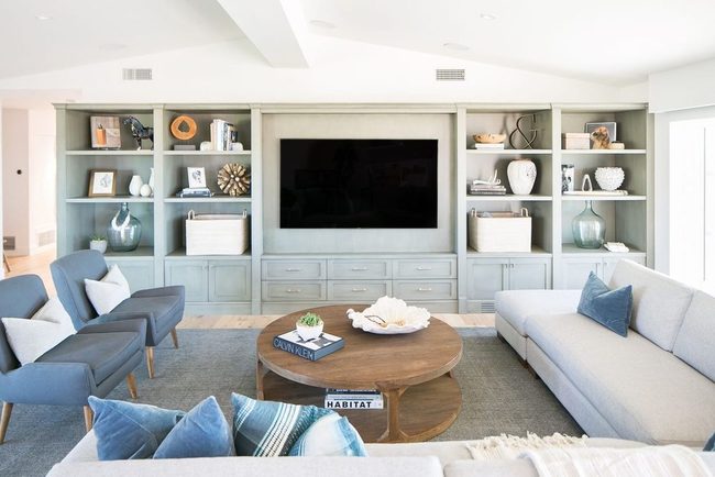
Blue functions as a neutral in ways that might surprise you, and while it technically isn't one, its flexibility and timeless appeal make it worthy of the designation.
In a room filled with muted colors, a deep denim tone brings just enough character to keep things from feeling flat, and it lets the softer side of the palette shine through while also picking up the blue-green undertones of your built-in shelving and cabinetry.
Navy Black Feature Wall Dreams
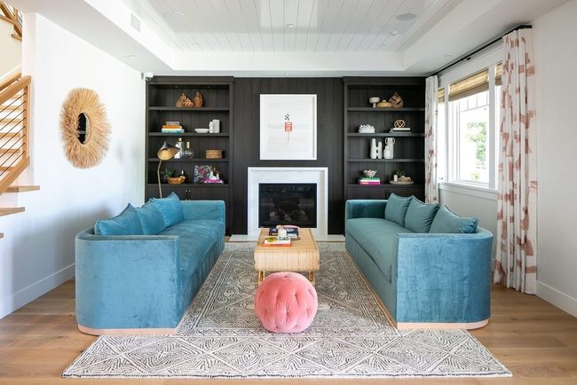
If you grew up hearing that black and blue don't belong together, this room will surprise you and show that old rules deserve to be challenged.
Navy and black can actually get along quite well, and the real secret is balancing a muted tone with something bright and energetic, like the cheerful blue used here.
When you paint just the back wall black instead of the whole room, two things happen: you get that modern, unexpected feel people love, and your eyes have a natural place to rest while the space feels longer and more open.
Teal And Violet Gray Contrast
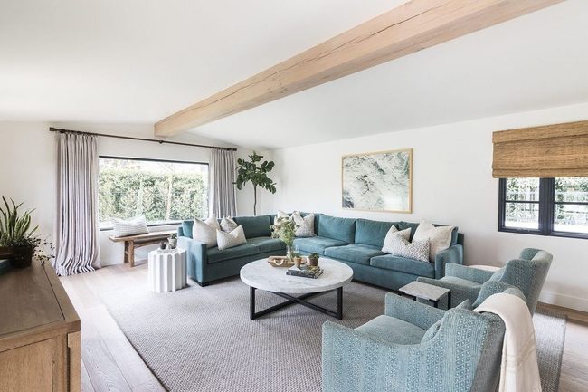
Teal and gray-violet make an unexpected combination that works better than you'd think, and this living room proves it.
Deep teal walls grab your attention first with their rich, moody presence, while the violet-gray accents add another layer of intrigue throughout the space You'll notice the rougher fabrics feel warm and touchable, while the sleek marble elements keep things from feeling too heavy or overdone.
Mixing these opposing surfaces and shades gives the room personality and depth that wouldn't exist if everything matched in tone or finish.
The combination proves that two unexpected colors can balance each other out and feel completely natural in a home.
This kind of bold color choice works best when you pair it with varied textures and materials, which anchor the colors and keep them from feeling flat or one-dimensional.
Anyone can apply this same strategy to their own space by choosing two colors that seem odd together and then letting different textures do the heavy lifting.
Deep Blue Floor Statement
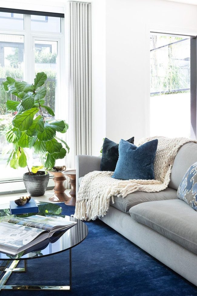
Instead of painting your walls in a bold color-maybe your landlord won't allow it or you're just not sure-an oversized rug gives you that same floor-to-ceiling color impact without any commitment.
A super-saturated rug like this deep blue one brings that major pop of color to your space and completely changes how the room feels.
Once you invest in a beautiful rug like this, you'll want to show it off, so pair it with a glass, lucite, or acrylic coffee table that lets you see what's underneath.
That transparent table keeps your eyes moving across the rug instead of stopping at a solid surface, and it means you're getting the most out of your purchase every single day.
We think these two pieces together prove that you don't need permission from anyone to transform a room with color and smart design choices.
Geometric Earth Rugs Global Living
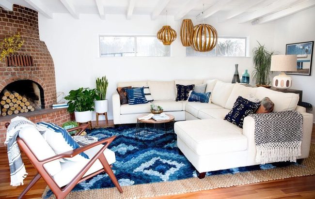
Bold geometric rugs in warm earth tones sprawl across the floor and instantly anchor your boho living room with personality and flair.
Layered pillows displaying indigo patterns and artisan details scatter across seating, mixing cultures and textures in a relaxed, wandering style that speaks to global influences.
Woven throws drape casually over furniture, inviting you to settle in and get comfortable without pretense.
Natural wood pieces stand alongside rattan accents, bringing that lived-in, eclectic spirit boho embraces.
Soft lighting from string lights or lanterns sets a warm glow that makes the space feel unhurried.
Plants in varying heights fill corners and surfaces, adding greenery that breathes life into the room.
I love how this approach to decorating celebrates imperfection and personal travel finds instead of matching everything too perfectly.
You end up with a space that feels collected over time and genuinely welcoming to anyone who walks through your door.
Isabella Martinez
Founder & Lead Design Enthusiast
Expertise
Seasonal Home Décor, Interior Styling, Space Planning, DIY Home Projects, Sustainable Design Solutions
Education
Savannah College of Art and Design (SCAD)
Pratt Institute, School of Design
Isabella Martinez is the founder of Decorrio, where she shares her love for seasonal home décor and creative design. With a background in interior design from SCAD and a master’s from Pratt Institute, she specializes in stylish, functional, and sustainable spaces.
With over 10 years of experience, Isabella helps homeowners bring warmth and personality into their homes. She loves DIY projects, festive decorating, and collaborating with local artisans to create unique designs.
When she’s not designing, Isabella enjoys exploring Austin’s arts scene, crafting, and hosting gatherings filled with seasonal charm.