
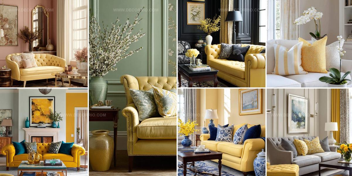
10 Butter Yellow Living Room Color Schemes That Glow

A butter yellow living room color scheme brings warmth and sunshine into any home space where families gather and memories happen.
Choosing the right palette can feel overwhelming when so many shades and combinations exist.
Soft golden tones paired with complementary hues create inviting atmospheres that make guests feel welcome the moment they walk through the door.
The psychology behind warm color palettes shows how certain shades influence mood and energy levels throughout the day.
Decorating with sunshine-inspired hues works beautifully across different design styles, from modern minimalist to traditional farmhouse aesthetics.
Finding balance between bold statements and subtle accents helps maintain visual interest without overwhelming the senses.
Subtle Yellow And Rose Living Rooms
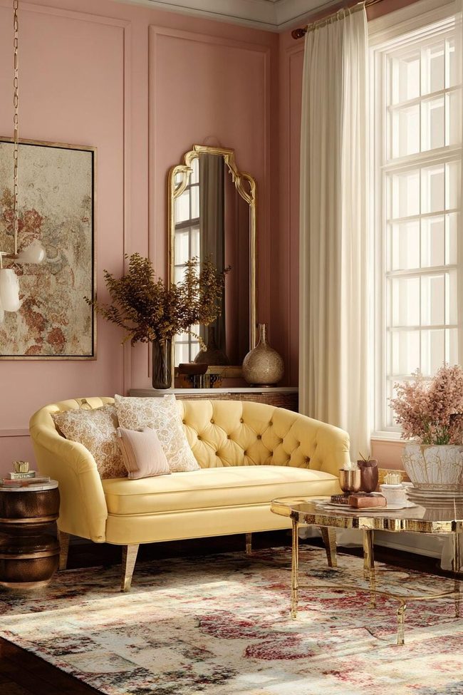
Butter yellow paired with dusty rose creates living spaces that radiate warmth and nostalgic charm while feeling surprisingly fresh and current at the same time.
Both colors share a softness that makes them natural partners, resulting in a palette that feels harmonious and welcoming from the moment you walk in.
Gold or brass accents enhance the inherent warmth in both hues and add an extra layer of sophistication to the overall look.
Cream or ivory serves as a breathing space between these colors through trim, ceilings, or larger furniture pieces and helps balance the palette beautifully.
Natural materials like linen, cotton, and light woods complement this combination and bring out its organic, effortless quality.
This pairing works across different design styles, from shabby chic to transitional to mid-century, and adapts depending on which furniture and accessories you choose.
You may find this color scheme transitions smoothly through the seasons and feels equally calming in winter or refreshing in spring.
The softness of butter yellow and dusty rose makes this combination ideal for creating spaces where you can truly relax and restore yourself after busy days.
Butter Yellow Meets Navy Blue Contrast
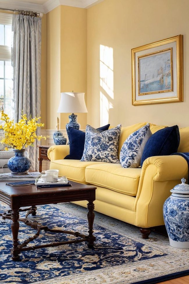
Butter yellow paired with deep maritime tones delivers a striking contrast that feels classic without slipping too far into obvious coastal styling.
The darker shade helps steady the warmth of buttery hues, preventing the palette from feeling overly playful, while brass or warm metallic accents introduce richness and depth throughout the room.
One option is to surround the space with creamy yellow walls alongside inky upholstered seating or painted cabinetry.
Reversing the balance also works beautifully, especially when darker walls are softened with pale golden accents through textiles, artwork, or decorative objects.
Crisp trim and light ceilings help maintain an open atmosphere and keep the stronger palette from feeling visually heavy.
Natural materials such as woven fiber rugs, cane accents, and textured storage pieces complement both shades effortlessly while adding warmth through texture rather than additional color.
Pattern mixing becomes especially effective within this palette.
Maritime stripes paired with floral prints or geometric motifs in buttery tones introduce variety without feeling chaotic.
Traditional interiors tend to suit richer golden shades combined with tailored furniture silhouettes and classic detailing, while modern rooms often benefit from cleaner-lined furnishings and lighter buttery tones that feel fresher and more relaxed.
Accent pillows, framed artwork, and layered textiles featuring both shades help distribute the palette naturally across the room.
Window treatments can also shift the mood dramatically.
Dark drapery against pale golden walls introduces contrast and depth, while lighter curtains framed by deeper walls soften the overall composition.
Rooms filled with natural daylight tend to showcase this palette especially well since sunlight enhances the warmth of buttery tones while keeping darker shades from appearing too dense.
Butter Yellow And Black High-Contrast Sophistication
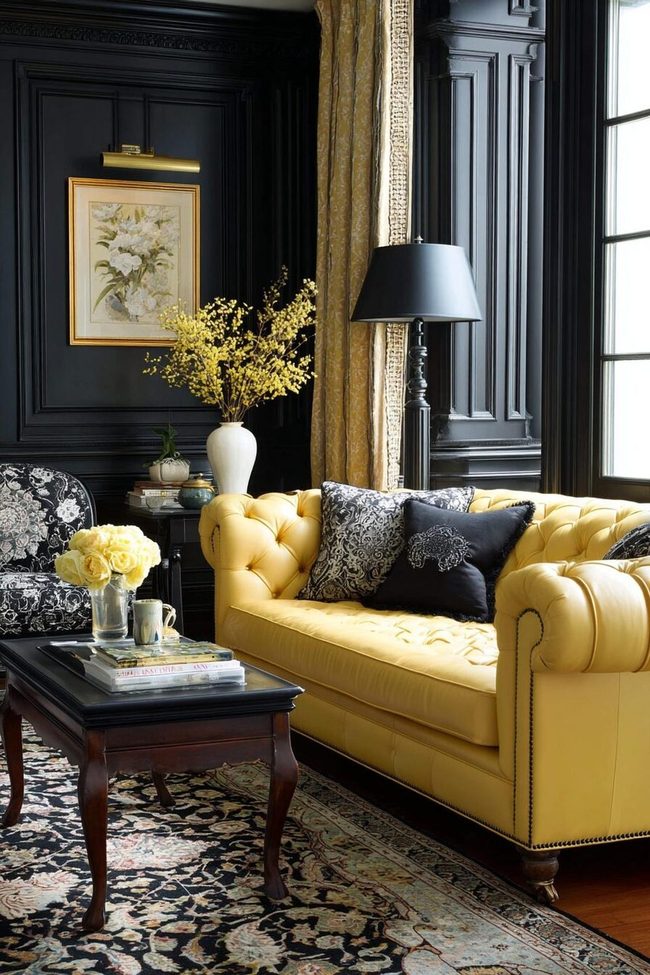
Butter yellow and black shape an instant visual drama that commands attention while keeping your space surprisingly livable and polished.
Dark black walls paired with butter yellow furniture and accessories deliver a strikingly modern look that still feels warm, or you can flip it with sunny yellow walls and bold black accents for classical elegance.
Both approaches work well whether you love color but want architectural definition in your home.
White naturally appears as a third element, providing visual breaks so the contrast doesn't become overwhelming.
Gold and silver metallic accents add another layer to this strong pairing, with gold enhancing warmth while silver brings modern coolness.
Texture matters especially here, so bring in varied materials like velvet, leather, wool, and linen to add depth and keep things from feeling flat.
This color scheme adapts beautifully across design styles from Art Deco to modern to traditional, depending on your furniture and accessories.
You can layer different shades of butter yellow from pale cream to deeper gold for sophisticated dimension without losing the dramatic effect.
Black outlines architectural interest beautifully against butter yellow backgrounds, so this pairing works wonderfully in spaces with interesting features.
The timelessness of these two colors means your investment stays stylish regardless of changing trends, and since butter yellow reflects light, your space stays clear even with significant black elements.
This combination shapes excellent backdrops for artwork and collectibles, which stand out beautifully against either color.
Butter Yellow Walls Meet Lavender Accents
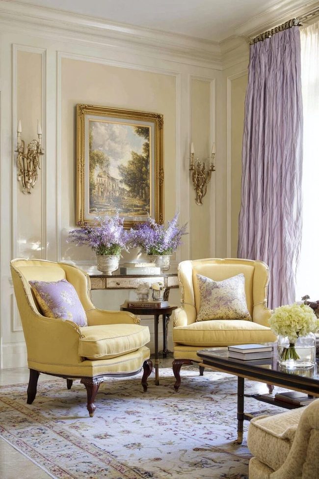
Butter yellow and lavender introduce a living room that immediately catches attention with its unexpected while keeping a harmonious mood blend of warm and cool tones, offering both sophistication and a distinctly spring-like energy that transcends seasons.
This pairing feels particularly striking when morning light streams through your space, as the shifting daylight enhances the gentle undertones in both colors and brings out their natural beauty.
You can balance these two colors by choosing butter yellow walls paired with lavender furniture, or flip it around with lavender as your backdrop and butter yellow accents throughout.
White or cream trim, ceilings, and larger pieces provide essential breathing room between these distinctive hues and keep the space from feeling overwhelming.
Silver or chrome accents complement the coolness of lavender, while gold or brass enhances the warmth of butter yellow, and combining both metals adds depth and sophistication.
Texture matters significantly with this combination, silk, velvet, and linen bring out the richness of across color and add tactile interest to your furnishings.
Floral patterns naturally bridge butter yellow and lavender together, creating visual harmony without requiring much extra thought on your part.
This scheme adapts beautifully across different design styles, from shabby chic to modern, and shifts easily with the seasons by incorporating deeper accents in fall and winter while staying fresh in warmer months.
Butter Yellow Meets Muted Gray
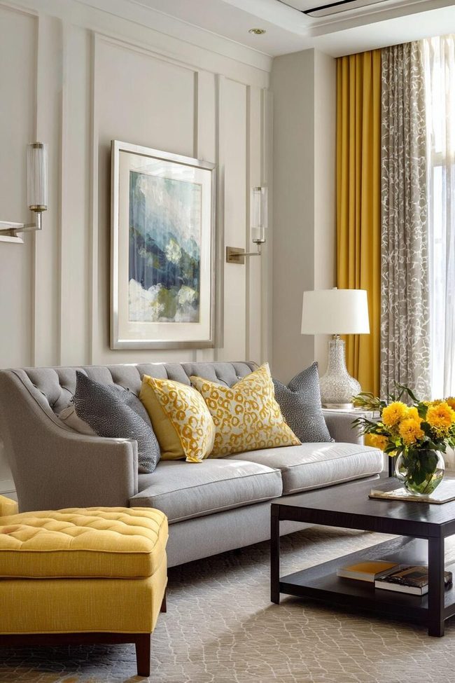
Butter yellow walls paired with deep charcoal gray furniture make a bold, modern statement that stops you in your tracks, and this high-contrast look feels decidedly current without sacrificing timeless appeal.
Medium wood tones add warmth to the scheme while lighter woods enhance the contemporary vibe, and both work beautifully to ground the space.
You can layer in different shades of gray throughout to build depth while butter yellow keeps everything feeling warm and connected.
Varied textures prevent the pairing from looking flat, fuzzy throw pillows, smooth ceramics, and nubby woven blankets all bring dimension to your rooms.
Silver and chrome accents enhance the modernity here, though gold and brass will warm up the overall feel if you want something a bit softer.
This combination works in any lighting condition since the contrast between the colors stays strong whether your space gets lots of natural light or relies more on lamps.
Because gray stays neutral, butter yellow gets to shine as the star without overwhelming the room, and this balance makes it perfect for open-concept spaces or small rooms that need to feel open and airy.
Butter Yellow With Chocolate Brown Walls
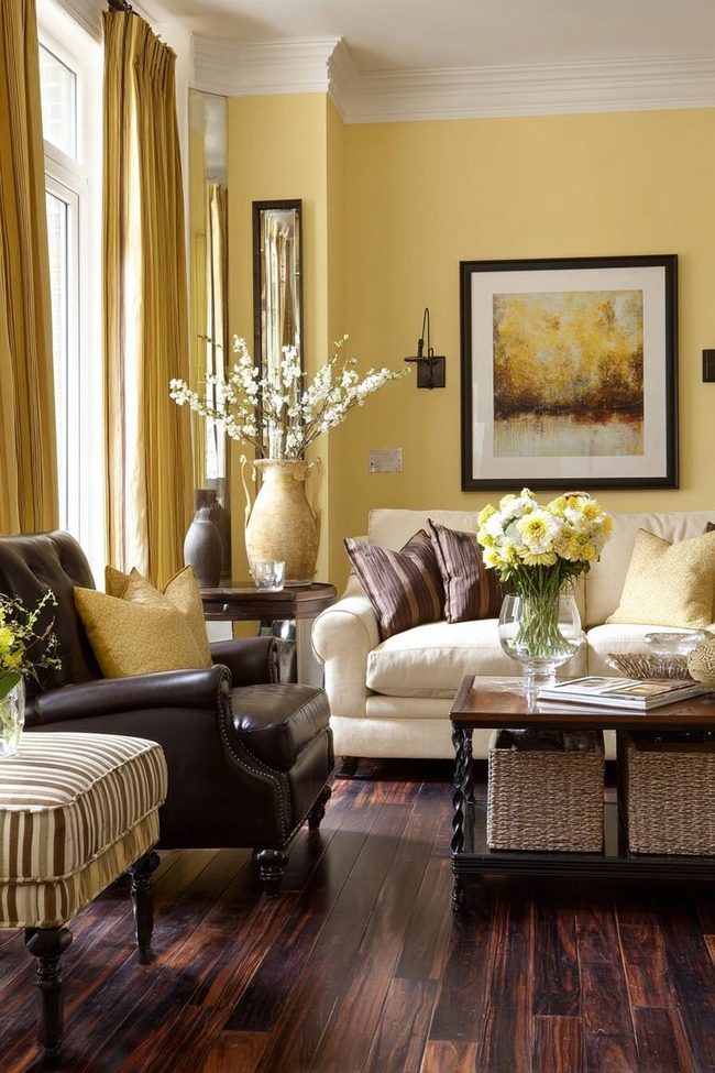
Butter yellow and chocolate brown introduce a warm, sophisticated pairing that instantly makes any room feel welcoming and grounded in comfort.
Dark chocolate brown furniture paired with butter yellow walls offers a bold with a more approachable atmosphere balance that works beautifully in living rooms where people gather and relax.
Natural materials like leather, wood, and rattan absolutely shine with this combination and enhance the inherent warmth of both colors.
You will want to layer in varied textures, velvet, linen, wool, and sisal, so the space feels rich and dimensional rather than flat.
Gold and brass accents work wonderfully here, adding touches of warmth that elevate the overall look without overwhelming the scheme.
This pairing suits traditional and transitional spaces best, though contemporary rooms can pull it off with thoughtful application.
Rooms flooded with natural light benefit most from this combination since butter yellow reflects light and keeps the chocolate brown from feeling too heavy, while spaces with limited light work better when you lean more toward butter yellow with chocolate brown as supporting accents.
Small doses of burnt orange, deep red, or forest green add depth without competing for attention, and the timeless quality means quality pieces in either color will remain relevant for years to come.
Your art collections and decorative objects look eye-catching against both colors, and this foundation transitions seamlessly into adjacent rooms like dining areas and entryways for a flowing home design.
Butter Yellow Meets Cool Teal
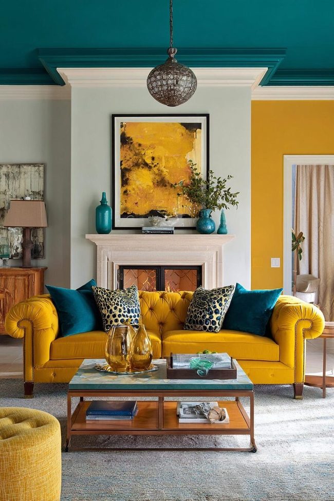
Butter yellow walls paired with teal furniture introduce an instant visual jolt that energizes any living room while keeping things sophisticated and balanced.
Nature inspires this pairing, think buttercups against a summer sky, yet it reads as completely modern when you use it in your home.
If you want maximum drama, go bold with teal seating against butter yellow walls and let that contrast do the talking without veering into chaotic territory.
Medium wood tones with warm undertones ground this lively in tone combination beautifully, and white or cream trim and ceilings give your eyes places to rest between these strong hues.
Patterns work wonderfully here as a way to blend both colors together, so look for geometric prints, ikat designs, or abstract pieces that feature both shades.
Gold metallics enhance the warmth of yellow while chrome or silver complements the cool side of teal, and varying the depth of throughout color, from pale buttery tones to deep golden yellows and light aquas to rich teals, keeps things feeling intentional throughout your space.
Contemporary furniture with clean lines lets these colors take center stage and makes the pairing shine even opener.
You could find this combination works in both open rooms flooded with natural light and darker spaces with limited windows, though the feeling shifts depending on how much light you have.
Butter Yellow And Coral Power Combo
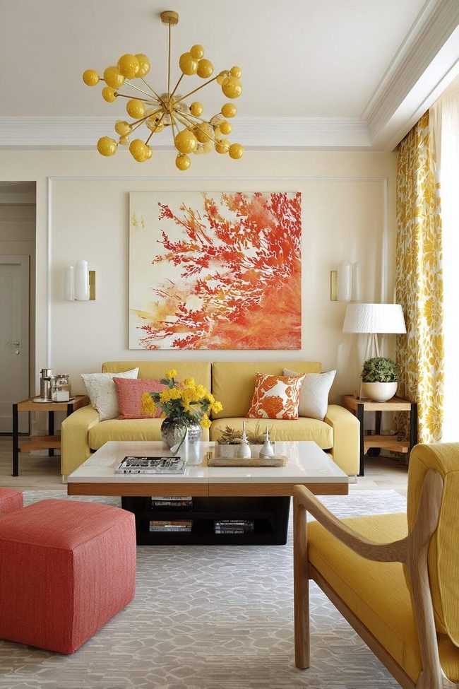
Butter yellow and coral together bring about a bold, joyful atmosphere that punches your living space with the warmth of a perfect sunset and instantly energizes any room you want to feel more alive.
These two colors share natural warmth while their different intensities keep your eye moving around the space, making them work as both contemporary and timeless companions whether your home leans modern or traditional.
For a gentler approach, you might try butter yellow walls with coral accents through pillows and artwork, while those comfortable with color could go for a coral sofa against butter yellow walls for a statement no one will miss.
Balancing this high-energy pairing requires plenty of neutral elements, white trim, natural wood tones, and cream-colored rugs all help prevent the combination from feeling too loud.
Gold and brass metallics enhance the warmth of both colors and add glamour to this eye-catching scheme, and patterns that blend both hues like florals or geometric designs help unite the space.
Textural contrast matters here too, mixing smooth surfaces with rougher textures adds depth and keeps the high energy from feeling flat.
Yellow And Green Terrace Palette
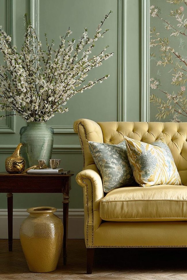
Butter yellow walls paired with sage green accents add a striking visual contrast that brings the fresh balance of a spring garden right into your home, and this nature-inspired palette feels both peaceful and engaging at the same time.
What makes this combination so effective is how the gentle undertones of sage perfectly complement the sunny warmth of butter yellow, producing a sophisticated look that won't overwhelm you when you need to unwind.
Natural light plays a key role in bringing out the best in both colors throughout the day, so rooms with plenty of windows really shine with this scheme.
Wood, rattan, and linen materials enhance the outdoors-inspired feeling, especially when you choose light to medium wood tones that add warmth without competing with either hue.
Botanical prints and patterns that blend both colors reinforce the nature theme while adding visual interest to walls and textiles.
You can adapt this pairing to many design styles, keep lines clean and modern with geometric patterns, or go traditional with classic furniture shapes and muted versions of both shades.
Adding indoor plants becomes part of your core design rather than an afterthought, since their natural greens play beautifully against the butter yellow backdrop.
Textural layers matter here, so mix nubby linens, gentle velvets, and natural fiber rugs to keep the space from feeling flat, and the timeless quality of these earthy tones means your design won't feel dated anytime soon.
Butter Yellow Walls Meet Crisp White Trim
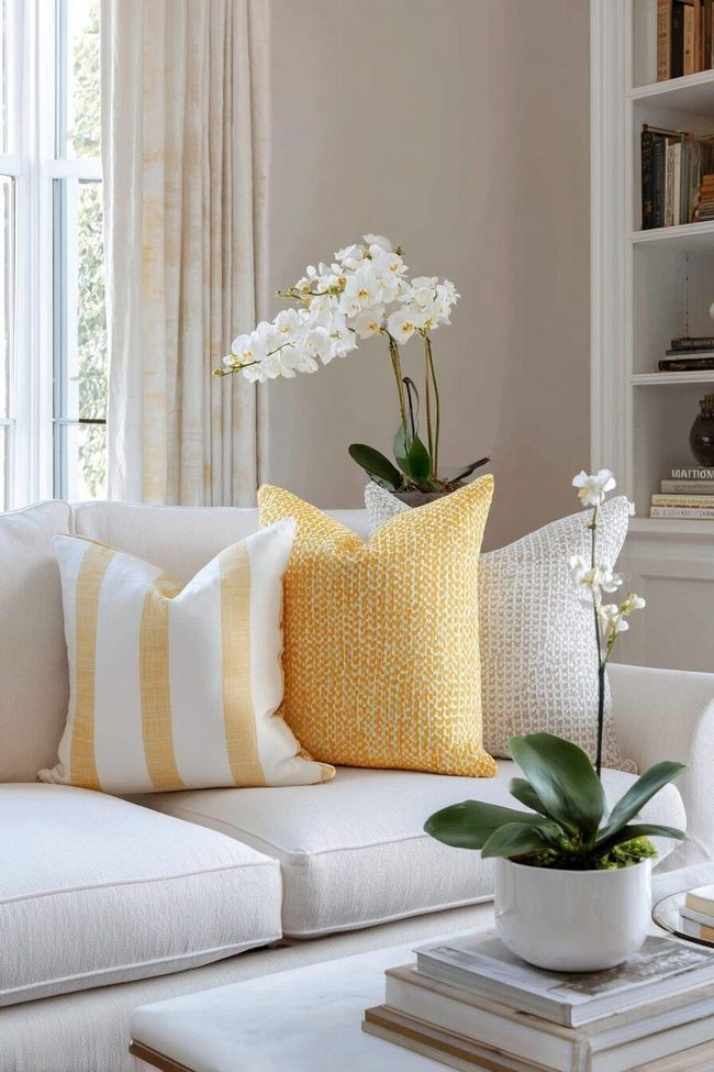
Butter yellow and white set up a living room that glows with perpetual sunshine, and this classic pairing never loses its appeal across farmhouse, traditional, contemporary, and minimalist spaces alike.
White serves as the perfect canvas for butter yellow to shine, letting you control how much of that sunny hue you want in your room.
Go bold with butter yellow walls and white trim and ceiling for cheerful energy, or keep walls white and bring in butter yellow through furniture and curtains for a gentler approach.
Texture matters greatly with such a simple color scheme, so layer in natural fibers, varied weaves, and different materials to add depth and interest.
Wood tones work beautifully as a third element, whether you choose light natural woods or darker stained pieces.
Pattern mixing, stripes, florals, and geometrics in these two colors, keeps things visually engaging while the space stays feeling unified.
This combination is particularly smart for smaller rooms because the brightness of both colors opens up the space and makes it feel larger.
You can also introduce black or navy blue in small doses through picture frames, lamp bases, and objects for additional dimension.
These colors shift subtly throughout the day in naturally lit rooms, keeping the space dynamic without effort.
Your art collections and special pieces stand out beautifully against this simple backdrop.
Architectural small touches like shiplap or wainscoting in white with butter yellow walls above add dimensional contrast.
Isabella Martinez
Founder & Lead Design Enthusiast
Expertise
Seasonal Home Décor, Interior Styling, Space Planning, DIY Home Projects, Sustainable Design Solutions
Education
Savannah College of Art and Design (SCAD)
Pratt Institute, School of Design
Isabella Martinez is the founder of Decorrio, where she shares her love for seasonal home décor and creative design. With a background in interior design from SCAD and a master’s from Pratt Institute, she specializes in stylish, functional, and sustainable spaces.
With over 10 years of experience, Isabella helps homeowners bring warmth and personality into their homes. She loves DIY projects, festive decorating, and collaborating with local artisans to create unique designs.
When she’s not designing, Isabella enjoys exploring Austin’s arts scene, crafting, and hosting gatherings filled with seasonal charm.