
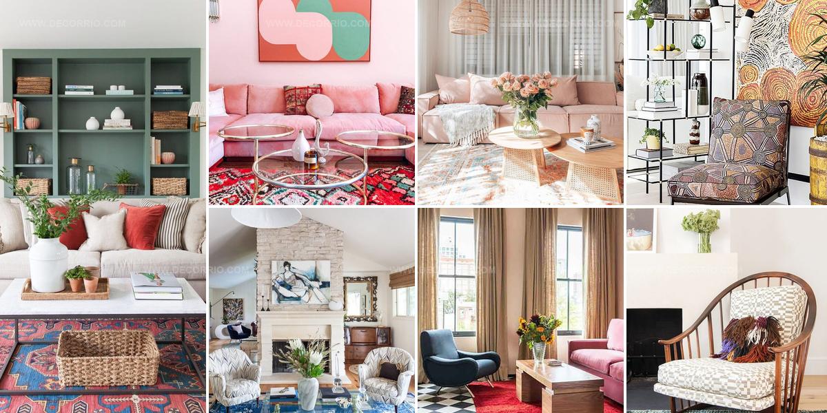
25 Colorful Living Room Ideas That Spark Creativity
Rooms filled with bold hues can dramatically change how a space feels and functions in daily life.
Color has an amazing ability to influence mood, energy levels, and even the perceived size of any interior area.
When decorating with multiple shades, the key lies in balancing visual interest against overwhelming the senses.
Many homeowners hesitate to embrace bolder palettes because they worry about making permanent mistakes or creating chaotic environments.
However, incorporating lively tones doesn't require a complete overhaul or expensive renovations to achieve stunning results.
Strategic placement of saturated shades alongside neutrals creates depth while maintaining harmony throughout the entire space.
Refreshing a room with confident color choices will help you craft an environment that truly reflects personality and brings joy every single day.
Artwork First Foundation
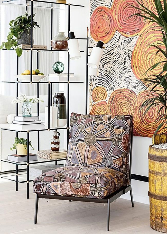
When you pick wall art as your starting point, you can build the rest of your space around it and let it shine.
Colors and patterns matter most when you're decorating with multiple shades and hues, so choose artwork and designs that pair well together and share similar themes, shapes, and color palettes.
Pieces that seem to come from the same artist add extra polish to your space.
Keeping these elements aligned keeps your room from feeling scattered while still giving you plenty of personality and interest.
Start by hanging your favorite artwork first, then select your other decorations so they complement rather than compete with what you've already chosen.
This method makes sure everything in your room connects visually without feeling boring or overdone.
Your space will feel balanced when the colors and patterns speak the same language throughout.
Primary Colors Meet Checkered Floors
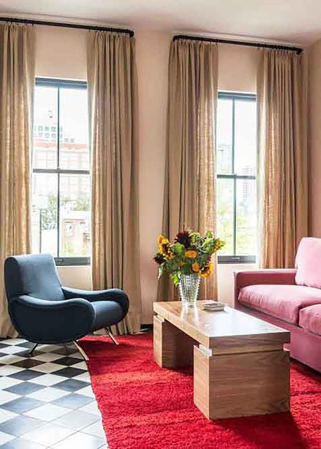
Bold mix of primary colors and geometric patterns makes this living room feel fresh and approachable, blending several design styles into one unified space that doesn't take itself too seriously.
Black-and-white floor tiles with a retro spin create striking visual contrast against the room's warmer elements and anchor the entire layout.
Oat-colored drapery stretches from floor to ceiling, emphasizing the room's generous height and echoing the wood tones of the low-profile angular coffee table to tie the space together naturally.
Comfortable seating pieces sit low and relaxed, setting a casual mood that invites you to settle in and unwind.
Wood finishes throughout the room repeat and reinforce each other, creating visual harmony without feeling stiff or overly planned.
You'll notice how the interplay between cool-toned tiles and warm neutral fabrics keeps the room balanced and livable.
Contemporary touches peek through the traditional elements, giving the space personality without overwhelming it.
This is a room where different design approaches live side by side, making it both interesting to look at and genuinely pleasant to spend time in.
Soft Olive Navy Living Room
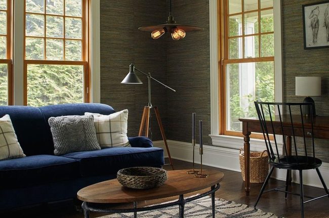
Before you settle on colors for your living room, decide what feeling you want the space to give off when you walk in.
If calm and relaxation are what you're after, stick with shades that won't strain your eyes or overwhelm your senses.
Earthy tones such as olive and navy work wonderfully for this because they feel grounded and gentle.
We all know how much our surroundings affect our mood, so picking the right palette from the start saves you from redecorating later.
Warm neutrals and muted greens can also help you achieve that peaceful vibe you're looking for.
Once you understand the atmosphere you want to build, everything else falls into place much more easily.
Your color choices become the foundation that guides all your other decoration decisions moving forward.
Jewel Tones On White Canvas
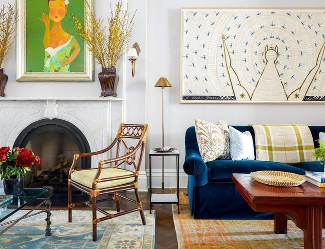
White walls might sound plain at first, but they actually shine when you pair them with rich jewel-toned furniture and bold artwork.
If your living room already bursts with colorful pieces, keeping the walls neutral stops the space from feeling overwhelming.
You get to showcase all those gorgeous colors without fighting for attention against the wall color itself.
We often forget that blank walls can be our best tool for letting furniture and art stand out.
Leaving walls white gives you total freedom to change up your decor later without needing a fresh coat of paint.
It's a smart move if you love color but want the room to feel balanced and not chaotic.
Many people find white walls provide the perfect backdrop for showing off what they love most in their space.
Monochromatic Blue Depth Layering
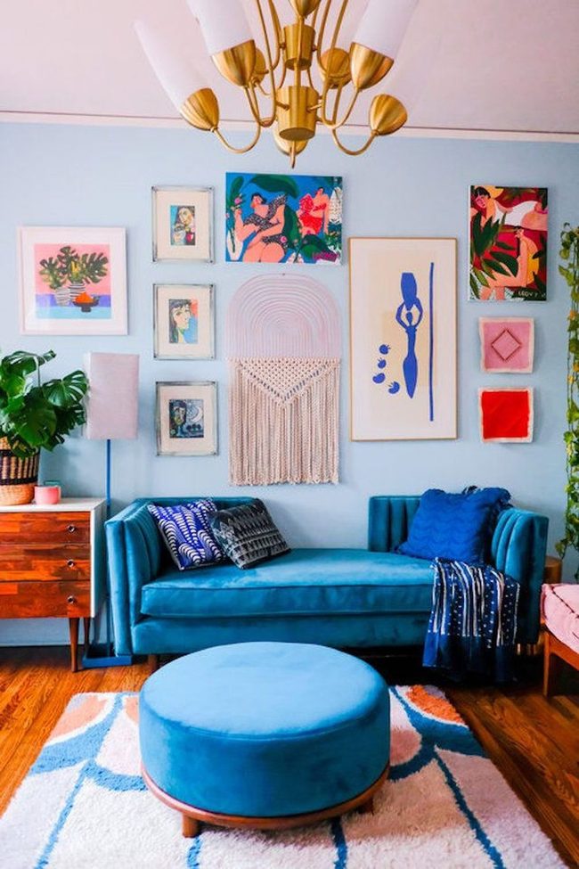
Bold blue walls make an immediate statement in any living room, and when you pair them with a deeper blue sofa, you've got a striking color story that really works.
Don't hesitate to push this idea further by layering in an even darker blue through your rug or other accents.
We often worry about repeating colors too much, but the truth is that multiple shades of the same hue create harmony and depth.
If you love a particular color, let that preference guide your choices throughout the space.
By mixing pale, medium, and dark versions of blue together, you build visual interest without clashing.
You can pull this technique off with any color you're drawn to, and it keeps your room feeling balanced and connected.
Different tones of the same color work beautifully because they feel natural together.
When you're decorating, go ahead and embrace your favorite shade-just vary it enough to keep things from feeling flat.
Deep Navy Walls Sophisticated Living
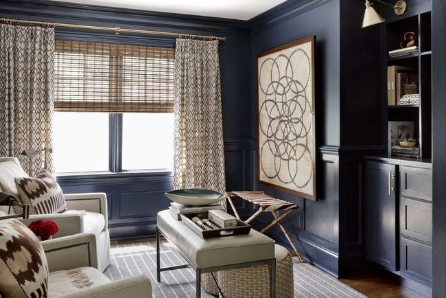
Glossy navy walls set the tone for this colorful living room from Becca Interiors, and they prove that adding color doesn't require brightness.
Deep, rich hues like these wrap the space in sophistication and mood without being loud or overwhelming.
You can layer in other colors alongside these darker tones and still maintain a calm atmosphere.
Jewel tones, muted patterns, and warm accents all work beautifully with navy or other deep colors.
We often think color means bright and energetic, but this room shows how darker shades can feel just as full of personality.
The space manages to be stylish and visually interesting while keeping things subdued and grounded.
Next time you're thinking about adding color to a room, consider going deeper rather than brighter and see how it changes the whole feel.
Neon Yellow Ottoman Black Lacquer
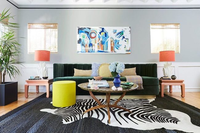
Neon-colored pieces rarely enter our minds when we plan soothing rooms, yet this black lacquer living room proves we should reconsider that assumption.
A bright highlighter-yellow ottoman sits in the space and delivers the most eye-catching moment in the entire design You might think such a bold color would clash, but instead it brings fresh energy to a room that could otherwise feel heavy.
Instead of overwhelming the space, the neon shade adds excitement and personality without demanding all the attention.
Maximalist Patterned Walls With Bold Furniture
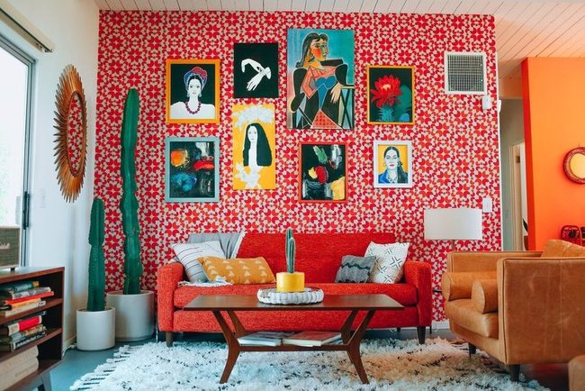
Patterned wallpaper in bold hues makes this living room a riot of color that you can't help but notice first, and Dazey Den has layered even more visual interest on top with a funky sofa that echoes those same tones.
Tall cacti stand in corners and catch light from the windows, adding another layer of green and texture to the scene.
Colorful artwork hangs on the walls and brings additional personality to every surface you look at.
Even the cognac leather armchair contributes warmth and brightness rather than toning things down.
Nothing in this space is timid or muted, and that's exactly what makes it so appealing.
I think what works best here is how nothing fights for attention because the whole room is equally vibrant and alive.
You don't need fresh paint when you've got this much pattern and color working together across furniture, accessories, and wall coverings.
Deep Blue Patterned Floor Anchor
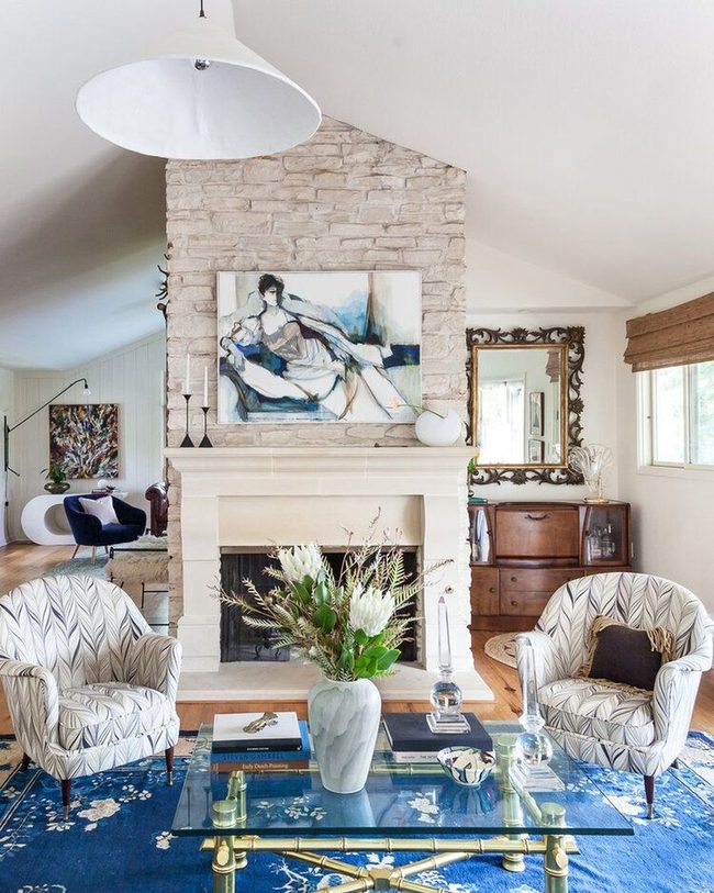
Large, colorful area rug can completely transform a neutral living room, and you don't need to change any other furniture or art to make it happen.
If you choose a rug with bold color and interesting patterns, it becomes the star of your space right away.
In rooms where most pieces are beige, gray, or white, a striking rug draws all the attention and sets the mood for everything else.
Blue rugs, especially deeper shades, bring a romantic and dramatic quality that makes people stop and notice your room.
You can layer furniture and decorative items on top of the rug, and it still holds its own as the strongest visual element in the space.
We recommend picking a rug size that fits well under your seating area so the color really shines through and anchors the whole room together.
When you find the right rug, it becomes the foundation that balances out neutral walls and furniture and gives your space personality without much effort.
Olive And Brick Connected Through Rugs
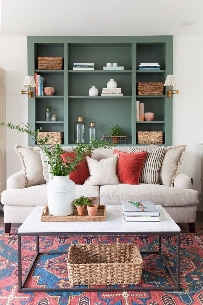
Your living room's olive-toned shelving unit and brick-colored throw pillows work as a pair because the area rug beneath them features both of these colors and naturally connects them.
Most color combinations succeed when you have something that bridges them, and a rug is one of the easiest solutions for this task.
You can use patterns, shared undertones, or neutral pieces to link colors that might otherwise feel disconnected.
When shopping for rugs, look for ones that pull multiple hues from your existing furniture and decor.
This approach keeps your space from looking like separate design choices scattered around randomly.
If you're worried about whether two shades will mesh, a rug or another layering piece can settle that question fast.
Many people overlook how much a single item can unify a room's color story.
Emerald Sofas In Neutral Space
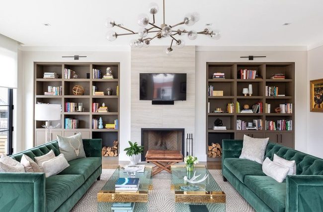
If bold colors make you nervous, zeroing in on one or two spots in your space works wonderfully and lets you keep everything else simple.
Two emerald sofas facing each other become an instant standout in a neutral living room, and pairing them with pale blue glass coffee tables adds another layer of visual interest without scattered colors everywhere.
This approach feels balanced because your eye lands on these pieces and the surrounding walls and floors stay calm.
You can breathe easier knowing the room won't feel chaotic or overdone.
Most people find that concentrating color in specific zones gives them confidence to experiment with deeper or richer tones.
Starting small like this means you can always add more color later if you want, or stick with this measured look if it suits your style.
Building a room this way keeps things grounded while still letting personality shine through.
Mixed Patterns Multiple Colors
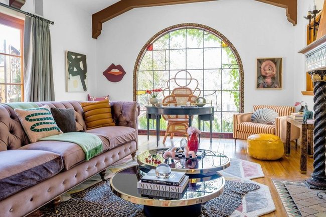
Layering patterns together has shifted from being a design no-no to one of the hottest trends in decorating, and this approach opens up so many possibilities for bringing more color into your space.
You don't have to stick with matching sets anymore-mixing stripes with florals, geometric shapes with textures, and bold prints with understated ones all work beautifully when you trust your eye.
Pairing patterns actually makes decorating simpler because you get more visual interest without hunting for the perfect single print The key is mixing different scale patterns, so larger prints pair well with smaller ones and they support each other rather than compete.
By playing with multiple patterns, you inject personality and color throughout a room with confidence.
This method saves you money since you can mix affordable pieces from different places and still achieve a polished look.
Start small if pattern mixing feels new to you-try two or three patterns in a room first and build from there as you gain comfort.
Oversized Brown Furniture Sanctuary
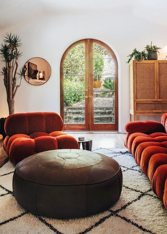
Oversized seating dominates this living room and makes the space feel luxurious, with a low-slung sofa and armchair that sprawl across the floor and a substantial brown pouf that echoes their generous scale.
Neutral tones throughout the room don't need bold saturation to make an impact, and here they create a warm, tactile atmosphere you can almost sense through a screen.
Indoor plants scattered around bring garden freshness indoors and prevent the space from feeling enclosed or dated.
A rose gold mirror bounces light around the room and picks up on the circular shapes repeated in other furnishings and decor.
What really makes this living room work is how thoughtfully the designer balanced scale, proportion, shape, and color to create something that feels both grounded and open.
You get a sense of comfort and softness in every corner, with nothing feeling cramped or overly decorated.
The overall effect is a room that balances style with genuine livability, where you'd actually want to relax and spend time.
Pink, Red, And Turquoise Power
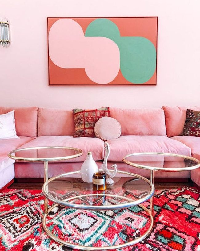
If you want to fully commit to a colorful scheme, don't hold back on the boldness.
Pink often gets linked to kids' bedrooms, especially that bubblegum shade, but you can absolutely design a grown-up room around pink without landing in juvenile territory.
Mix in complementary colors like bright red and turquoise to elevate how sophisticated the space feels.
Going all-in on color takes confidence, and the payoff is a room that makes a real statement.
You'll find that pairing pink with deeper or more vibrant hues prevents it from feeling one-note.
We recommend choosing at least two or three supporting colors that balance out your main pink tone.
This approach works because different shades play off each other and keep the space from feeling flat.
The end result is a room that looks intentional and polished rather than accidental or underdeveloped.
Emerald Velvet Anchor Statement
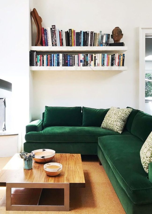
Start your space by choosing one piece that stands out-maybe a bright green sofa like the one shown-and build the rest around it using neutral tones so you don't overwhelm the room.
Velvet upholstery on your anchor piece adds a hint of sophistication when people come over, and the rest of your neutral palette keeps the room from feeling too staged or stiff.
You can live in this space every day without feeling like you're performing, and it's still polished enough for entertaining.
Picking just one bold element means you have freedom to experiment with textures and materials elsewhere without clashing.
This strategy works whether you're dealing with a small apartment or a sprawling living area.
Natural colors for your supporting pieces-whites, grays, beiges-let your main item shine while keeping the overall mood calm and grounded.
Colorful Furniture Against White Walls
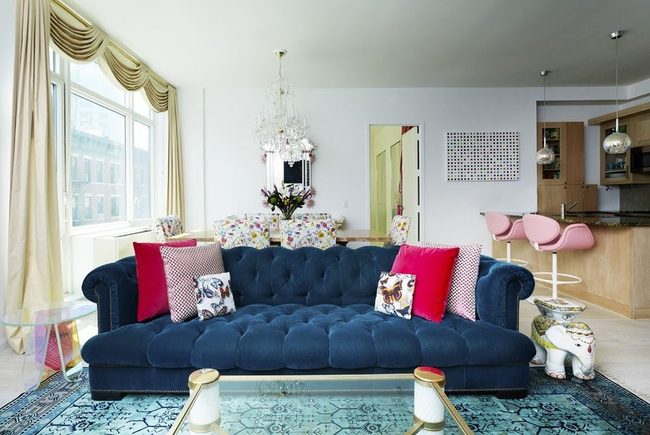
White walls in this New York living room give the colorful furnishings all the space they need to stand out and draw attention.
Moving from the living room into the kitchen, a gentle pink hue connects both spaces and makes them feel like one unified zone.
Bikoff understood that sometimes less is more on the walls so that other elements can have their moment.
You'll notice how the neutral backdrop lets each piece of furniture and accessory really speak for itself.
This kind of restraint with wall color opens up possibilities for you to play with bolder choices elsewhere in your home.
By using that soft pink bridge between rooms, she shows us that you don't need matching everything to feel connected and harmonious.
It's about finding one or two threads that link your spaces together and let them flow naturally into each other.
Blush Pink Sofa Shifts Everything
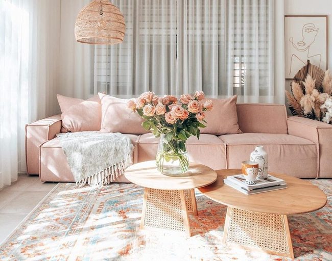
Blush pink works wonderfully in rooms because it adapts to whatever colors surround it, and you can shift how it feels just by changing what else you put in the space.
In a room like the one from House of Harvee, where everything stays in similar tones, that blush sofa reads as warm and peachy.
But if you filled the same room with bright, bold colors everywhere else, that same pale pink would fade into the background and feel almost neutral.
This flexibility means you're not locked into one specific style when you choose this shade.
You can make blush pink feel like a star player in your room or let it sit quietly in the wings depending on what matters most to you right now.
Such adaptable colors give you options down the road when you want to refresh other parts of your space without starting over completely.
Soft Pastels Meet Sharp Edges
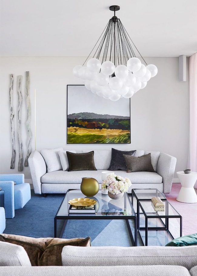
Bold colors fill this living room, yet it feels refined and put-together because warm neutrals balance the brightness and clean-lined furniture keeps things from feeling overdone.
Soft pastels in pinks and creams pair beautifully with deeper chocolate browns and muted olive greens, and black accents along the edges and trim add a sharp, structured quality that prevents the space from looking too casual Streamlined furniture pieces with no unnecessary ornamentation help ground all that color and make the room feel intentional.
You get the fun of playing with multiple hues while maintaining an understated elegance because nothing clashes or overwhelms.
Simple silhouettes mean the eye can rest between the bolder tones, and that breathing room is what keeps everything from feeling chaotic or overstuffed.
If you want color in your own space, this approach shows that restraint in furniture shape and neutral anchors make all the difference.
Blue Daybeds With Neutral Balance
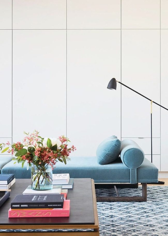
Light shades of blue, red, or green can add color while still feeling calm.
This approach keeps a room timeless without making it feel dull.
Patterned Tiles, Southwestern Fireplace
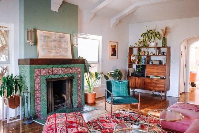
Consider using tiles as a straightforward way to bring color into your living room without needing a major overhaul.
Ceramic or patterned tiles on a fireplace can be bold and eye-catching, especially when they match your room's style.
In a Southwestern-inspired space, a tiled fireplace becomes one of the room's most striking features and works alongside your furniture and accessories to add visual depth.
You don't need to redesign everything to make this work either.
Paint, textiles, and wall art can all complement your tiled surfaces and keep the look balanced.
Sticking with one region's design style, like Southwestern, helps everything feel connected This approach keeps your project simple while still making a real difference in how the room feels.
Muted Orange And Dusty Pink Living Room
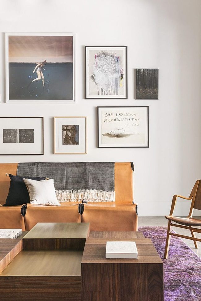
If you love the idea of bringing color into your living room but worry about getting bored with something too bold, choosing muted tones of your favorite hues is a smart solution.
Katie Martinez's space shows exactly how well this approach works in practice.
Her sofa features a subdued orange that feels warm without demanding attention, and the dusty pink-purple rug beneath it adds another layer of color that stays calm and restrained.
Both pieces bring personality to the room without overwhelming the senses, and because they're so understated, you won't find yourself tired of them anytime soon It's an easy way for you to enjoy color in your space while keeping things balanced and livable for years to come.
White Sofa, Colorful Accents
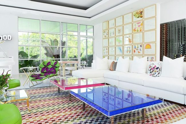
Designer Sasha Bikoff demonstrates how a bright white sofa can serve as the perfect foundation for a bold, colorful living room in her Bridgehampton project.
Rather than loading your sofa with intense hues, you can let a crisp white piece sit as your anchor and channel all your color energy into the surrounding elements instead.
Coffee tables in rich tones, layered rugs with pattern and depth, and striking artwork on your walls become the true stars of the room.
This approach gives you so much flexibility to play with shades and switch things up without replacing your main furniture piece.
White sofas work exceptionally well in rooms where you want the freedom to experiment and evolve your design over time.
Bikoff's work shows that breaking away from the typical colorful sofa choice actually opens up more creative possibilities for your space.
You end up with a room that feels balanced and lets each accent piece shine without competing for attention.
Faded Mustard And Pearl Mix
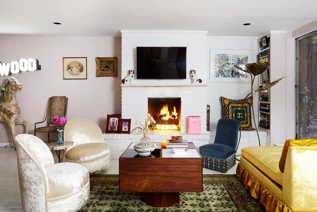
Head to a vintage store and you'll find furniture that brings genuine warmth to any room.
Vintage pieces have a special quality-their colors have mellowed and softened over the years, and that worn-in patina makes spaces feel lived-in and comfortable.
In this living room, the mix of seating tells a story: pearly swivel chairs sit alongside a mustard-colored sofa, and together they create a sense of history and character When you gather vintage furniture like this, you're not just filling a room with functional seating; you're building layers of warmth and authenticity that modern pieces rarely achieve.
Old furniture invites people to relax because it already looks like it's been loved and used.
Mix different vintage finds from different eras and you end up with a space that feels genuine rather than sterile.
Neutral Canvas Meets Unexpected Color
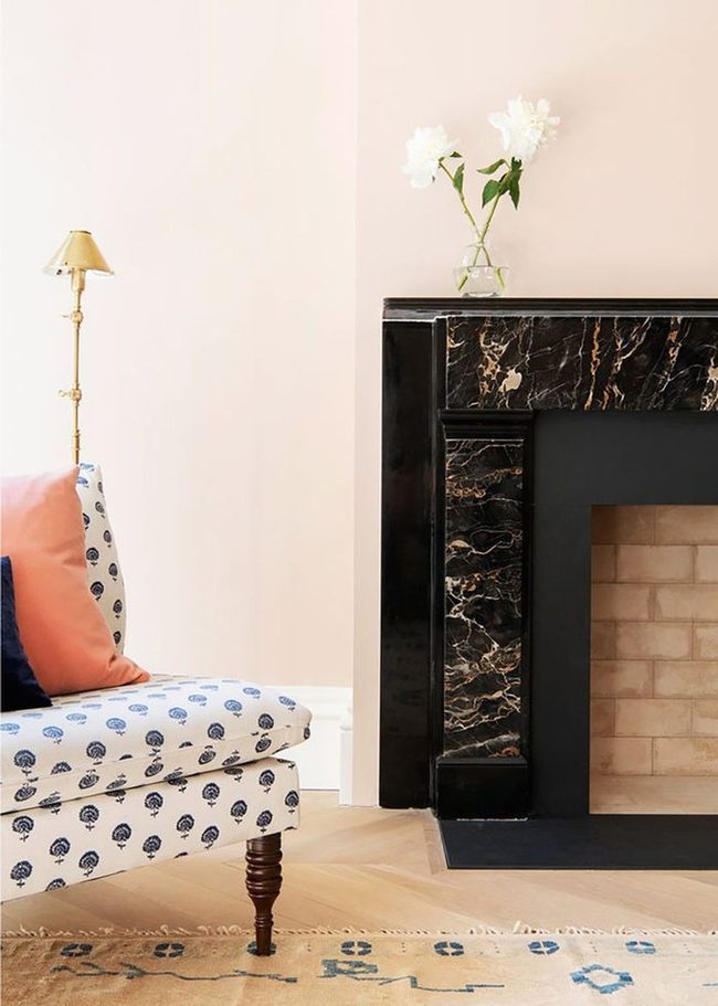
While this room sticks mainly to neutral tones, the few colorful accents scattered throughout make a real difference and show how much impact a little color can bring to your space.
If you like decorating with neutrals but want to experiment with patterns and color in safer ways, this living room offers solid inspiration for your own home.
Choosing more classic pieces-like a vintage Persian rug or a paisley armchair in preppy colors-keeps things interesting and adds visual interest without feeling too bold or risky.
You don't need to go overboard with bright hues to make a space feel dynamic and layered.
Starting with traditional patterns and muted backgrounds helps you ease into bolder choices.
Mix in one or two statement pieces in a different color family, and suddenly your neutral room has personality.
We often think neutrals have to feel boring, but paired with printed fabrics and traditional styles, they become a strong foundation for something truly unique.
Deep Turquoise Living Room Essentials
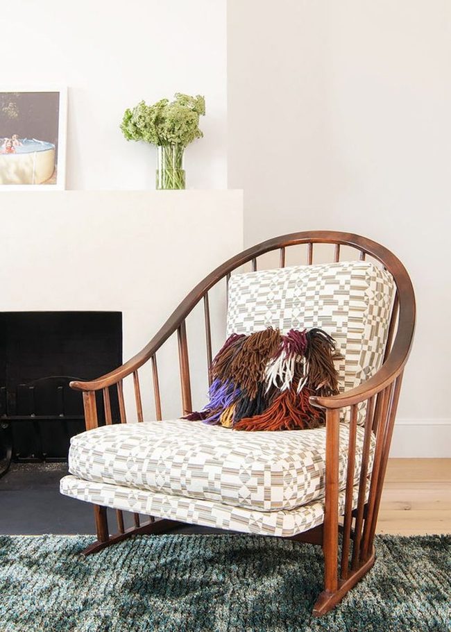
Deep greens and turquoises bring an air of sophistication to any room, and if you're hesitant about bold colors, these moody hues offer a perfect starting point for transformation.
A luxurious textured carpet serves as an anchor for the space while cream-colored walls keep things light and open around it.
Your armchair should feel comfortable and approachable to balance the richness of the darker tones and make the room feel livable rather than stiff.
Throw pillows are one of my favorite ways to layer in color and texture without any commitment since you can swap them out whenever you want to refresh the look.
Consider mixing materials and patterns in your pillow selection to add depth and personality to your seating areas.
Changing out these small accessories is an easy way to keep your space feeling fresh across seasons or whenever you're ready for something different.
Best of all, this flexibility means you can experiment with new color combinations and styles without any stress or major investment.
Isabella Martinez
Founder & Lead Design Enthusiast
Expertise
Seasonal Home Décor, Interior Styling, Space Planning, DIY Home Projects, Sustainable Design Solutions
Education
Savannah College of Art and Design (SCAD)
Pratt Institute, School of Design
Isabella Martinez is the founder of Decorrio, where she shares her love for seasonal home décor and creative design. With a background in interior design from SCAD and a master’s from Pratt Institute, she specializes in stylish, functional, and sustainable spaces.
With over 10 years of experience, Isabella helps homeowners bring warmth and personality into their homes. She loves DIY projects, festive decorating, and collaborating with local artisans to create unique designs.
When she’s not designing, Isabella enjoys exploring Austin’s arts scene, crafting, and hosting gatherings filled with seasonal charm.