
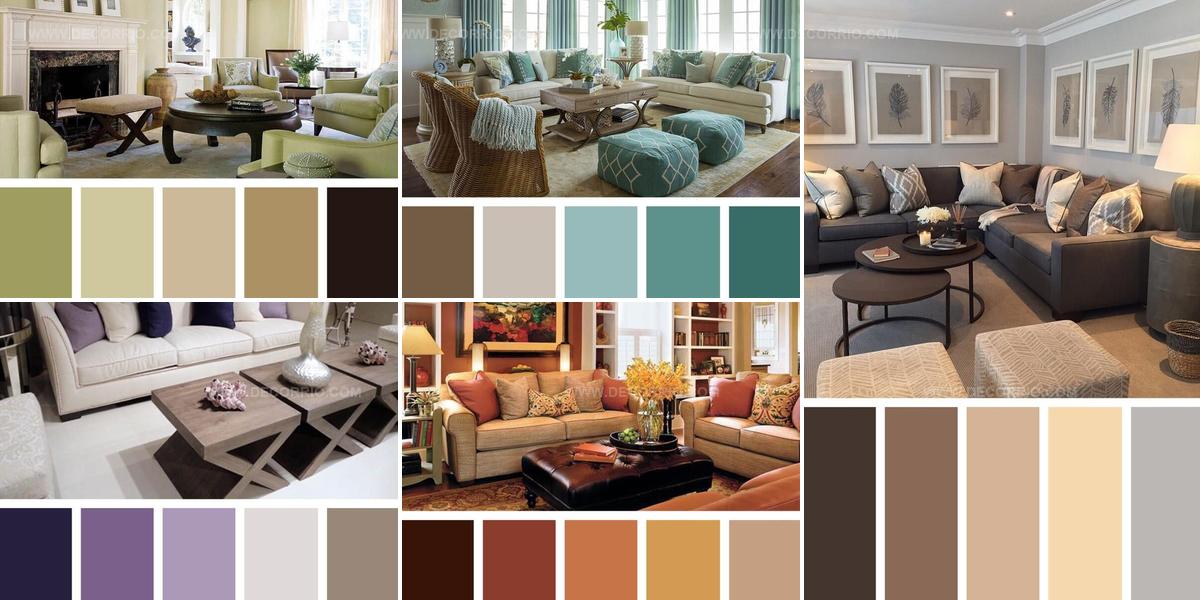
11 Fresh Ways to Use Living Room Color Scheme Ideas

Bold hues or soft neutrals both work wonders when choosing a living room color scheme that reflects personality and style.
Color has the remarkable power to shift mood, alter perceived space dimensions, and establish the atmosphere where families gather daily.
Whether leaning toward monochromatic palettes or complementary contrasts, the right combination sets the foundation for every furniture piece and decorative accent in the room.
Many homeowners feel overwhelmed by endless paint chips and fabric swatches, unsure which direction will yield the most satisfying results.
Understanding basic color theory principles removes guesswork and builds confidence in design decisions.
The psychology behind warm versus cool tones influences how comfortable and inviting a space feels to everyone who enters.
Wicker Gold Against Cool Blue
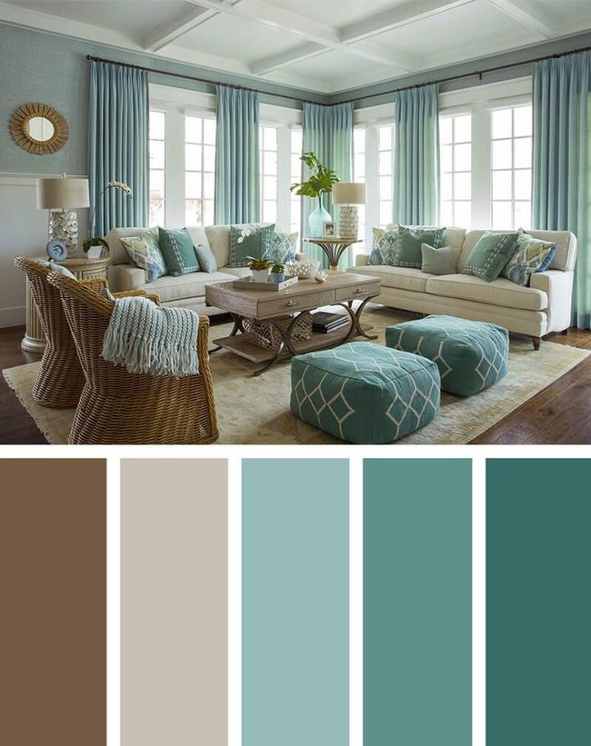
Wicker chairs in warm gold tones sit throughout this living room, catching the light and breaking up what could otherwise feel like too much blue on the walls and furniture.
Blue appears across the walls, curtains, and the main couch, giving the room a fresh and calm energy that makes you want to relax right away.
Neutral linens show up in the rug, side tables, and additional seating pieces, balancing out all that blue and preventing any single color from taking over.
This mix of warm wood, cool blues, and natural textures reminds you of those long, easy days away from home.
You can settle into this room and feel like summer is always within reach, no matter what's happening outside.
Pale Gold Walls And Espresso Anchors
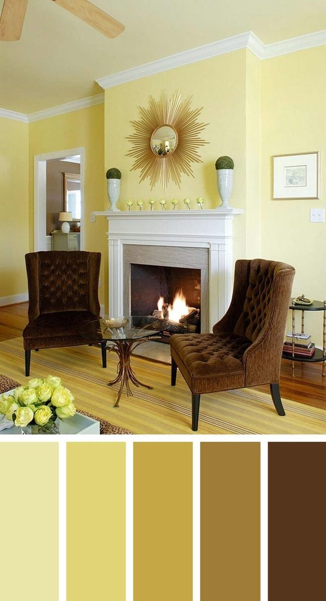
Gold walls in the lightest shade make your room feel open and airy, while warm tones throughout create a relaxed atmosphere perfect for conversation.
Two espresso brown chairs sit as anchors in the space, balancing out all that golden warmth and giving you solid spots to settle in.
A striped rug with caramel, topaz, and wheat tones pulls the whole color scheme together beautifully.
Everything in this room works in harmony, from the rich wall color down to the comfortable seating, and it all feels naturally welcoming without being overdone.
Beige, Sea Green And White Beach Living
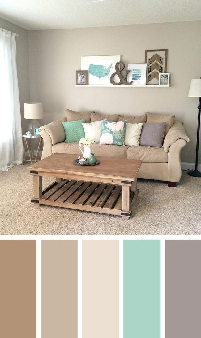
Light beige walls and a matching carpet set the foundation for a relaxing beachy living room that feels naturally warm and welcoming.
Your couch and coffee table echo these sandy tones and build out the peaceful base throughout the space.
Sea green and white throw pillows break up the neutral palette and add visual interest without overwhelming the room.
Wall art displayed on a decorative ledge brings another layer of personality and connects to the coastal theme.
Gray pillows and picture frames scattered around introduce a more soothing element and keep things from feeling too monochromatic.
Mixing these tones together makes the whole room feel balanced and easy to spend time in.
Brown Sectional, Neutral Comfort Zone
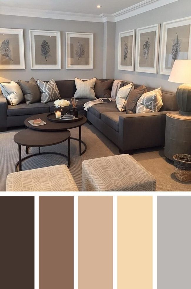
Sit back on the rich brown sectional sofa with its cream and gray patterned pillows and from there, you can see how comfortable this family room truly is.
Light gray walls and a cool neutral mix of browns and cream form the foundation of the space, while a plush tan carpet underneath brings in warmth and softness.
Brown, cream, and gray tones play nicely together and the room feels calm without being boring.
Everything works on the same wavelength, so there's no visual clash or distraction pulling your attention away.
You can just relax here without feeling overstimulated by bold colors or clashing patterns.
It's the kind of room where you naturally want to stay longer, kick back, and enjoy some quiet time to yourself.
Pink, Chocolate And Cream Layers
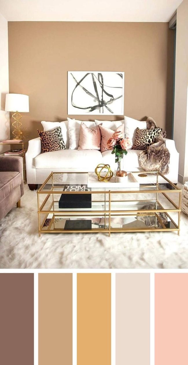
Start with a bold black and white painting as your statement piece - it brings an edgy contrast that immediately catches attention in any space.
Leopard print pillows work surprisingly well as a neutral element and blend seamlessly with nearly any color you choose.
Pink cushions paired with a gold table and matching lamp add glamour and warmth throughout the room.
On your walls, chocolate and beige tones create a comfortable, lived-in feeling that makes the space feel less cold.
What helps this design shine is how it pulls from Neapolitan ice cream colors - that mix of pink, chocolate, and neutral tones - and balances sophistication with genuine comfort.
You don't need to overthink it; when you layer these warmer tones with your bolder pieces, the whole room naturally feels pulled together and welcoming.
Purple Accents In Neutral Urban Sanctuary
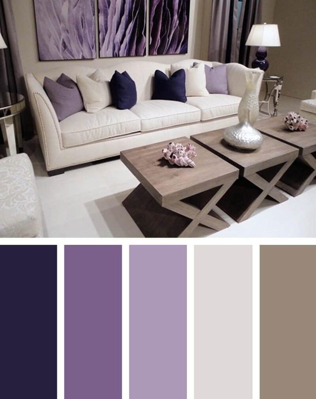
Shades of purple appear throughout this urban living space - in the throw pillows, artwork, window drapes, and lamps - and they bring a layered quality to the room without feeling overdone.
Ivory carpets and cream-colored couches sit against taupe walls and tables, establishing a calm foundation that lets you step away from the city noise outside.
We find that this combination of neutrals and purple creates depth while keeping the space peaceful and restful.
Walls hold their soft color, furniture pieces blend together naturally, and the purple accents prevent the whole room from feeling flat or boring.
You get a balance between complexity and simplicity, where nothing fights for your attention yet the space remains interesting.
This approach works well for anyone wanting their home to feel like a quiet refuge in the middle of an urban environment.
Celadon And Espresso Balance
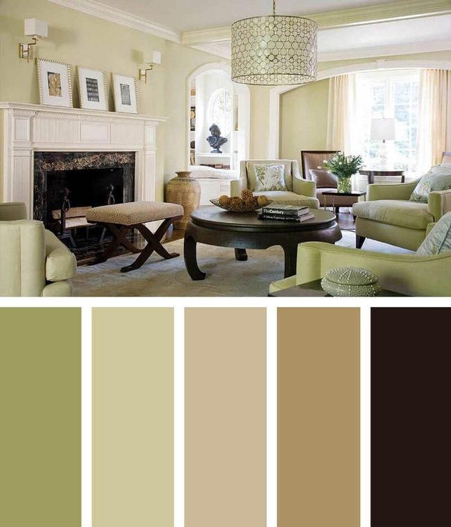
Light celadon walls paired with a rich espresso coffee table create an elegant foundation that draws the eye across this living room, and the color combination brings both calm and sophistication to the space.
Matching celadon chairs echo the wall tones and work with the dark wooden table to establish balance throughout the room.
A neutral beige carpet grounds the furniture arrangement and allows the color story to shine without overwhelming the senses.
Floral satin pillows add texture and visual interest against the solid furnishings around you.
A brown ceramic vase sits nearby and coordinates with a matching side chair to reinforce the earthy warmth that runs through the whole design.
We find that this combination of cool celadons and warm espresso tones creates a living room that feels both peaceful and put-together without trying too hard.
You can easily adapt this palette to your own space by starting with those two main colors and letting them guide your other choices.
Brown Earth Meets Turquoise Pop
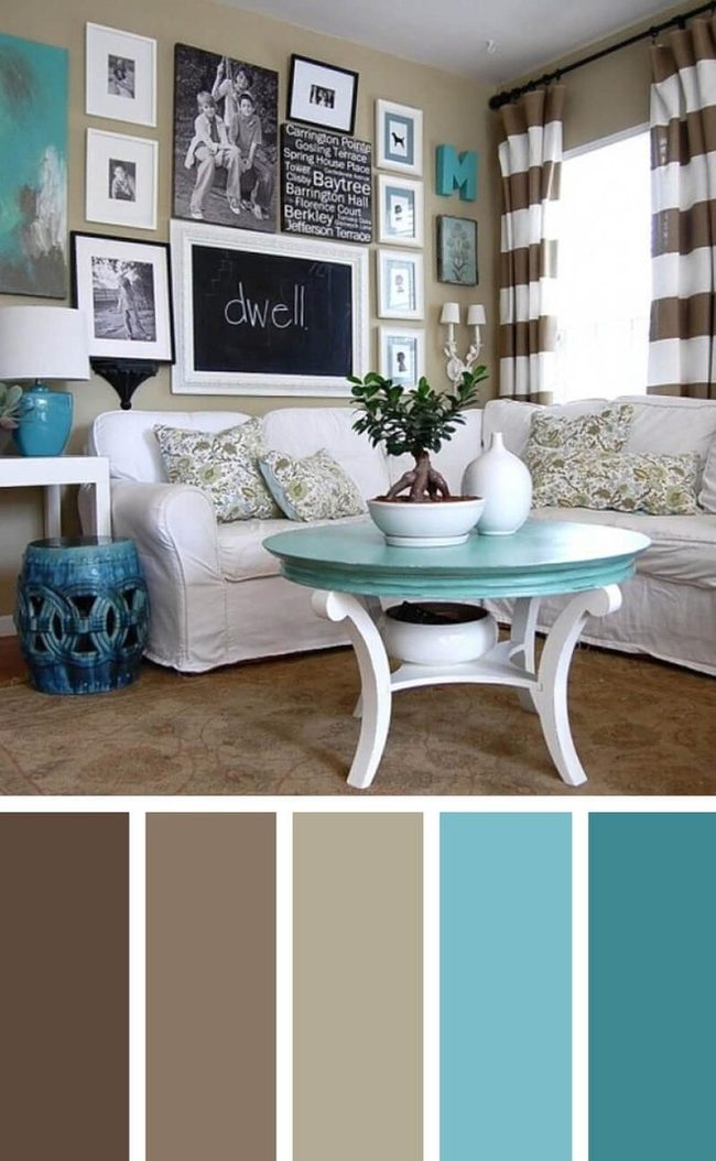
Earth-toned walls and flooring in warm browns set a relaxed foundation for this cheerful living room, while turquoise accessories and striped curtains introduce vibrant color that references both sky and nature.
A white slipcovered couch positioned in the space provides casual comfort and keeps the bold palette from becoming overwhelming.
You get the best of both worlds here - the grounding effect of earthy tones mixed with those punchy turquoise accents that make the room feel alive and fresh.
We find that this balance between neutral and colorful works well because it lets the room breathe without feeling flat or boring.
Striped curtains add visual rhythm to the windows, and those turquoise pieces scattered around give you focal points to rest your eyes on.
Light and neutral slip covers on the furniture also help ground the scheme, preventing it from feeling too busy or chaotic.
Espresso Floors Meet Velvet Luxury
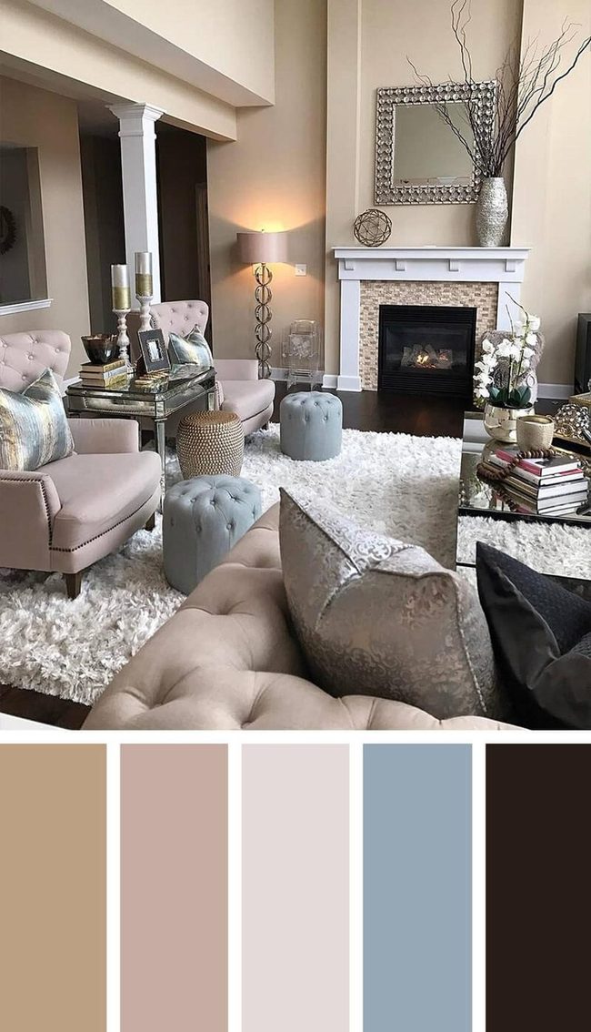
Deep espresso flooring stretches across the room and immediately catches attention with its rich warmth, while fawn-colored walls wrap around the space and create a sophisticated backdrop that feels both grounded and refined.
Tufted furniture featuring nail head trim sits prominently in the room, and velvet pillows add layers of luxury alongside a white shag rug that brings softness underfoot.
Mirrored end tables bounce light around the space and reflect the room's upscale atmosphere, while metallic accents sprinkled throughout nod to Old Hollywood glamour without overwhelming the design.
Pale shades of blue mixed with linen tones and crisp white elements keep the room feeling balanced and prevent it from sliding into something too cold or stuffy.
When you layer these pieces together, the space feels both refined and welcoming at once.
Crisp White Tables Pink Pillows Blue
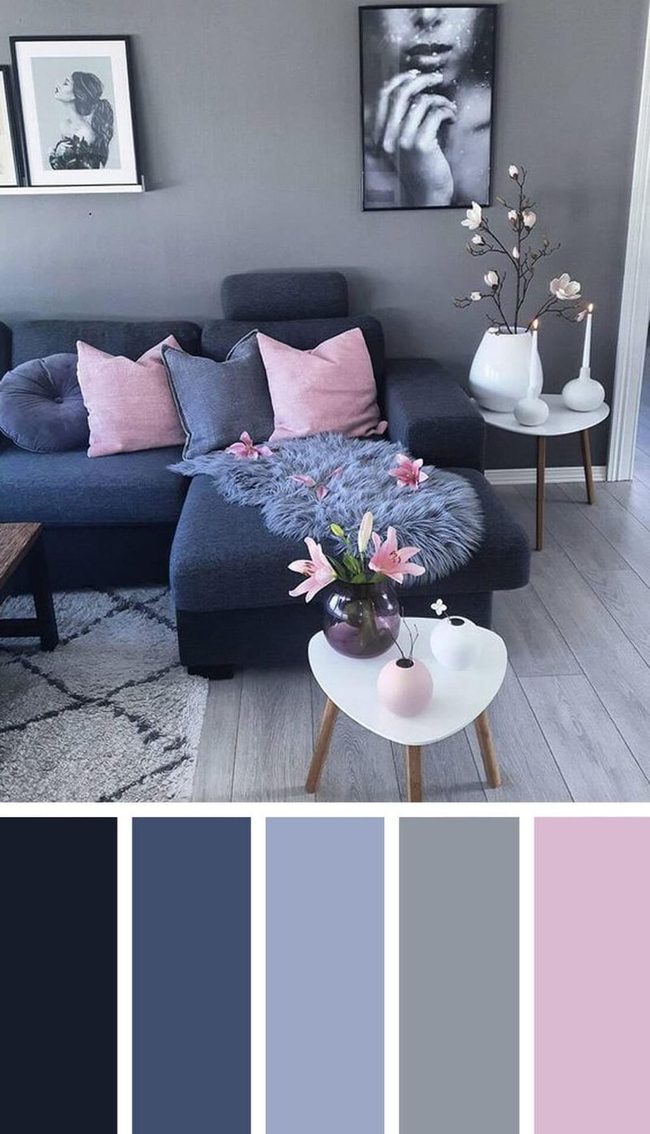
Gleaming white side tables stand out immediately and give your room a fresh, clean look that draws attention.
Pink throw pillows and flowers bring warmth into the space and balance out the cooler tones of blues and grays you've used elsewhere.
A deep twilight blue couch sits at the center, topped with a lighter-toned fur throw that adds texture and comfort against the soothing gray walls, floor, and rug.
Black and white photographs scattered across the walls inject your own personality and character into the room.
Together, all these pieces work to make the space feel intimate and hopeful.
We think this mix of colors and textures helps you achieve a calm, peaceful room that feels both personal and serene.
Deep Orange And Gold Living Room
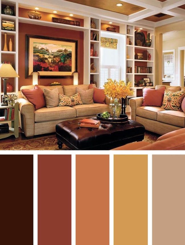
Walls and furnishings in deep orange and gold tones create the most striking feature of this space, and these warm hues sit naturally beside each other on the color wheel to work in perfect balance.
Layering two different shades of orange along with orange-brown tones throughout the pillows and rug strengthens this harmonious color story.
This mix of warm and neutral tones keeps the room from feeling overwhelming while letting the deeper hues shine.
Most people find this combination easy to live with day after day.
The balance here comes from knowing when to push color forward and when to pull it back with neutral shades.
Michael Thompson
Senior Content Editor
Expertise
Content Strategy Development, Editorial Team Leadership, Home Décor Trends & Style Curation, Digital Storytelling for Interior Design, Quality Assurance in Publishing
Education
University of Missouri, Columbia
University of Texas at Austin
Michael Thompson is the senior content editor at Decorrio, bringing over 12 years of experience in journalism and home décor writing. With a journalism degree from the University of Missouri and a master’s in English from UT Austin, he blends storytelling with expert design insights.
At Decorrio, Michael curates inspiring content that helps readers transform their spaces with style and ease. He’s passionate about home organization, DIY projects, and quality design ideas that make everyday living more enjoyable.
Outside of work, Michael enjoys exploring Austin’s culture, tackling home improvement projects, and mentoring aspiring writers.