
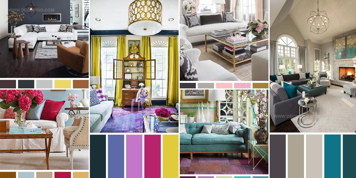
7 Living Room Color Scheme Ideas That Feel Like Home

A well-chosen living room color scheme can completely reshape how a space feels and functions in daily life.
Colors influence mood, perception, and even the apparent size of any room.
Finding combinations that work together requires understanding basic principles while trusting personal preferences.
Harmony between walls, furniture, and accents makes spaces feel cohesive rather than chaotic.
Different palettes evoke distinct atmospheres, from calming retreats to energizing social hubs.
Whether leaning toward bold contrasts or subtle neutrals, the right approach depends on lifestyle and aesthetic goals.
So go ahead and reimagine what's possible within those four walls.
Magenta Walls Gold Metallics Light Blue
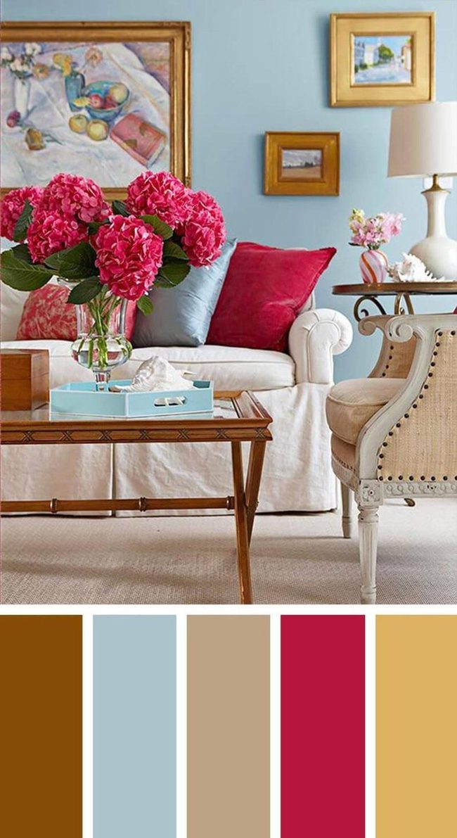
Deep magenta walls make a bold statement in any room without taking over the whole space, and pairing them with cool blue accents lets that rich color really stand out.
Gold picture frames and table legs bring something different to your decor compared to the usual black or brown options, especially when set against light blue walls where they catch the light and draw attention.
You can mix these saturated jewel tones together and still keep the room feeling balanced instead of overwhelming.
We've seen how gold metallics pop beautifully against softer blue backgrounds, creating a sophisticated look that feels fresh.
Light blue serves as a calming counterpoint to the deeper magenta, so neither color dominates your sightline.
Metal finishes in gold add warmth and personality to your space while keeping things looking polished.
Purple And Blue Statement Walls
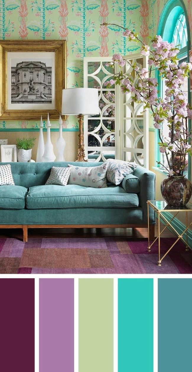
Walls covered in bold purple and blue wallpaper grab immediate attention and set the mood for the whole space.
As you look closer, you can see how those lively hues bring energy and personality to the room without feeling overwhelming.
Window trim in matching blue echoes the wallpaper and helps everything blend together naturally.
White pillows and lampshades break up all that color and keep the room from feeling too busy or heavy.
If you love rooms filled with personality and color, this approach speaks directly to your style.
The balance between the vibrant backdrop and the neutral accessories makes the space feel complete and welcoming.
We think this design works because it doesn't shy away from bold choices while still knowing when to dial things back with lighter pieces.
Orange Fire, Turquoise Calm
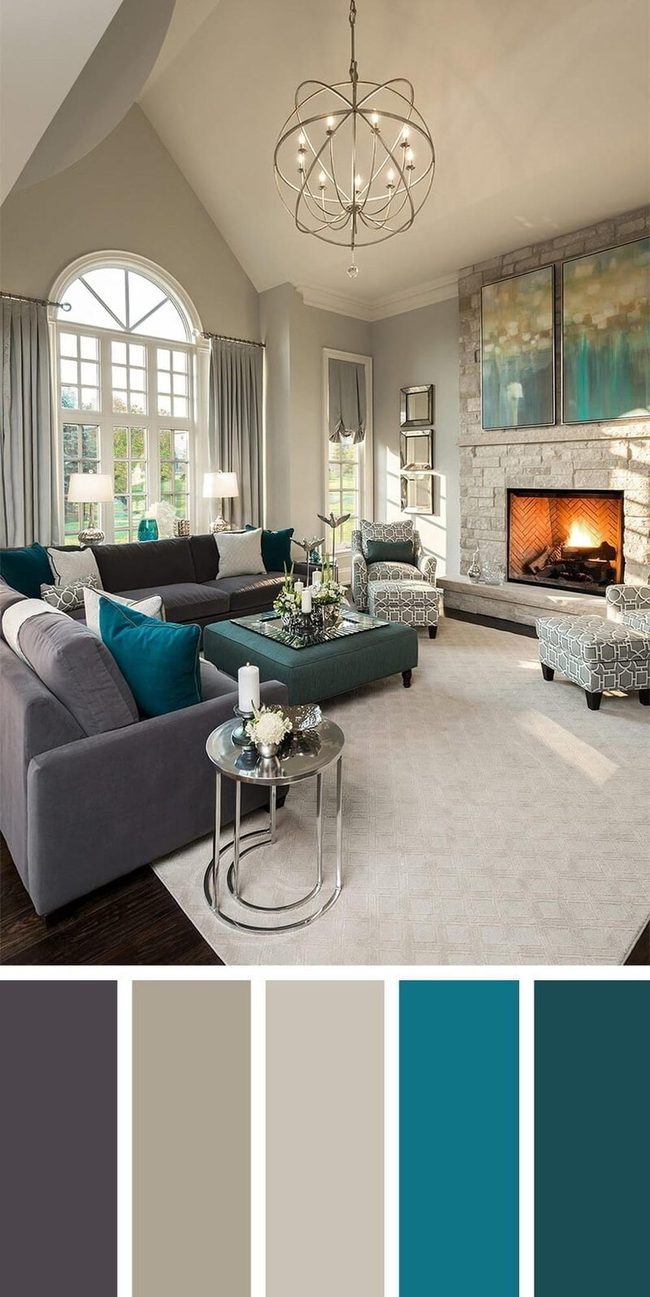
Roaring orange fire commands your attention with its bold contrast against turquoise accents, making this space feel alive and energetic.
Turquoise appears throughout the room as a unique shade that calms your senses much like other blues do.
Dark hardwood floors ground the space, and a large rug laid across them softens the hard edges and prevents the room from feeling heavy.
You begin to notice the sofa in a slightly darker tone balances out the lighter walls and keeps everything from washing out.
Grays and blues dominate the palette here, and they show us that neutral colors have personality and warmth when you layer them thoughtfully.
The combination of these cooler tones prevents the orange fire from overwhelming the space.
Natural light and these balanced choices work together to make the room feel open and breathable.
Whether you're relaxing or entertaining, this mix of bold and neutral elements creates a room that feels both dynamic and restful.
Soft Pink Balanced With Deep Gray
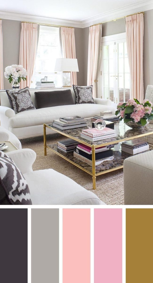
Deeper gray pillows stand out against lighter walls and furnishings, which keeps your room from looking flat or one-dimensional.
When you pair soft pinks with cool gray tones, the space feels more refined and grown-up.
Leaning too heavily on pastel pink throughout your home risks making it feel outdated or overly feminine in a way that doesn't match modern tastes, so balance matters when you're working with this color palette.
Magenta Meets Greenish Gold Balance
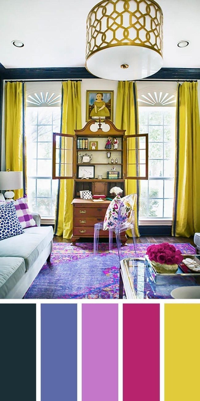
Dark blue-gray walls around the windows balance out the bold colors throughout the room, and this muted tone prevents brighter hues from feeling overwhelming.
Magenta accents stand out beautifully against greenish-gold curtains, creating a nice equilibrium between warm and cool tones.
You can start by choosing a beloved artwork or object - like a girl's bright dress in a painting - and build your whole color scheme from there.
This method helps you pick colors that feel natural together rather than random.
Looking at what you already love in your space makes selecting new pieces much easier.
We often overthink color choices, but anchoring everything to something you genuinely adore simplifies the process.
Your room will feel more put-together when colors connect back to one meaningful piece.
Soft Blue Accents In Neutral Rooms
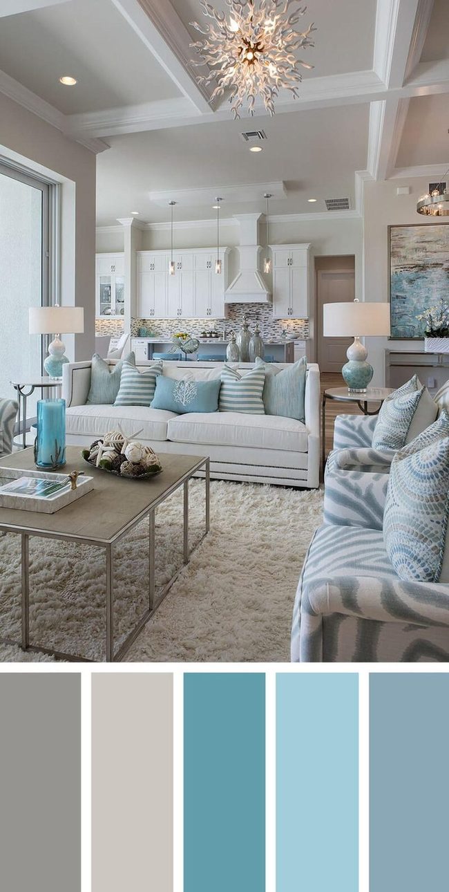
Light colors throughout your room establish a calm and restful foundation, while soft blues in accessories like lamps, table centerpieces, and pillows introduce visual depth and character.
You get flexibility with a neutral base because swapping out accent pieces refreshes the entire look without the hassle of repainting walls.
Ceiling trim in a contrasting shade keeps your eye moving around the space, and this simple touch maintains interest without overwhelming the room.
The beauty of this approach is how easily you can shift the mood by changing a few key items whenever you feel ready for something new.
Dark Floors, Light Furniture Contrast
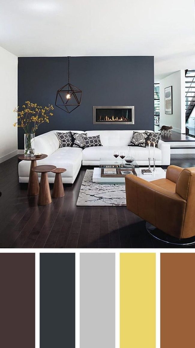
Dark hardwood floors paired with a rich accent wall make a bold statement in an open concept living area, and placing a large light-colored sofa and throw rug against these darker tones creates natural visual boundaries that define the space without walls or barriers.
By echoing the floor's rich color elsewhere in your furnishings and accessories, you tie the room together in a way that feels natural rather than forced.
This kind of balancing act means you don't have to worry about your open floor plan feeling shapeless or undefined.
Large furniture pieces in lighter shades stand out beautifully against dark backgrounds and help you separate different zones for living and relaxing.
Light textiles like a pale rug anchor the seating area and draw the eye toward your main gathering spot.
When you repeat colors throughout the room instead of using them just once, everything feels connected.
Isabella Martinez
Founder & Lead Design Enthusiast
Expertise
Seasonal Home Décor, Interior Styling, Space Planning, DIY Home Projects, Sustainable Design Solutions
Education
Savannah College of Art and Design (SCAD)
Pratt Institute, School of Design
Isabella Martinez is the founder of Decorrio, where she shares her love for seasonal home décor and creative design. With a background in interior design from SCAD and a master’s from Pratt Institute, she specializes in stylish, functional, and sustainable spaces.
With over 10 years of experience, Isabella helps homeowners bring warmth and personality into their homes. She loves DIY projects, festive decorating, and collaborating with local artisans to create unique designs.
When she’s not designing, Isabella enjoys exploring Austin’s arts scene, crafting, and hosting gatherings filled with seasonal charm.