
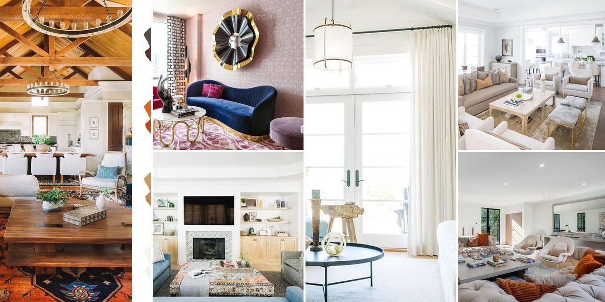
6 Living Room Color Schemes That Work Every Time

A living room feels completely different when colors work together instead of fighting for attention.
Most people struggle with combining hues because they lack a reliable framework for making decisions that feel both safe and exciting.
No-fail living room color schemes provide that foundation, allowing anyone to confidently select palettes that enhance furniture, lighting, and personal style without second-guessing every choice.
The right combination makes spaces appear larger, cozier, or more sophisticated depending on what feels authentic to how someone wants to live.
Understanding which colors complement one another eliminates the anxiety that comes from staring at paint swatches for hours without clarity.
When harmony exists among walls, textiles, and accessories, rooms become places where comfort and beauty coexist naturally.
Learning proven combinations gives anyone the power to redesign a space with confidence and enthusiasm.
Blue Layers With Living Green
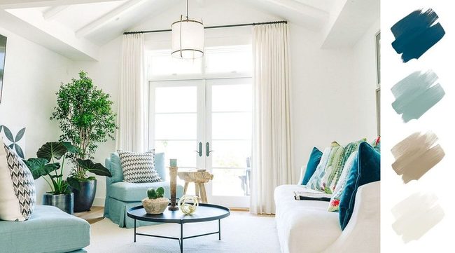
Robin's egg and peacock blues mixed with white create a living room that feels both calm and engaging, and layering different shades within the blue family is key to avoiding a flat, one-note look.
Caitlin Whelan of Whelan Design House points out that blue works in nearly any climate and has a naturally soothing effect that keeps people coming back to it for their homes.
She pairs lighter powder blue linens with deeper teal or dark turquoise in heavier fabrics like mohair, and this contrast between delicate and bold textures brings dimension to the room.
Mixing soft and rich tones alongside each other prevents the space from feeling boring and adds visual interest without being overwhelming.
Plant elements-whether through cactus-printed pillows or actual greenery in pots-help you achieve that grounded, peaceful feeling the color scheme promises.
You can scatter these natural touches throughout to strengthen the zen quality of the room and tie the blues together naturally.
Denim Blues Meet Terra Cotta Warmth
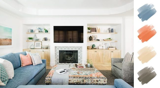
Denim blues paired with terra cotta create an immediate visual punch that feels both fresh and modern, and when you add warm wood tones and taupe into the mix, the whole space shifts into something comfortable and grounded.
These warm neutrals work beautifully as accent colors throughout your home, bringing an energizing quality that keeps the palette from feeling dull or flat.
Light grays and soft denim shades balance out the bolder terra cotta pieces, so the room stays easy to relax in without losing personality.
Many designers are gravitating toward this combination because it hits that sweet spot between laid-back and put-together, making spaces feel genuinely livable.
You can sink into an evening around the TV and feel how the colors support relaxation rather than demanding attention.
The terra cotta doesn't need to be everywhere; strategic pops of it against neutral walls or furniture do the heavy lifting.
Whether it's pottery, throw pillows, or wall accents, these warm tones add character and depth that cooler palettes often miss.
This palette proves you don't have to shy away from color to create something calm and inviting.
Jewel Rug Anchors Warm Wood Ceiling
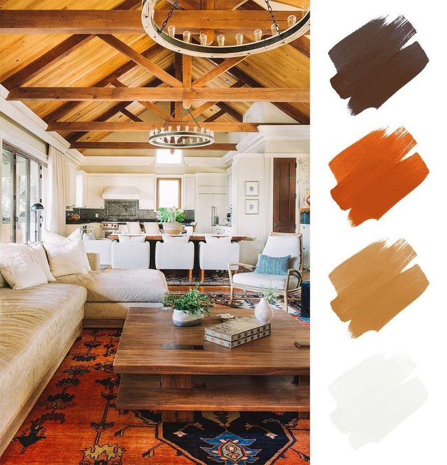
Bold jewel-toned rug stretches across the floor and soaring warm-wood ceilings rise above, these two elements anchoring the room and reflecting each other in unexpected ways.
Neutral upholstered pieces sit between them, letting both the saturated color below and the rich wood tones above take center stage.
Mixing different wood species together-walnut alongside oak, maple with cherry-brings depth and warmth to any space without feeling cluttered or forced.
You can see this blend happening in the furnishings here, where each wood tone adds its own character while harmonizing with the others.
Warm woods pair beautifully with rich jewel-toned fabrics, and together they build spaces that feel both grounded and layered Playing with multiple wood species and saturated colors lets you build rooms that feel organic and balanced at the same time.
Layered Neutrals With Animal Print
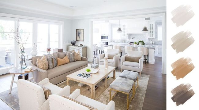
Tan, beige, and cream come together in this living room to create a modern space that feels both grounded and full of character, and the designer Robin Strickler explains that mixing textures and warm tones prevents the neutral palette from feeling flat or boring.
Terra cotta accents, natural leather, light wood pieces, and brass hardware blend seamlessly to give the room a timeless quality that still feels fresh and current.
Animal print elements scattered throughout add a playful edge and echo the leather and hair-on-hide textures already present in the space Light woods bring natural warmth, brass catches the eye with subtle shine, and leather grounds everything with texture and depth.
The animal print touches keep things from feeling too serious or predictable.
You can see how this balance between calm neutrals and livable details makes a room that's both relaxing and genuinely interesting to spend time in.
Robin's method shows that neutral doesn't have to mean boring or cold when you bring in the right combination of materials and hints of personality.
Jewel Tone Living Room Luxury
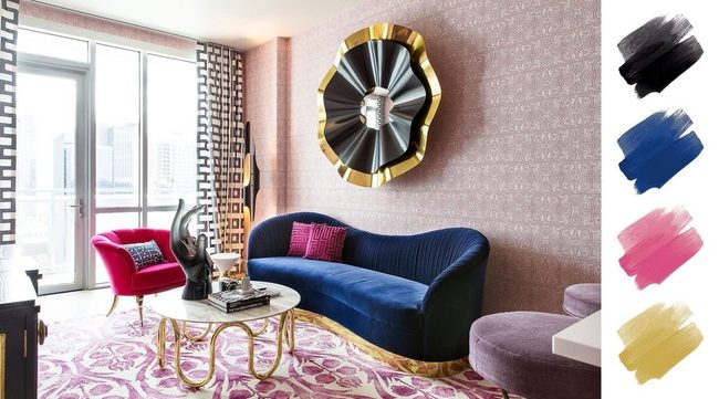
Jewel tones make a bold statement, which is exactly why designers return to them season after season, and fuchsia paired with navy delivers that glamorous, exciting energy perfectly in a living room.
Rose quartz wallpaper catches the eye immediately with its soft pink tones across the walls.
Amethyst upholstery on furniture brings deep purple richness into the space and invites you to sink in and relax.
Gleaming gold accents scattered throughout-think hardware, trim, or decorative pieces-add that luxe touch that makes the room feel like a treasure box.
You don't need many gold elements to make them shine and feel special.
Navy grounds the whole scheme and keeps it from feeling overwhelming.
When you bring these colors together, the result is a living room that feels special and refined, a space that radiates personality and style without trying too hard.
Burnt Orange Accents On Neutral Canvas
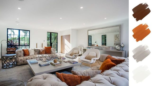
Orange might seem like a difficult color to decorate with, but we think that reputation doesn't hold up under scrutiny.
Burnt orange accents bring life and character to this neutral living room in ways that feel both natural and exciting.
Designer Claudia Afshar notes that natural materials and earthy tones keep the space feeling open and bright.
Black steel-framed windows and doors stand out against the lighter interior, and they frame the outdoor succulent garden like artwork you can see from inside.
Isabella Martinez
Founder & Lead Design Enthusiast
Expertise
Seasonal Home Décor, Interior Styling, Space Planning, DIY Home Projects, Sustainable Design Solutions
Education
Savannah College of Art and Design (SCAD)
Pratt Institute, School of Design
Isabella Martinez is the founder of Decorrio, where she shares her love for seasonal home décor and creative design. With a background in interior design from SCAD and a master’s from Pratt Institute, she specializes in stylish, functional, and sustainable spaces.
With over 10 years of experience, Isabella helps homeowners bring warmth and personality into their homes. She loves DIY projects, festive decorating, and collaborating with local artisans to create unique designs.
When she’s not designing, Isabella enjoys exploring Austin’s arts scene, crafting, and hosting gatherings filled with seasonal charm.