
20 Pastel Living Room Decor Ideas That Feel Like Spring

A pastel living room offers a serene escape where soft hues blend to create calm, sophisticated spaces perfect for modern homes.
Gentle colors have the power to make any area feel more open and inviting without overwhelming the senses.
The beauty of working with muted tones lies in how effortlessly they complement various design styles, from minimalist to traditional.
Soft shades on walls, furniture, and accessories can refresh a space while maintaining a timeless appeal that never goes out of style.
When done thoughtfully, this approach to decorating brings harmony and balance into everyday life.
The versatility of light colors means they work beautifully in small apartments or spacious houses alike.
Warm Wood Against Pale Walls
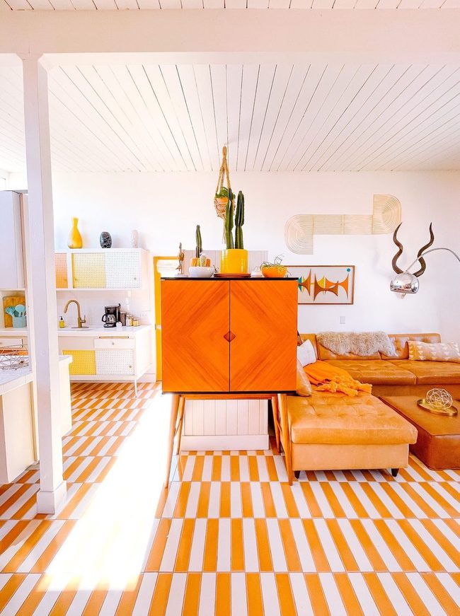
Warm orange tones in the flooring, wooden furniture, and sofa stand out dramatically against the pale pastel walls and ceiling, creating a striking contrast that brings energy to the room.
You can see how the brighter hues pop without overwhelming the space because they're balanced by the soft, muted backdrop that keeps things calm.
Yellow and blue accents appear in small doses throughout, and this restraint prevents the room from feeling chaotic.
We find that this approach works well because it avoids both extreme minimalism and over-the-top decorating styles.
Light walls give your eyes a place to rest, while the warm wood and orange furniture command attention when you look around.
Instead of filling every corner with bold color, the designer lets these key pieces do the heavy lifting.
By keeping the overall palette simple and letting the contrast shine, you end up with a space that feels both lively and balanced.
Rose Pink Walls Meet Modern Brass
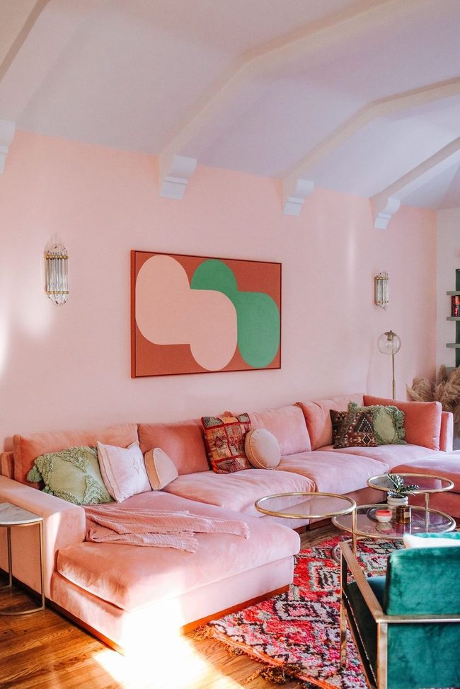
Bold rose-tinted walls paired with a striking sofa command attention the moment you walk in, and they set the tone for this romantic space.
Angular wall art and a modern coffee table balance these warmer tones while maintaining softness throughout the room.
Brass accents gleam against natural wood floors, adding layers of warmth and dimension that guide your eye around the space.
Wood, metal, and painted surfaces interact with one another across the room and create visual interest without feeling cluttered.
You can mix materials like this to add depth and personality without overwhelming your decorating choices.
Natural textures from the flooring ground everything and keep the look from feeling too polished.
When you pair unexpected elements together thoughtfully, your room feels both refined and lived-in.
Frost Gray Stone And Wood
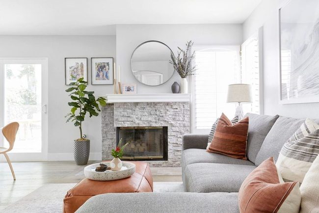
Frosted walls in icy tones meet brighter accent colors in the throw pillows, and this contrast keeps the space balanced and modern.
Gray furniture with clean lines sits alongside a textured stone fireplace that adds depth and visual interest throughout the room.
Raw wood materials bring warmth to the design and help prevent the space from feeling too formal or cold.
You get dimension without clutter because the designer chose each element to work in harmony rather than compete.
Light hues dominate the background, which gives you breathing room while the accent pieces pop just enough to hold your attention.
A relaxed atmosphere blends nicely with polished furnishings, so the room feels both welcoming and refined.
We see how restraint in color choice and thoughtful balance make a space feel larger and more serene than it actually is.
Ivory Peach With Green Accents
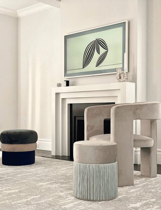
Ivory and peach walls dominate this living room with their smooth, polished surfaces that lean toward a traditional style, while two muted green accent pieces break up the otherwise neutral palette and keep things from feeling too monotone.
Texture plays a huge role throughout the space-you'll notice it in the three-tiered fireplace, the velvet chair, the upholstered ottoman, and the patterned rug, which means there's visual richness from floor to ceiling.
If you're working with neutral tones like these, adding a few bold, dark accents scattered strategically around your room helps guide the eye and prevents the space from feeling flat or one-note.
We find that this layering approach makes all the difference when you want calm walls but don't want the room to lose its personality.
The key is using restraint with those darker pieces so they stand out without overwhelming your soothing foundation.
Spacing them out intentionally gives your eye natural places to rest and explore as you move through the room.
Beige Walls With Living Green Plants
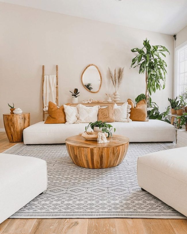
Beige and pastel walls create a warm foundation in this living room, with earthy tones flowing smoothly from floor to ceiling and offering plenty of depth that keeps the space from feeling flat.
Lush houseplants scattered throughout the room bring life and movement to the calm setting, while natural wood grains add rich texture that prevents the neutral palette from becoming boring.
You can see how this simple color scheme works without needing bright pops of color everywhere, and the result is a den-like atmosphere where you'd be happy to settle in for hours.
By sticking to warm, natural tones and letting plants do the heavy lifting, the room feels grounded and peaceful while still holding your interest.
Soft Pistachio Meets Burnt Orange
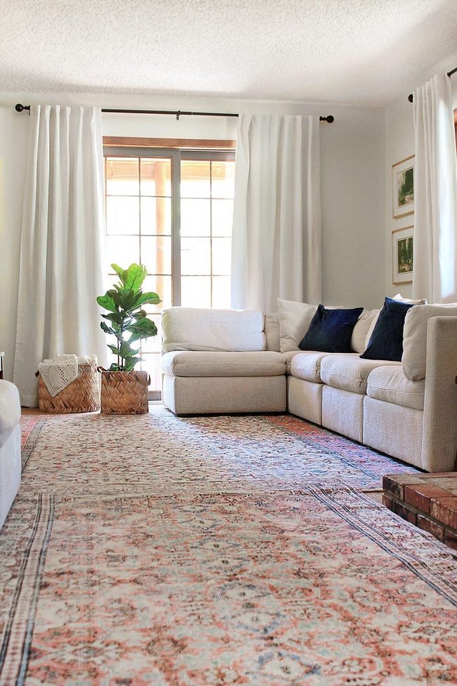
When your living room leans toward warm tones and you want to add contrast without making the space feel harsh, soft pistachio offers a gentle alternative to stark white walls Natural woven baskets scattered throughout bring in texture and earthiness that keeps everything grounded.
Minimal decor allows the soft pistachio to breathe and prevents the space from feeling crowded.
This quiet color choice adds a refresh to your palette while staying calm and approachable.
You get the visual break you need from warm colors without any jarring transitions between elements.
It's a smart way to introduce something new that feels both restful and thoughtfully balanced.
Mint And Forest Green Layers
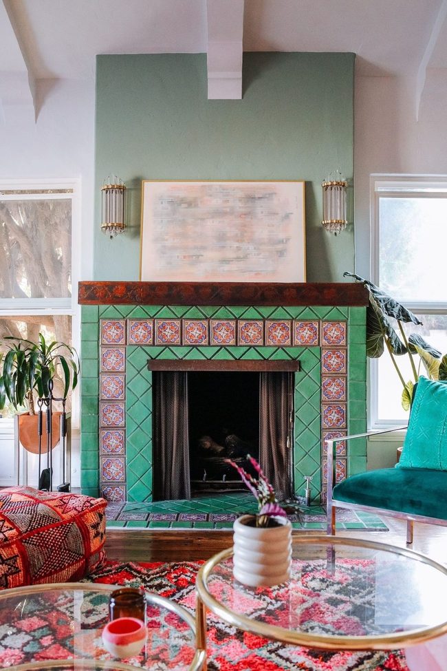
Mint walls pop against the deeper green fireplace in this living room, and the color contrast stops you from missing this bold design choice.
Boho furniture scattered throughout the space adds personality and keeps things from feeling too polished, while a patterned rug and floor pillow introduce bright geometric shapes that dance across the room Multiple shades of green and mint work alongside each other, and different textures from the furniture, textiles, and wall treatments keep your eye moving around the room.
If you're thinking about embracing color in your own home, this room shows that layering various tones of the same hue actually adds depth and interest.
The mix of patterns, furniture styles, and color variations means there's something different to look at no matter where you stand in the space.
Soft Blue Walls With Bright Accents
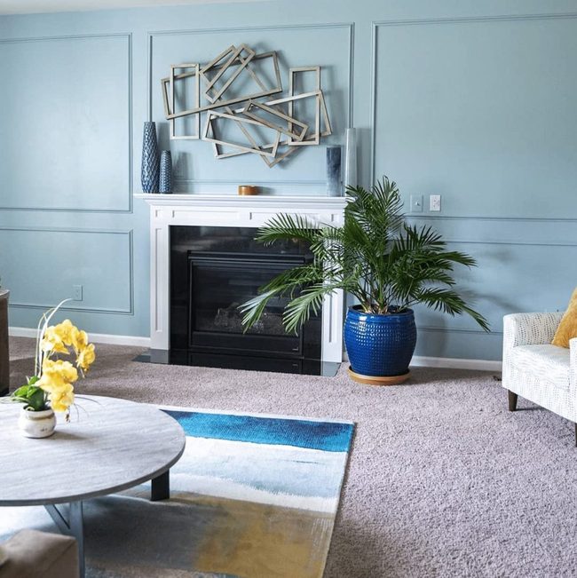
Painting your walls and trim in the same soft blue creates an immediate visual punch that draws the eye around the entire room in one flowing movement.
Ocean-inspired hues like this one deliver a calming sensation right away, and they work beautifully when you layer in darker blue accents throughout your living room.
Brighter elements such as yellow flowers and throw pillows break up the cool tones and add dimension without clashing with the blue backdrop.
You'll find that mixing these lighter and darker shades together prevents the space from feeling flat or one-note Keeping the wall color consistent while switching up accent tones lets you refresh the look whenever you want to rearrange things.
The ocean feeling stays strong, yet the room doesn't feel boring or too matchy.
We think this color strategy works because it gives you structure while leaving room for personality.
Soft Beige Living Room Essentials
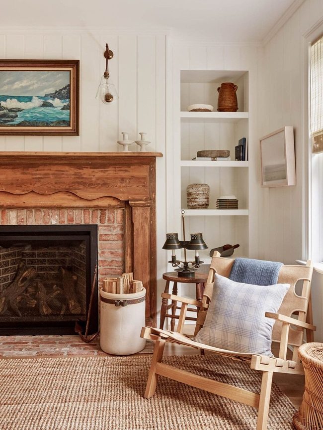
Creamy beige walls create a calming backdrop in this living room if you want to skip bold colors and stick with something softer instead.
Woven textures and rustic wood on the fireplace mantel add warmth and a hint of cabin charm without overwhelming the traditional style of the space.
Throw blankets in muted tones drape over seating and introduce just enough color to keep the room from feeling flat.
Wall art in minimal hues hangs above furniture and reinforces the understated aesthetic.
We think this approach works because it balances comfort with restraint and lets you relax without visual clutter.
Neutral palettes like this one give you the freedom to swap out accessories whenever you want a change.
Natural materials throughout the room tie back to the beige foundation and create a unified look.
If you prefer decorating without strong color statements, this style offers plenty of inspiration for your own space.
Pastel Cloud Living Room
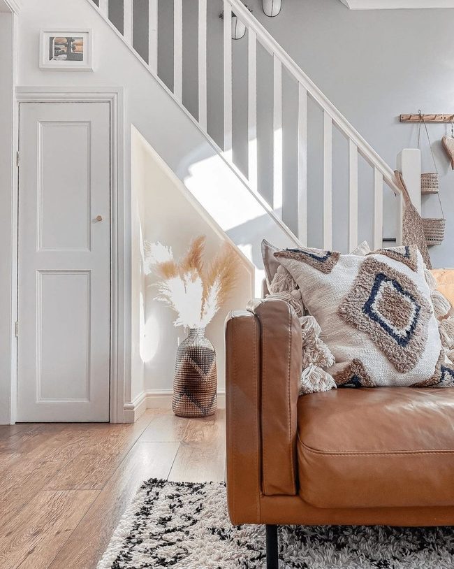
Standing in this living room, you might feel like you've stepped into a home floating among the clouds, especially when your eyes land on that pastel accent wall behind the stairs with its perfectly chosen shade that anchors the whole design.
Soft white trim frames the space cleanly, while plush pillows scattered around invite you to sink in and relax.
Natural light pours through the windows and fills everything with brightness and openness An oversized rug spreads across the floor and grounds the seating area with softness.
It all comes together to create a space where you feel lifted away from everyday stress, surrounded by gentle colors and comfortable pieces that make breathing feel easier.
Terracotta Fireplace Anchors White Space
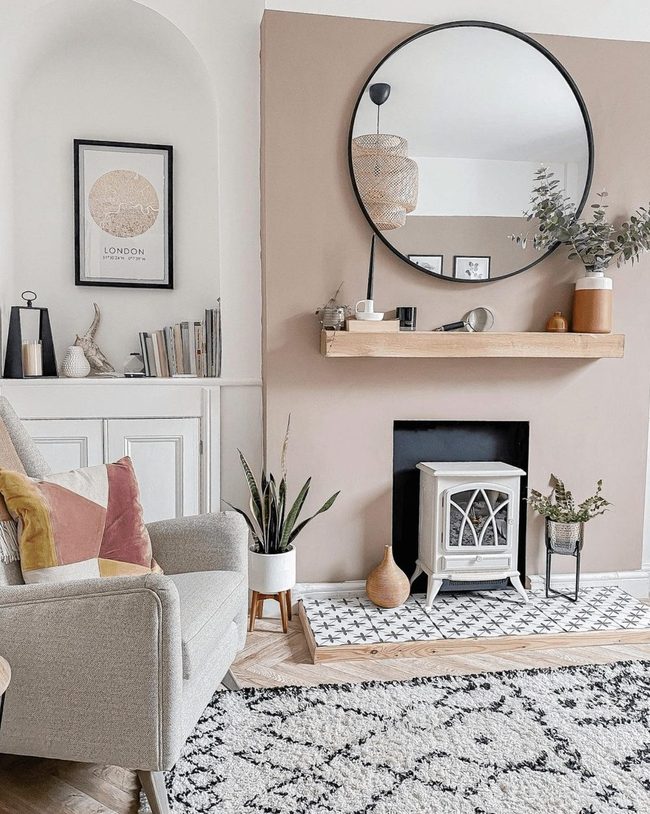
Clay-painted fireplace in soft pastel tones becomes the standout feature of an all-white room and immediately draws your attention as you walk in.
Blush-colored decor pieces scattered throughout echo the terracotta warmth that spreads across the space and ties back to this bold wall Small natural touches like these keep the room from feeling flat and give it personality that doesn't clash with the clean, minimal backdrop.
You can balance statement-making elements with a neutral palette by letting one warm tone flow through different surfaces and objects.
Texture matters just as much as color here, so the rug's soft pile and the tiles' varied pattern work together to prevent the space from feeling too simple or sterile.
This approach shows how nature-inspired hues and tactile finishes breathe life into a room while respecting its calm, understated foundation.
Large Canvas Earth Tones Buttercream
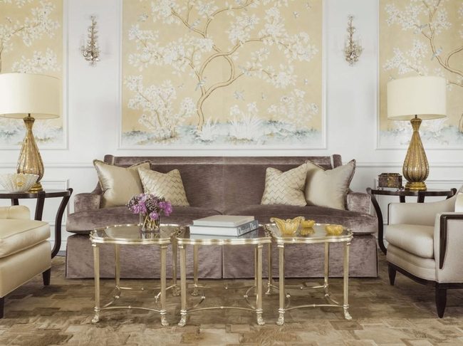
Skip painting your walls and instead make your living room pop with large artwork featuring rich earth tones mixed with buttercream yellow, a color that adds both warmth and edge to your space.
Darker furniture pieces work throughout the room and anchor the deeper warmth created by your art selection.
Brass accents scattered across the room shine against softer materials and bring a refined quality to the overall look.
You can layer these elements together without overwhelming the space, and the result feels balanced and intentional.
Metal touches catch light from windows or lamps and keep the room from feeling too heavy or monotone.
Starting with art rather than wall paint gives you flexibility since you can swap pieces out whenever you want a fresh direction.
This approach lets you build your color story gradually as you add each piece of furniture and accessory over time.
Lavender Walls Maximalist Gallery
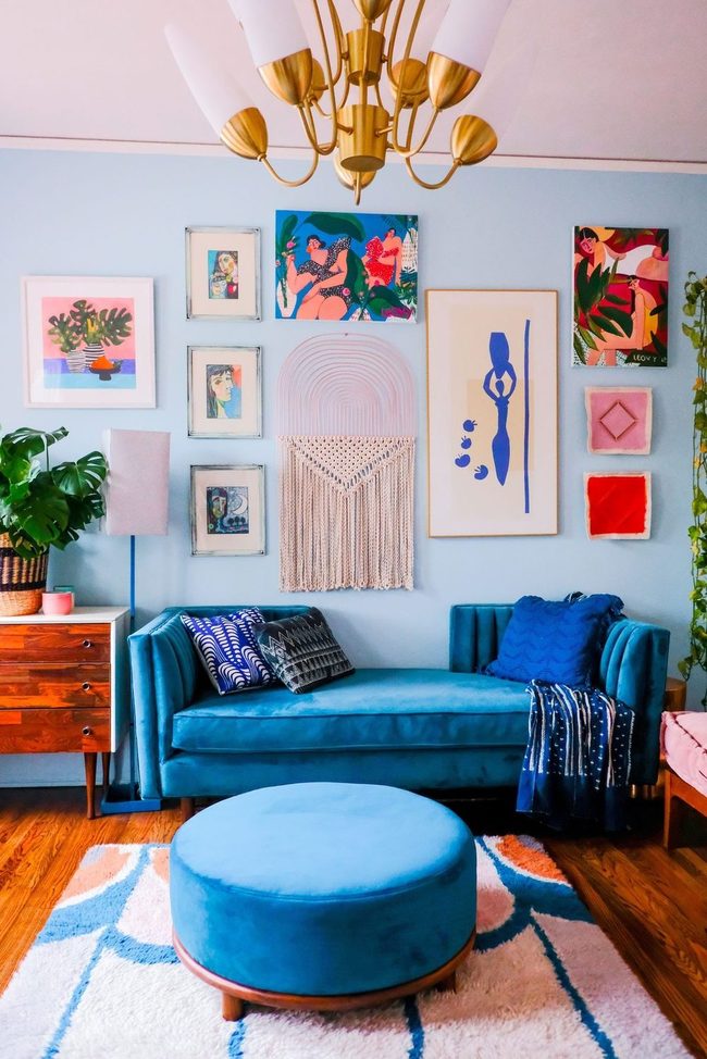
Soft lavender walls and pale sky blue tones bring a gentle sweetness to this living room that you'll notice right away.
Gallery walls packed with artwork sit alongside a blue ottoman and colorful accessories that pop throughout the space, and these bold pieces work across the room to form something distinctly personal.
With mid-century lines mixed into a maximalist approach, the whole setup stays relaxed and livable while still holding plenty of personality and charm.
Soft Neutral Palette Living Room
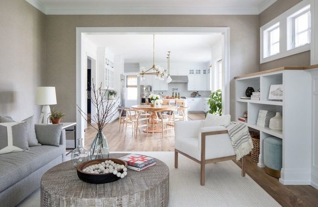
Soft blues and beiges flow throughout this airy room, starting with sandy walls that set a calm foundation for the space, and a gray sofa that anchors the seating area without feeling heavy.
Pale pastels maintain the fresh atmosphere from wall to wall, and small white touches pop up in corners around the living room, giving you clean sight lines and brightness wherever you look.
Light tones keep the room open and breathing, preventing darker shades from weighing down what should feel like an easy, restful space.
Neutral colors like these work well when you want a room that feels peaceful without demanding attention from every angle.
Coral Sofa Metallic Warmth
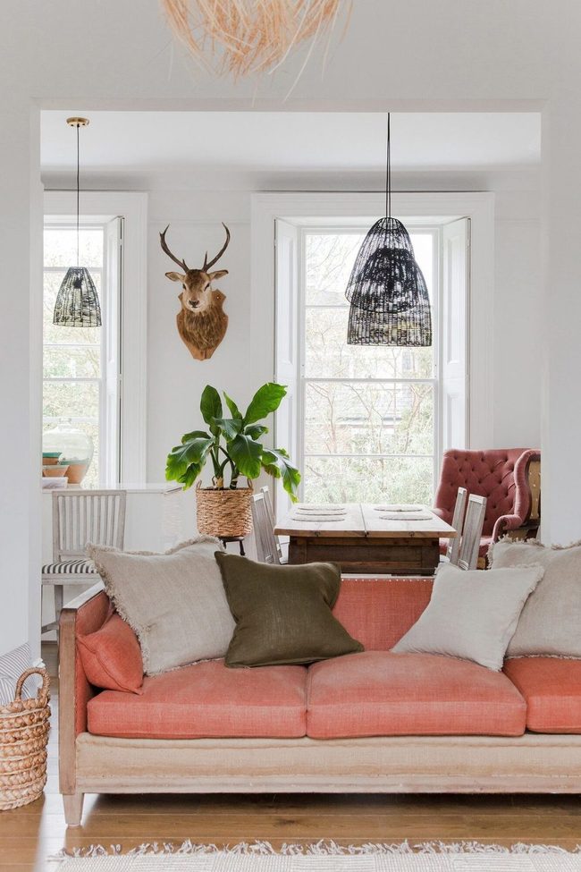
Swap out your usual seating with a bold coral sofa and metallic accents to completely reshape how your living room feels, and you won't need to repaint the walls to make a dramatic difference.
Woven furniture and natural materials balance out the boldness of those statement pieces and prevent the space from feeling too harsh or cold.
Adding varied textures and finishes throughout the room keeps things interesting without requiring you to commit to a full paint job.
Each piece you select contributes to the overall look while still letting your personal style shine through.
Mix different materials like wood, fabric, and metal to build depth and warmth.
You can shift the entire mood of your living room by focusing on furniture alone and layering in pieces that speak to your taste.
Natural fibers paired with metallic touches create a balanced space that feels both modern and comfortable.
This method lets you experiment with your style before making bigger changes to walls or permanent fixtures.
Sage Green With Natural Textures
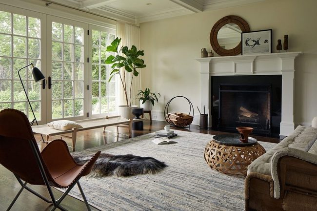
Sage green walls create an instant sense of peace in any living room, and this muted shade with its yellow undertones works wonderfully because it feels both restful and welcoming at the same time.
Pairing this faded green with natural furniture materials keeps things grounded and balanced.
Dark leather pieces, warm wood tones, and soft white accents all complement sage beautifully and help the color feel less isolated.
You'll find that these earthy combinations prevent the space from feeling too matchy or overdone.
I recommend layering in these natural textures rather than sticking to just one material throughout the room.
Wood tables beside leather seating and white linens on chairs build visual interest while staying in harmony with your sage walls.
When you keep the palette simple and rooted in nature, the whole room feels more settled and authentic.
Natural elements work best because they echo the calm that sage itself already brings to your space.
Olive Walls With Living Green
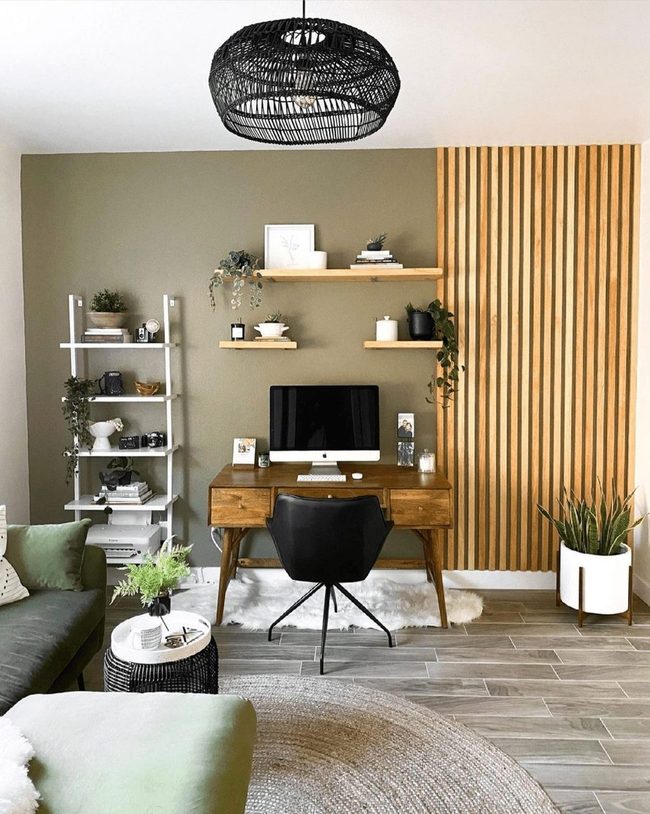
Olive-colored walls command attention in this living room by offering a sophisticated hue that feels bold without overwhelming the space, and when you pair it with soft green furniture, patterned accent pillows, and thriving houseplants scattered around, the green theme flows naturally from wall to wall.
Wood slat paneling behind the seating area brings warmth and texture that balances the wall color, while a natural wood desk reinforces the earthy foundation throughout the room.
Houseplants positioned on shelves and side tables add life and connect the outdoor feeling to your indoor sanctuary.
This blend of muted olive tones with natural materials creates a room that honors both classic design principles and comfortable, lived-in style.
You can see how the wood elements echo the plants' organic shapes and ground the space.
Mixing these layers of green, natural finishes, and warm wood keeps the room from feeling too serious or too casual.
Such a balance makes the space feel like a place where you genuinely want to spend time rather than just look at it.
Warm Wood Ceiling With Pastel Layers
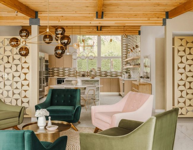
Warm wood ceiling rafters draw the eye upward and anchor your living room with natural character, while pale pink and olive green armchairs paired with one dark accent piece establish layers of depth across the space.
Geometric wall designs add texture and personality without overwhelming the room, since the neutral color scheme keeps everything grounded and balanced.
You can layer these earthy tones throughout your furniture and decor to build that soft pastel feel you're after.
I love how this combination manages to stay clean and minimal while still giving the room plenty of dimension.
The mix of warm woods and muted colors works well for spaces where you want interest without chaos.
Wood elements especially bring warmth that pastel shades sometimes need to feel complete.
Consider how these tones flow from one piece to the next as you select your items, and you'll find the room feels naturally put together.
Soft Pink Walls With Black Frames
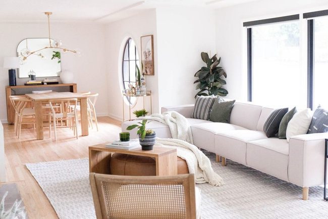
Pink stands out as a go-to choice among pastel shades, and this living room shows how to use it well.
Bright walls with just a whisper of pink in them warm up the whole space and balance nicely against crisp white furniture and accessories.
Bold black window frames add drama and contrast, while an upholstered leather ottoman brings in texture and grounds the room.
You get depth from those gently pink walls without overdoing it, which gives the space a relaxed and refined look that doesn't feel heavy or overdone.
Blush Walls With Coral Trim Contrast
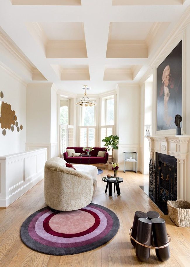
If rose gold, pale pinks, and soft warming hues appeal to you, this blush-themed living room might be exactly what you're looking for.
Bold, dark colors on the far sofa stand out strikingly against the lighter surroundings and add depth to the room.
Faded coral pink trim along the walls contrasts nicely with ivory surfaces while keeping the overall color scheme balanced and connected.
When you want to highlight a pastel accent color, painting your trim a shade or two darker than the walls produces a polished result.
This approach works well because the contrast makes both the walls and trim feel more defined and intentional.
You can adjust how strong the effect is by choosing how many shades darker the trim becomes.
Lighter walls paired with darker accents keep the room feeling airy while adding visual interest at eye level.
Michael Thompson
Senior Content Editor
Expertise
Content Strategy Development, Editorial Team Leadership, Home Décor Trends & Style Curation, Digital Storytelling for Interior Design, Quality Assurance in Publishing
Education
University of Missouri, Columbia
University of Texas at Austin
Michael Thompson is the senior content editor at Decorrio, bringing over 12 years of experience in journalism and home décor writing. With a journalism degree from the University of Missouri and a master’s in English from UT Austin, he blends storytelling with expert design insights.
At Decorrio, Michael curates inspiring content that helps readers transform their spaces with style and ease. He’s passionate about home organization, DIY projects, and quality design ideas that make everyday living more enjoyable.
Outside of work, Michael enjoys exploring Austin’s culture, tackling home improvement projects, and mentoring aspiring writers.