
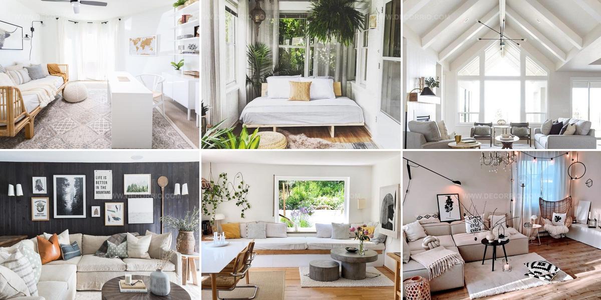
13 Elegant Gray and White Living Room Ideas

A pretty gray and white living room becomes a peaceful retreat where style meets everyday comfort.
Soft neutrals work together to create spaces that feel both modern and welcoming.
The combination offers flexibility that allows homeowners to adapt their decor as tastes change over time.
Cool tones blend seamlessly with warm accents, making rooms feel balanced and harmonious.
Simple color palettes eliminate visual clutter while maintaining visual interest through texture and layering.
When you choose neutral foundations, adding personality through furniture and accessories becomes effortless.
Browse through inspiring ways to craft a serene space that feels uniquely yours.
Neutral Layers, Maximum Texture
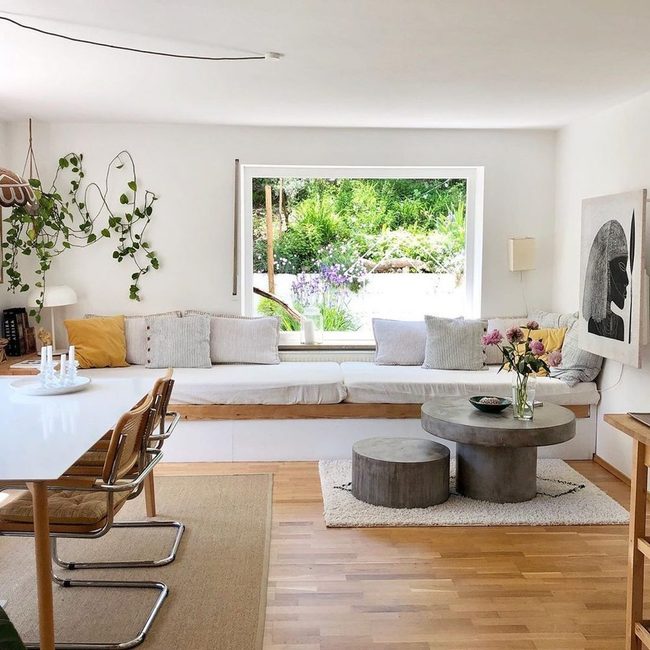
Mixing different textures is one of the simplest ways to keep a neutral room from feeling boring, and you don't need much to make it work.
Materials like wool, leather, wood, and metal bring depth and richness to gray and white spaces without adding color or clutter.
Natural woven pieces such as rattan or wicker soften the look and keep things from feeling too cold or hard.
According to interior designer Esther Dormer of Dormer Design, layering these materials throughout your room makes a minimal palette feel more complete.
You might use a leather chair next to a wooden side table, then add a wool throw and wicker basket to round out the mix.
Each texture catches the light differently and makes your room more interesting to look at.
The combination of warm and cool materials works well together and prevents your space from feeling flat or empty.
This approach keeps your neutral room feeling calm while still giving it personality and dimension.
Brown Wood Anchors Gray White
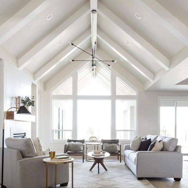
Wood furniture brings essential warmth to spaces dominated by gray and white, and you'll find that pieces like an oak coffee table or walnut chair make a real difference in how the room feels.
Even the most sophisticated neutral palettes can start to feel cold and uninviting without that natural brown tone grounding the space.
Brown wood tones blend seamlessly with grays and whites while adding depth and character that keeps your room from feeling too sterile.
Whether you go for lighter honey finishes or darker walnut shades, wood pieces help your neutral scheme feel lived-in and comfortable.
Adding a wooden side table, bookshelf, or seating option gives the eye somewhere warm to land among all those cooler tones.
Wood also brings texture and natural variation that plain painted walls simply can't match, and this layering makes the whole room feel more balanced.
Consistent Fabric Neutral Balance
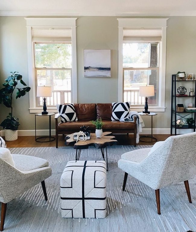
When building a neutral space, keeping your fabric choices consistent really matters for balance.
Different materials reflect light in their own ways, so matching two whites from different fabrics in the same room can actually be harder than you'd think.
Sticking with similar fabrics throughout helps you avoid the clash of warm and cool tones that happens when you mix textures randomly.
If you select one or two fabric types and use them across your room, the whole space starts to feel more put together.
This approach keeps your neutral palette from looking disjointed or scattered.
You'll find that this simple rule makes decorating much easier because you're not constantly second-guessing whether something fits.
One consistent fabric family gives your room a sense of purpose and harmony.
Charcoal Gray Meets Crisp White
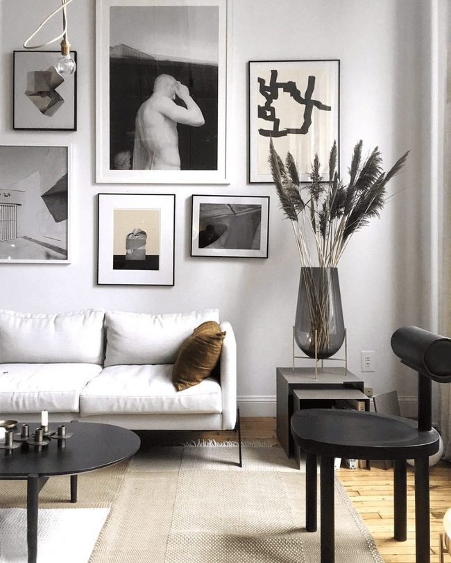
Mixing different shades of gray and white keeps your space from feeling dull and boring, so don't stick with just one tone throughout the room.
Seattle interior designer Rebecca Rowland recommends choosing a consistent color temperature as your foundation.
From there, layer in lighter grays alongside deeper charcoal tones and crisp whites to add visual interest.
This variety prevents your space from becoming too monotonous while still keeping everything harmonious.
You can swap between warm grays and cool grays depending on what works best with your lighting.
Alternating between matte and glossy finishes in these neutral shades also adds dimension without introducing new colors.
By playing with these subtle shifts in tone and texture, your neutral palette stays fresh and engaging rather than flat.
Neutral Walls, Layered Patterns
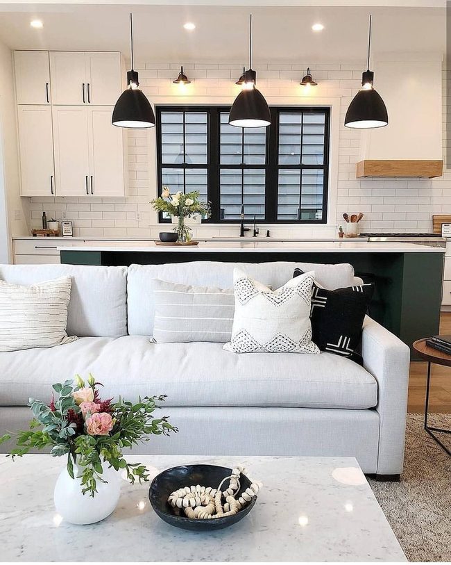
Gray and white walls serve as an excellent foundation when you want to layer in striped, dotted, and other playful patterns throughout your room.
Mixing patterns might seem risky, but they actually balance each other out when you have a neutral base to work with.
Throw pillows in different patterns are one of the easiest ways to introduce this variety without overwhelming your space.
You can swap them out seasonally or whenever you want a fresh look.
Combining textures alongside these mixed patterns adds even more dimension to a plain room.
Start with two or three patterns you love and build from there.
Most people find that limiting your palette keeps things from feeling chaotic.
Mixing patterns works best when you let the neutral walls do the heavy lifting and keep everything else grounded.
Neutral Foundation, Colorful Layers
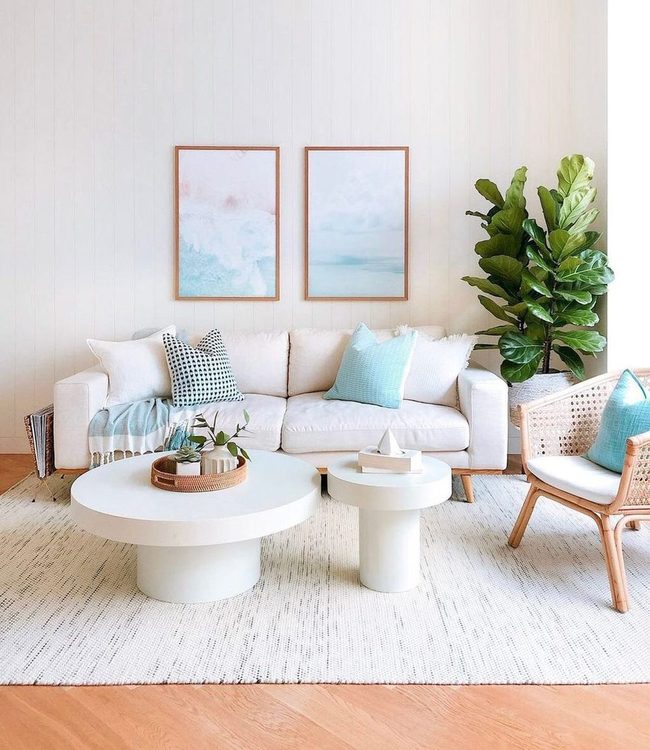
Larger furniture items in white or gray give your room a clean foundation that lets smaller, colorful pieces shine without competing for attention, according to interior designer Elle Jupiter who works in New York and New Orleans.
These neutral tones act as a blank slate where you can layer in pops of color through accessories and accents You gain flexibility in how you refresh your space without committing to one permanent look.
Softer background tones also help rooms feel more spacious and allow your eye to rest between bolder design choices.
When winter arrives or you want to switch up your style, simply rotating throw pillows, artwork, and textiles keeps everything feeling fresh and new.
Building your room around neutral anchors means you're never locked into one direction and can experiment with different color combinations whenever you want.
Gray And White Balance Method
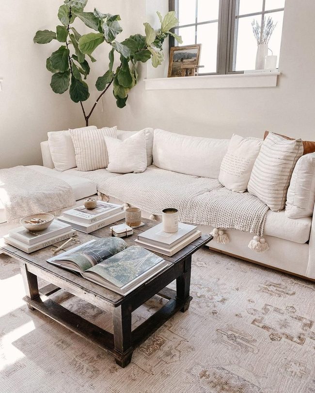
Picking between gray and white as your main color helps keep your space from feeling flat and boring.
If you like both shades, commit to one as your primary choice and use the other as a supporting accent throughout the room.
Going this route gives your space a clean, polished feel that doesn't end up looking dull or one-dimensional.
By designating an accent color, you guide people's eyes around the room in interesting ways and emphasize the art and architectural features you want to highlight.
It might seem counterintuitive, but choosing a dominant color actually creates more balance than trying to split your attention equally between the two.
You'll find that this method works well whether you prefer gray or white leading the way, since the supporting color still plays an important role in the overall design.
Either way, you get a fresh appearance without sacrificing visual interest or the chance to draw attention to the special elements in your space.
Green Plants In Neutral Rooms
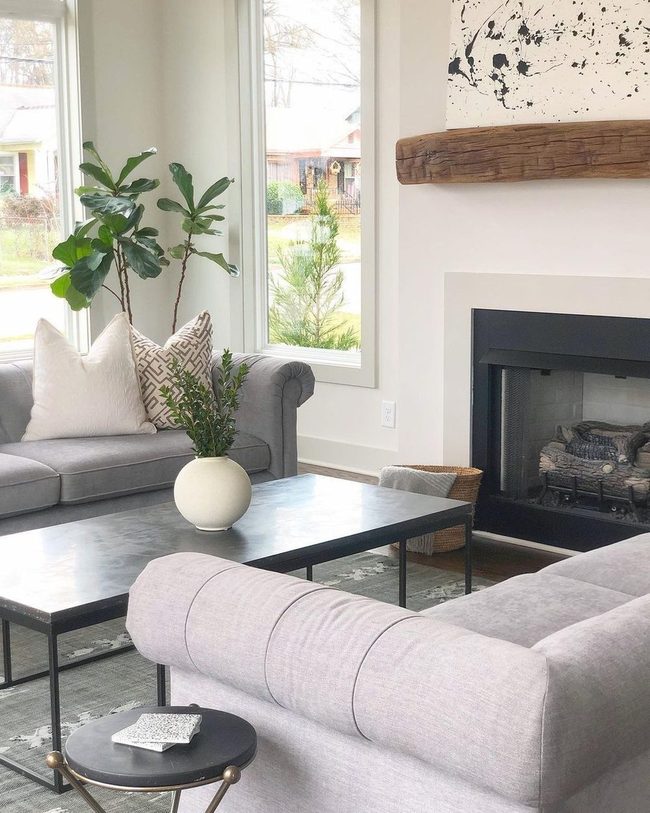
Incorporating greenery into your neutral space brings instant life and energy, whether you choose real plants or fresh flowers arranged on your coffee table.
If gardening isn't your strong suit, faux plants work just as well and require none of the maintenance.
Layering different textures throughout your room-combining natural elements with your freshly painted walls-builds depth and makes the space feel warm and approachable.
A simple bouquet or potted plant softens hard surfaces and adds organic appeal to any corner.
You don't need a green thumb to pull this off; even basic plant care or swapping in artificial options keeps things manageable.
Mixing these natural elements with your color scheme helps everything feel balanced rather than stark.
Plants and flowers also improve air quality and bring a sense of calm to your home.
Greenery is one of the easiest ways to refresh a space without major effort or expense.
Pale Sand Bridges Gray White

If you have a gray and white space that feels a bit flat, introducing a soft neutral like pale sand or camel can actually wake it up in unexpected ways.
Billy Ceglia, an interior designer based in Connecticut, recommends using just a touch of this warmer neutral rather than overdoing it.
You might bring in this color through an accent chair, a cozy throw blanket, or even a couple of pillows scattered around It doesn't take much to shift how the whole room feels.
Just one piece of furniture or a small textile in this shade can balance your space without competing with what you already have.
Neutral Base, Grouped Color Pops
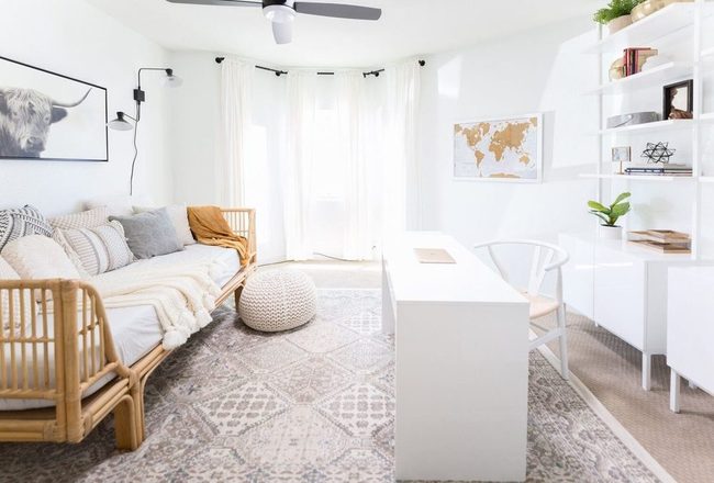
Gray and white walls and furniture give you a neutral canvas where colorful accents really stand out, and most designers agree that pairing colors together works better than scattering single items around the room.
When you add a green pillow next to a potted plant with matching green tones, or combine it with a rug that has green in the pattern, those pieces feel connected and intentional.
One green pillow sitting alone can look like an accident, but two or three green elements throughout your space create a sense of rhythm.
You don't need to match them exactly either-a darker green plant next to a lighter green throw pillow still reads as a coordinated choice.
This approach works with any color you love, whether that's blue, coral, mustard, or blush tones.
Pairing your accent colors means you get more visual interest without the room feeling chaotic or overdone.
Try this method the next time you're shopping for throw pillows or wall art and see how much more put-together your space feels when colors appear in twos and threes rather than as random singles.
White Crown Molding Gray Walls
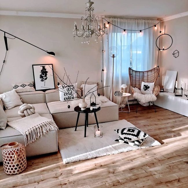
Crown molding offers one of the most striking design opportunities in any room, and if you have it in your living room, you should definitely think about how to use it.
Interior designer Sara Mosele of Sara Mosele Interiors in New York explains that your crown molding can either blend seamlessly into your space or stand out as a statement element depending on what you want to achieve.
When working with a gray and white color scheme, painting your walls gray while keeping the molding white creates nice balance and prevents the room from feeling flat.
On the other hand, if you're leaning toward a more modern feel, you can paint both your walls and molding the same color-either all gray or all white-and this approach gives you that clean, unified look without any visual breaks.
Either choice works well, so it really comes down to whether you want your crown molding to blend in quietly or provide that crisp contrast that makes the room feel more layered and intentional.
Deep Jewel Tones Transform Gray
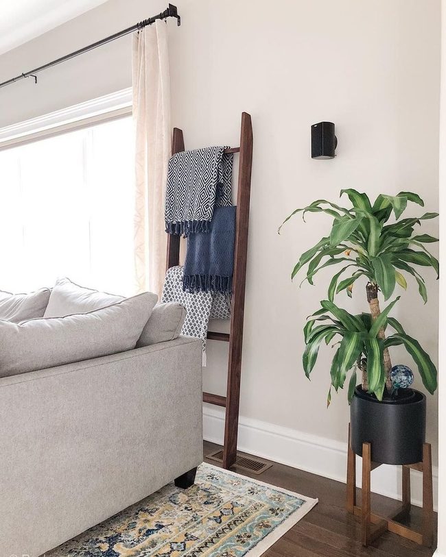
Jewel-toned accent walls or rugs make an immediate statement when you're ready to go bold with your color choices.
Dark blues, rich greens, and chartreuse all work beautifully for this purpose, with chartreuse being Garcia's go-to pick for its striking presence.
If jumping straight to a full wall feels too adventurous right now, you can start smaller with a jewel-toned throw pillow or blanket and see how it feels in your space.
This approach lets you experiment without committing to something permanent, and you can always expand from there once you see how the colors interact with your existing pieces.
Many people find that even one piece in these deeper tones shifts the entire mood of a room and keeps it looking current rather than safe or predictable.
Horizontal Dark Gray Shiplap
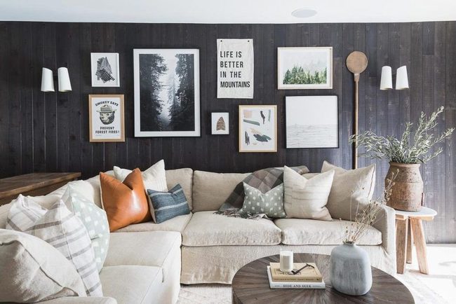
Shiplap walls offer one of the most striking ways to transform your gray and white living room, and you can push this architectural feature in many directions depending on your style.
If you want shiplap to take center stage, paint it a bold color like dark gray and run the boards horizontally across your walls-this choice also makes the room feel wider and more open.
For a softer approach that lets other design elements shine, install shiplap vertically on just the lower third of your walls and use a pale gray paint so it blends nicely with white upper walls.
Home designers often recommend this moderate style for rooms following a modern traditional aesthetic since it adds interest without overwhelming the space.
You can also paint shiplap in unexpected hues if you're ready to make a real statement with your walls.
Either way, shiplap works as a practical architectural addition that anchors your room's design while giving you flexibility to build around it with other furnishings and décor.
Michael Thompson
Senior Content Editor
Expertise
Content Strategy Development, Editorial Team Leadership, Home Décor Trends & Style Curation, Digital Storytelling for Interior Design, Quality Assurance in Publishing
Education
University of Missouri, Columbia
University of Texas at Austin
Michael Thompson is the senior content editor at Decorrio, bringing over 12 years of experience in journalism and home décor writing. With a journalism degree from the University of Missouri and a master’s in English from UT Austin, he blends storytelling with expert design insights.
At Decorrio, Michael curates inspiring content that helps readers transform their spaces with style and ease. He’s passionate about home organization, DIY projects, and quality design ideas that make everyday living more enjoyable.
Outside of work, Michael enjoys exploring Austin’s culture, tackling home improvement projects, and mentoring aspiring writers.