
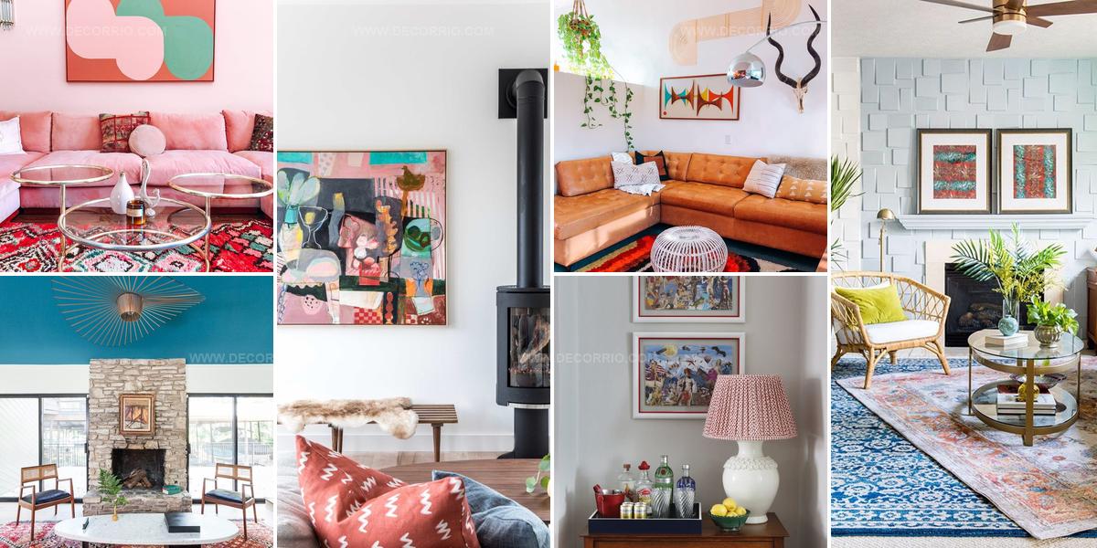
20 Bold Red Living Room Ideas That Command Attention

A red living room can become the most memorable space in any home when done with intention and style.
Bold color choices like crimson walls or scarlet accents make a powerful statement that guests remember long after they leave.
The warmth and energy this shade brings to a room can shift the entire mood from ordinary to extraordinary.
Whether through furniture, paint, or decorative touches, incorporating this passionate hue requires balance and thoughtfulness.
Many homeowners worry about overwhelming a space, but the right approach creates sophistication rather than chaos.
Confidence matters when working with such a dramatic palette, and the results speak for themselves when executed well.
Red Patterned Layers Soften Space
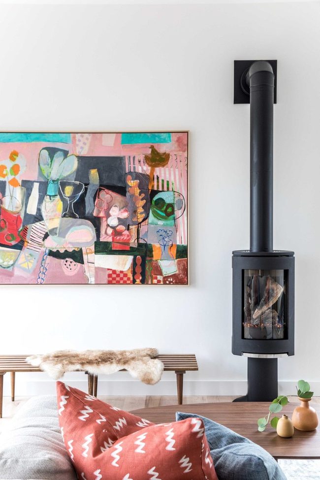
Bold printed patterns in red can seem intimidating at first, but here's what I've learned: adding texture through patterns actually softens the intensity of the color and makes it much simpler to work with in your space.
Mixing multiple patterned red pieces together rather than keeping them separate gives you more freedom to experiment with your decorating choices.
A striking art print featuring various shades of red connects beautifully with a single red throw pillow, and this simple pairing brings harmony to the entire room without overwhelming the senses.
Don't hesitate to fill your home with patterned red items in different styles and patterns.
You'll find that layering prints in this way adds depth to your rooms while keeping everything balanced.
When you combine bold patterns with solid-colored accents, the overall look feels more balanced and approachable.
Red doesn't have to feel harsh or dramatic when you use this technique.
Try adding patterns to your red pieces and see how much warmer and more welcoming your space becomes.
Red And Vibrant Print Anchors
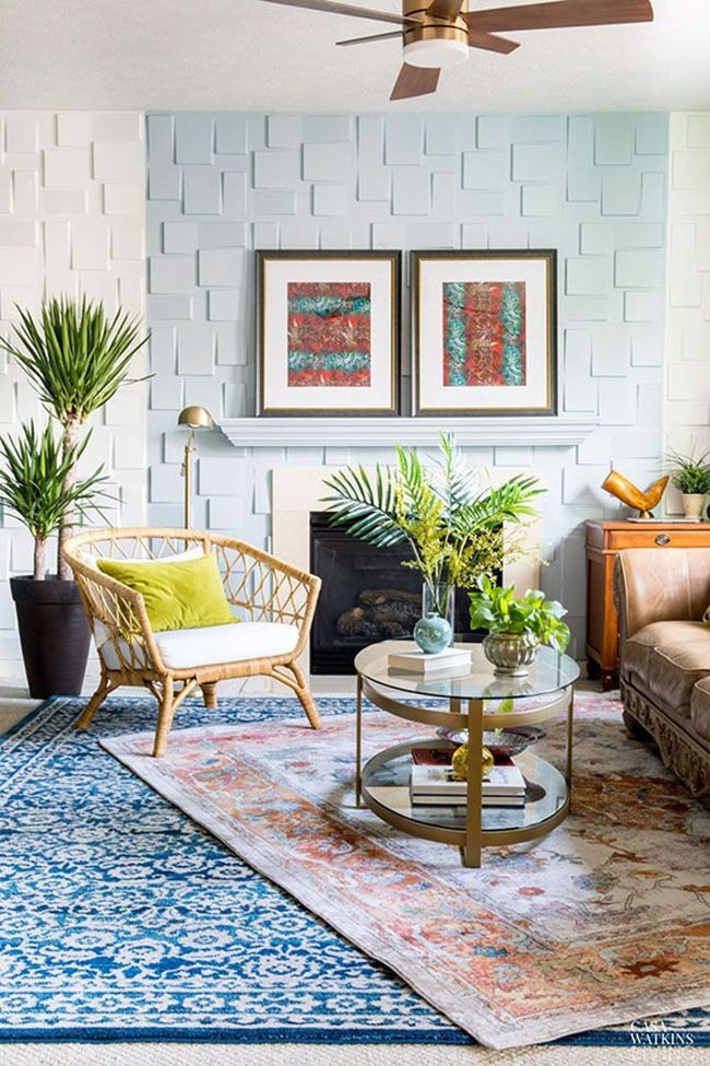
Bold, colorful art pieces make an immediate statement in any room, and you can use them to bring in shades that don't exist elsewhere in your space.
Rather than matching colors already present, let art be the thing that shifts your whole palette in a new direction Hanging art that pops gives you an easy way to refresh a room without changing furniture or repaint walls.
You might find that one or two well-chosen pieces spark the entire design scheme of your space.
Art doesn't need to blend in with what you have; it can stand out and pull the room forward with confidence.
This approach works because strong colors in artwork actually anchor a room and give everything else permission to be more relaxed around them.
Velvet Red Sectional Anchors Neutral Space
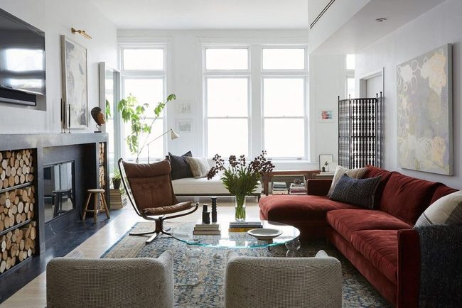
Red couches are bold and uncommon as living room centerpieces, and choosing one demands confidence, but when you select a deeper, earthier tone in rich velvet, the piece blends into your space far more naturally than you might expect.
Pair this striking sectional with neutral furnishings that have interesting textures, and the result feels refined and timeless.
Wood tones, cream-colored accents, and layered fabrics balance out the intensity of the red upholstery without diluting its presence.
We're impressed by how this approach elevates the entire room and makes everything around it feel more sophisticated.
Natural light plays across the velvet surface and highlights the color's depth throughout the day.
You don't need matching accent pieces or complicated decorating rules to make this work.
Grounding the space with neutral elements lets your bold seating choice become the natural anchor without overwhelming the room.
Sticking with one strong statement piece and surrounding it with calm, textured neutrals is actually simpler than spreading bold colors throughout.
Burgundy Leather And Warm Wood
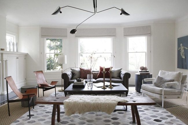
Red tones dominate this living room and create the strongest visual impression, with burgundy pillows and a saddle leather couch anchoring the space in deep, rich hues.
Lighter shades like pink coral add dimension without overwhelming the room, and you don't need every piece to match exactly-pulling from the same color family gives you a polished look without feeling rigid or overdone.
Warm wood furniture and brass accents tie everything together because they share those same earthy undertones that run throughout the room.
When you work with colors this way, the space feels like it was put together with intention and care.
Your accent pieces support the main colors rather than compete with them.
Staying within one color family makes decorating feel easier and the results feel more natural.
I think this approach works in any room because it balances visual interest with harmony.
You get a room that looks put-together without looking stiff or overly coordinated.
Burgundy Tufted Statement Sofa
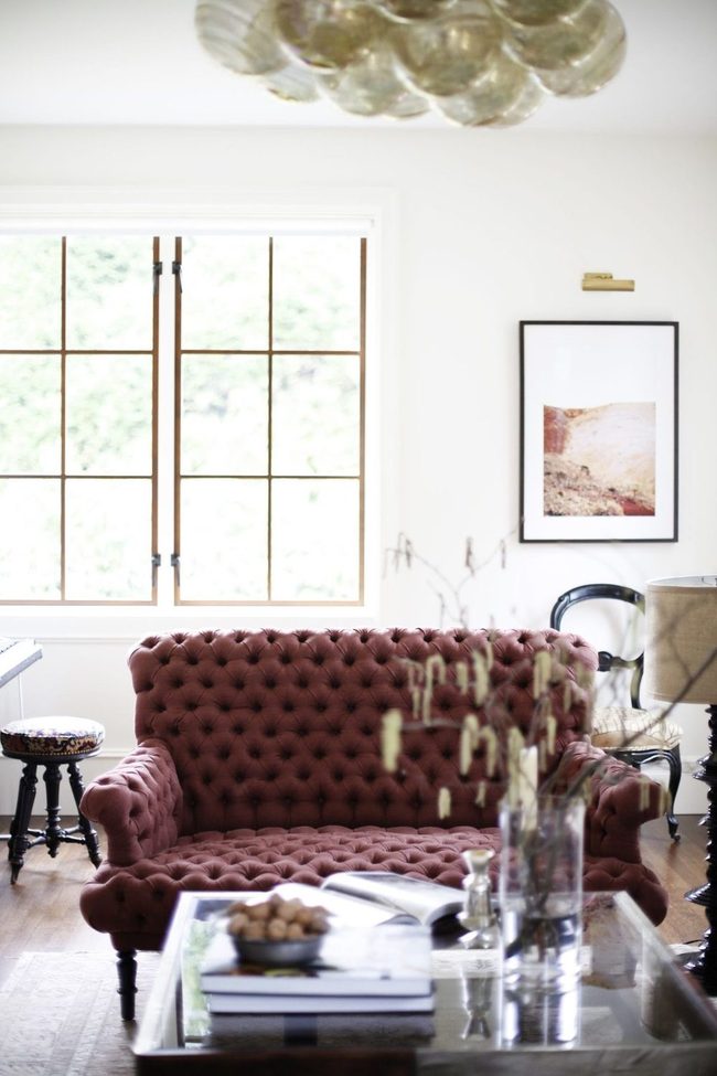
Bold burgundy couch with top-to-bottom tufting makes an undeniable statement when you place it front and center in your room, and there's nothing wrong with designing everything else around a piece you genuinely love.
When something catches your heart like this, let yourself go all in and make it your anchor point for the whole space.
Building out from there becomes straightforward because you already have your color direction and style established.
Guests will immediately notice the couch and want to talk about it, which gives you natural conversation starter material.
From here, you can pick complementary wall colors, accent pieces, and accessories that support what your bold furniture is already saying.
We recommend thinking of it as layering around your statement maker rather than fighting against it.
Letting one strong piece lead your design choices actually simplifies the decorating process and ensures your room feels intentional rather than scattered.
Minty Pink Fireplace Statement
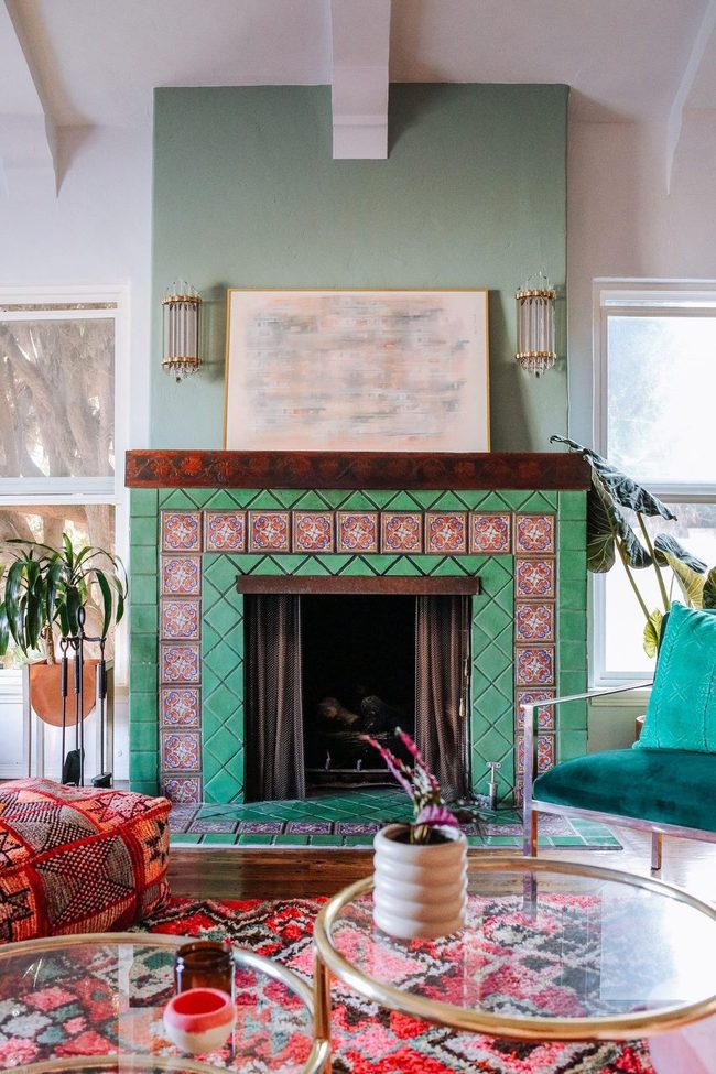
When you're decorating a space, it's easy to stick accent colors on the usual suspects like pillows, artwork, and small decorative objects, but some of the most eye-catching results come from putting bold hues in unexpected spots that most people overlook.
A living room with a minty green and pinkish red-tiled fireplace shows how powerful this approach can be, since fireplaces are typically neutral backdrops that fade into the background.
Pushing color onto architectural features like your floor or fireplace surround forces the whole room to rethink itself around that statement.
We often assume these larger surfaces should stay neutral to avoid overwhelming the space, yet the opposite can happen when you're brave about it.
Your fireplace becomes the room's main attraction rather than just a functional feature in the corner.
This strategy works because unexpected color placement makes people actually look at parts of a room they'd normally ignore.
Taking risks with where you apply color teaches us that sometimes the boldest moves happen in the spaces we never thought to touch.
Scarlet Drapes Steal The Show
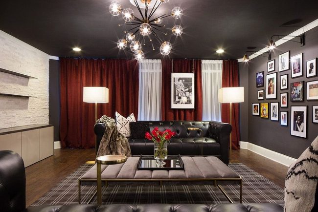
Red curtains command attention in any room and make an instant statement without requiring you to commit to large furniture pieces or permanent changes.
If bold reds feel like too much of a leap, starting with drapery lets you test the color at a lower cost and swap things out whenever you want.
Pairing your curtains with darker accessories brings grounding weight to the space, while lighter accents work the opposite way and help the room feel more open and airy.
Both directions deliver serious impact and let your personality shine through the design.
You'll find that this single element shifts the entire mood of your space.
Whether you lean toward deep jewel tones nearby or pale neutrals, the curtains become the star of the show.
It's a smart move for anyone wanting drama without the commitment of a full redesign.
Red Pink Green Gold Mix
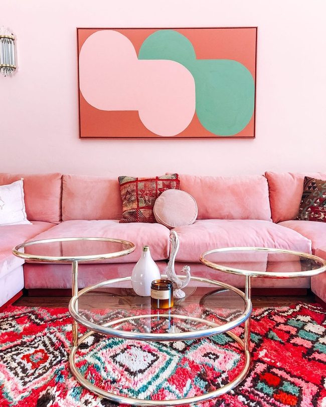
Bold color mixes can completely change how a room feels, and what makes a space feel exciting rather than predictable often comes down to your willingness to experiment with unexpected pairings.
Since red already packs so much visual energy, you have real freedom to push it further and combine it with colors that might seem risky at first.
One living room does exactly this by layering reds, pinks, greens, and golds together in a way that blends retro charm with contemporary style and feels genuinely chic Your room doesn't need to stick to traditional color rules, and when you trust your instincts and pair bold hues together, the results can be surprisingly polished.
It takes courage to mix warm and cool tones side by side, but that's exactly what makes a space feel alive and personal.
Rather than toning things down, leaning into these adventurous combinations shows confidence in your design choices and gives your home real character.
Red Pillows, Calm Palette
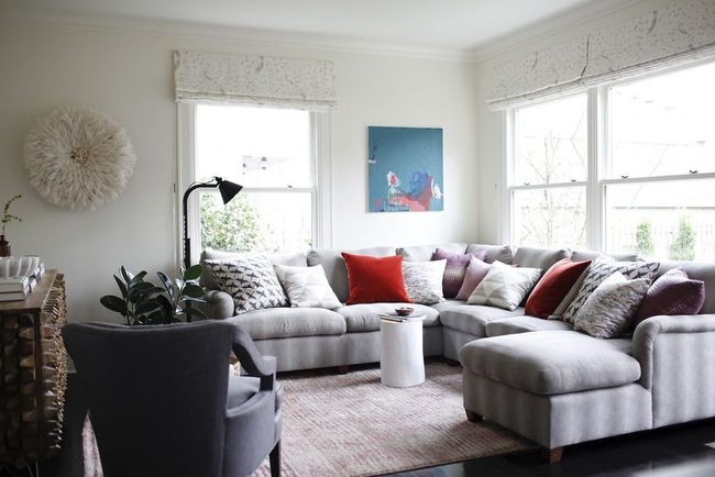
Before you paint an entire room red, it helps to think about how you actually spend your time there and what mood you want to create.
If you're settling into your living room to unwind and watch a movie, a bold red might feel too intense and work against the peaceful feeling you're after.
Instead, try mixing in red through smaller touches paired with calming colors so the space stays relaxed and comfortable.
Starting with a couple of saturated red pillows lets you test out the color without any major commitment, and you can always bring in more red pieces down the road if you end up loving how it looks and feels.
Red Sculptural Lamps, Neutral Backdrop
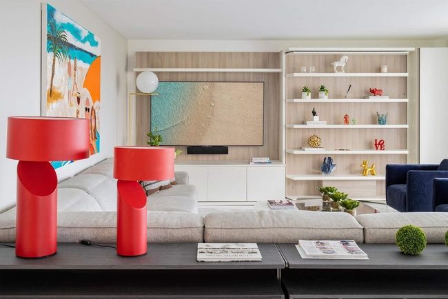
Red makes a bold statement in your space without needing to dominate every corner, and one smart way to play with color is to stick with a neutral base and layer in accent pieces that pop.
You can keep things balanced by using red strategically-maybe through a pair of sculptural lamps or other standout pieces-while letting softer tones form your backdrop.
If you want red to take center stage, simply use it a bit more than your other accent colors and let everything else fade into the background.
This beachy living room shows how well this approach works, especially when those striking red lamps become the stars of the show.
Building color this way means you get visual interest without feeling like the space is too much or overwhelming Your space will feel modern and intentional without any color competing for attention.
Red Cotton Prints And Sunlight
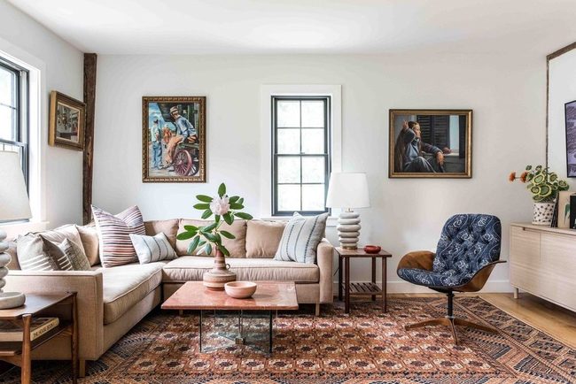
Red living rooms get a bad reputation for being overwhelming or gloomy, but here's what we've discovered: the color works beautifully when you let natural light flood in and pair it with lighter tones like white and beige.
This eclectic cottage space shows you exactly how to make it work by balancing bold red prints against neutral backgrounds and large windows that brighten everything up.
You can use red as an accent through patterned textiles or wall art instead of painting everything one shade, and this approach keeps the room feeling open rather than cramped.
Light plays such an important role in how red appears, so positioning your furniture near windows and using sheer curtains lets you control how bright or muted the color feels throughout the day.
Mixing red with cream, white, and tan pieces prevents the space from feeling heavy or dated.
The key really comes down to proportion and mixing warm reds with cool neutrals so neither one dominates completely.
When you get this balance right, red becomes a cheerful and sophisticated choice for any room.
Red Throughout Connected Spaces
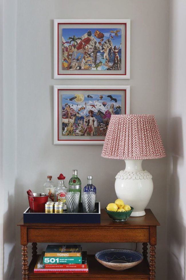
Bold red demands commitment, so start by anchoring your room with a statement piece like a sofa or area rug and then scatter the same shade throughout your space in unexpected places.
Books on your shelves, artwork hanging on walls, lampshade choices, and even bar accessories can echo that rich color and tie your room together visually.
When you weave red into patterns, prints, and fabrics, it stops feeling like a random element and becomes part of your intentional design scheme.
Throw pillows, upholstery accents, and smaller furnishings all offer chances to reinforce the color palette you've chosen.
Rather than treating red as an afterthought or tucking it away in one corner, lean into it and let it flow naturally from room to room.
This kind of repetition gives your space a sense of unity without feeling forced or overdone.
I think the key is making red feel like it belongs everywhere it appears, not like it was dropped in as decoration after the fact.
Rust Red With Earth Tones
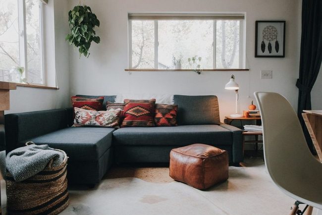
If you want to bring warm, natural colors into your space, red pairs beautifully with earth tones like rich browns and deep charcoals in ways you might not expect.
Rust-colored printed pillows and blankets offer a wonderful way to add color while keeping things grounded and connected to nature.
This combination works particularly well for a Southwestern feel, where nature-inspired hues come together throughout the room to give everything a warm, lived-in quality.
You don't need much to pull off this look-just a few key pieces in earthy shades can shift the whole mood of your space.
Browns anchor the palette and keep things from feeling too bold, while charcoal adds depth without stealing attention.
The rust accents then become little pops of warmth that tie in nicely with the overall scheme.
We've seen this approach work in countless living rooms where people want personality without overwhelming the senses.
It's a straightforward way to get a cozy room that feels both intentional and relaxed.
Warm Rug Meets Cool Ceiling
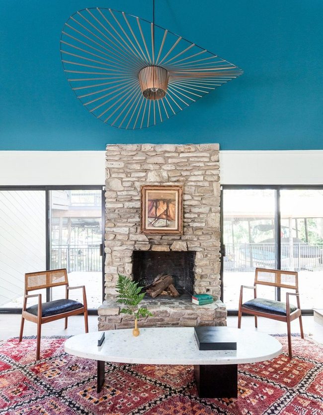
Bold color combinations work best when you balance warm and cool tones together, and there's no need to stick strictly to one temperature or the other.
In this room, a rich warm rug sits opposite a striking cool-toned ceiling, and the contrast between them feels visually satisfying rather than clashing.
A neutral fireplace positioned between them acts as a natural bridge, letting both bold colors shine without overwhelming the space.
You don't need to overthink matching your palette to a specific temperature rule.
Instead, mixing stronger tones with more subdued ones helps everything feel balanced and connected.
I've seen rooms come alive when people stop worrying about whether their choices are warm or cool and focus instead on how different colors play off each other.
The key is letting bolder pieces anchor a room while neutral elements give your eye a place to rest.
This approach keeps your space from feeling one-dimensional and makes the whole room feel more grounded.
Crimson Shag Floor Statement
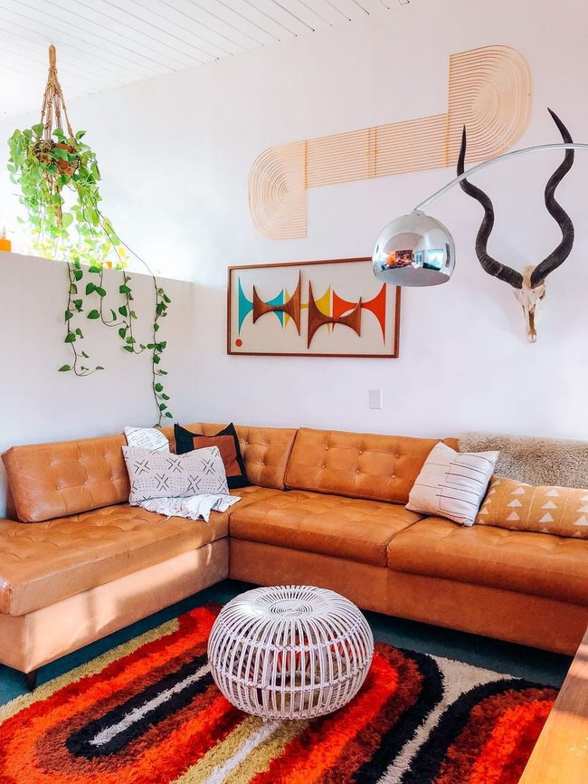
Red has stayed in homes for generations, shifting its look to match whatever style was popular at the time, and retro rugs show this beautifully with their bold color and thick textures that bring back memories of past decades.
Hunt through your local thrift stores or dig into your family's storage to find one of those classic red shag rugs that once sat in your grandparents' living rooms.
Once you bring one home, it completely changes how a space feels by wrapping the room in warmth and nostalgia.
Vintage rugs work well because their timeless appeal means they never really fade from fashion, no matter how many years pass.
Placing one on your floor adds character and personality that modern rugs often struggle to deliver.
You don't need much else to make the look work either since these pieces stand out on their own and set the tone for the whole room.
If finding an authentic vintage piece feels challenging, reproductions made today capture that same retro spirit and cost less than hunting down originals.
Either way, bringing a red retro rug into your home gives you that nostalgic atmosphere without any fuss or complicated decorating plans.
Red And Neutral Living Room Balance
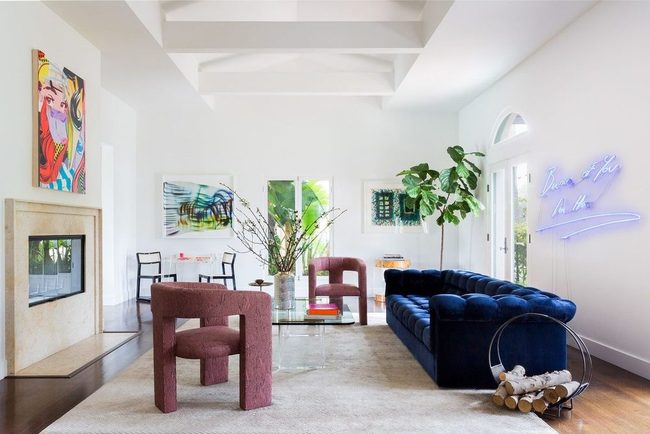
If you want a red living room that feels balanced instead of overwhelming, sticking with a two-tone color palette is your best bet.
Red paired with one other color keeps things bold without becoming chaotic.
When you add more than two colors, the room starts to feel eclectic and scattered, which dilutes the impact you're trying to achieve.
Going with just two tones gives you a simpler way to bring red into your home without it taking over completely.
You'll find that this approach works especially well when you choose artwork that reinforces your color scheme.
In this particular living room, the pieces on the walls amplify the two-tone palette and give the space real personality.
Keep your color combo simple, and you'll have a room that feels both daring and put-together.
It's a straightforward strategy that makes living with bold color much easier to pull off.
Deep Red Grounds Warm Rooms
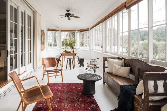
Deep red tones like burgundy and wine can anchor your space without overwhelming it, and these darker shades actually make rooms feel warmer and more lived-in than brighter reds would.
When you look at a sunny indoor-outdoor room with rich wood furniture and bamboo blinds, you'll notice how a deep red Persian rug sits at the center and pulls the whole space together, defining the layout while softening what might otherwise feel too airy.
The rug connects the natural wood tones and woven textures in the room, and it brings an unexpected layer of warmth that bright colors simply can't match.
We often think red has to be bold or striking, but working with deeper shades gives you a grounding effect that feels intentional without being loud.
Your space gains character and depth when you layer in these rich tones alongside natural materials and lighter accents.
If you want your room to feel like somewhere you actually want to relax and spend time, grounding colors like deep red are a smart choice.
Darker reds pair beautifully with wood and organic textures, and they won't fight for attention the way brighter hues do.
Deep Red Statement Wall With Modern Graphics
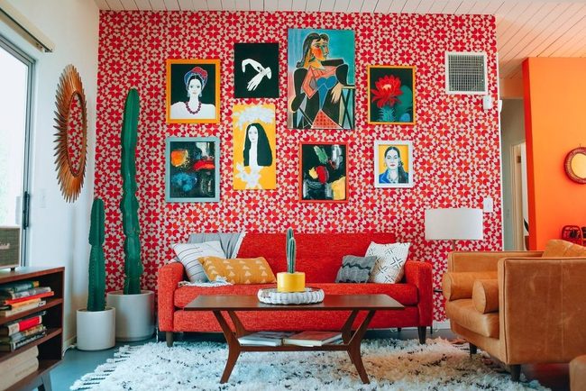
If you're ready to break free from safe decorating choices, consider painting an entire wall deep red to make the biggest statement possible in your living room.
Stewart suggests layering the color through textured wallpaper so the shade works its way throughout the room on multiple surfaces.
This bold approach ditches conventional design rules, and honestly, the result feels refreshing rather than predictable.
You can balance all that red intensity by adding graphic prints and modern artwork with clean, sharp lines that keep the space feeling fresh and organized.
Don't hold back if you want to push even further and add a red couch into the mix, since you've already committed to the color.
Modern furnishings and contemporary pieces prevent the room from feeling stuffy or dated.
When you layer colors and patterns this way, the space stays dynamic and exciting instead of becoming too heavy.
The key is mixing that bold wall color with lighter accessories and streamlined furniture so everything feels balanced and intentional.
Red Wood And Plush Warmth
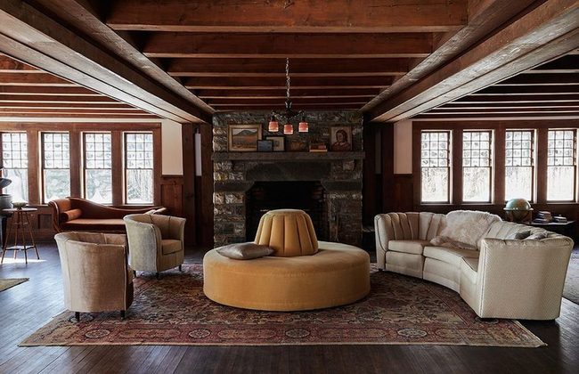
Most people want their homes to feel light and spacious these days, but if you're drawn to warmth and personality instead, deeper colors and soft fabrics can deliver exactly what you're after.
Red works beautifully in this style, whether it shows up as a grounding rug beneath your feet, artwork on the walls, or rich woodwork that anchors the room.
I love how these elements bring out the rustic charm without feeling overdone or heavy.
You could add a fireplace and a pet curled up nearby to complete the cozy retreat.
Luxurious textures like plush throws and quality upholstery make the space feel even more welcoming.
This approach suits anyone who prefers a room with history and depth over stark minimalism.
Dark tones and natural materials create a space where you actually want to spend time, not just pass through.
Muted Red Monochromatic Depth
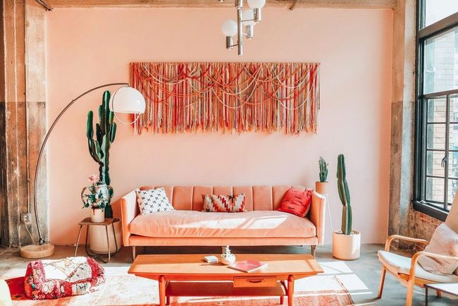
Washed-out tones might seem boring at first, but they can be just as striking as bold primary colors when you know how to use them right.
Fire-engine red doesn't have to dominate your space-soft, muted reds paired with pale neutrals create something far more interesting and modern.
One excellent way to make this work is pairing your washed-out color palette with a few vibrant pieces like artwork or throw pillows that pop against the quieter background.
A room done entirely in monochromatic red shades-from dusty rose to pale salmon to deeper burgundy-shows how you can play within one color family without the space feeling flat or dull.
The key is varying the depth and saturation across different surfaces and furnishings so your eyes have something to explore.
You don't need a rainbow of colors to make a room feel alive and interesting.
This approach proves that restraint in color can actually be more sophisticated and appealing than chaos.
Try it yourself and see how a limited palette of washed-out tones can feel both calming and unexpectedly bold.
Michael Thompson
Senior Content Editor
Expertise
Content Strategy Development, Editorial Team Leadership, Home Décor Trends & Style Curation, Digital Storytelling for Interior Design, Quality Assurance in Publishing
Education
University of Missouri, Columbia
University of Texas at Austin
Michael Thompson is the senior content editor at Decorrio, bringing over 12 years of experience in journalism and home décor writing. With a journalism degree from the University of Missouri and a master’s in English from UT Austin, he blends storytelling with expert design insights.
At Decorrio, Michael curates inspiring content that helps readers transform their spaces with style and ease. He’s passionate about home organization, DIY projects, and quality design ideas that make everyday living more enjoyable.
Outside of work, Michael enjoys exploring Austin’s culture, tackling home improvement projects, and mentoring aspiring writers.