
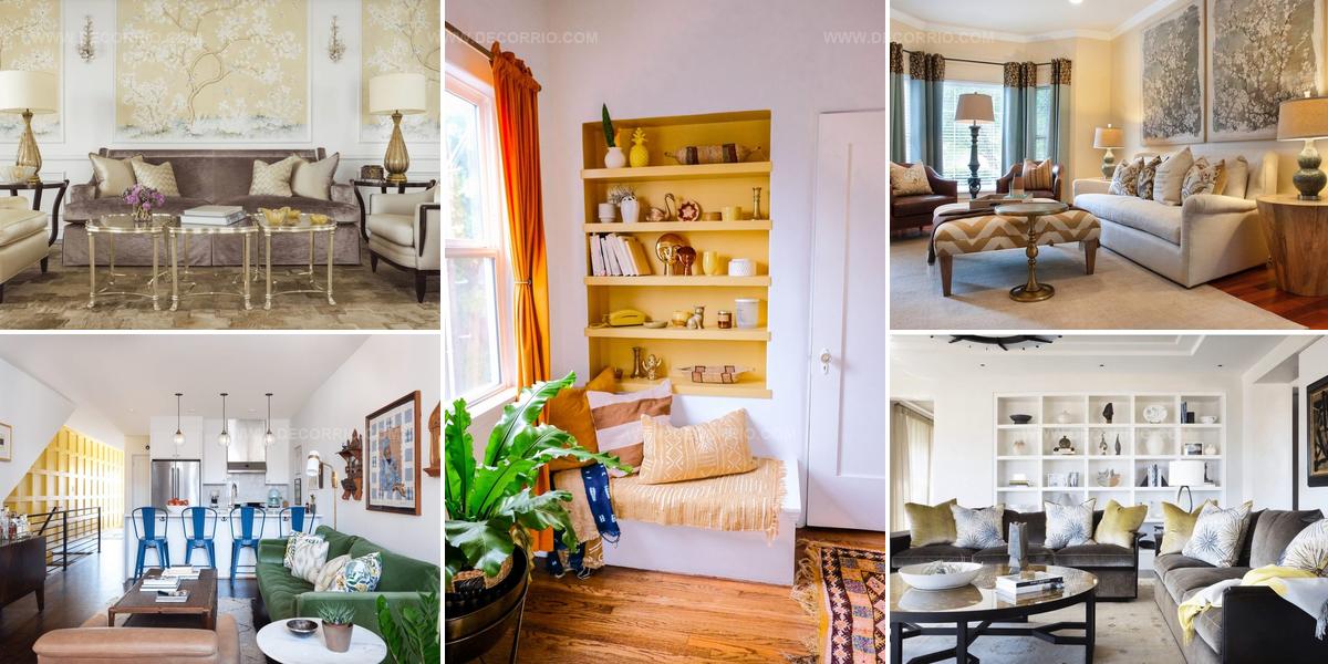
20 Bright Yellow Living Room Ideas That Feel Like Sunshine

A yellow living room brings warmth and energy into any home while creating an inviting atmosphere for family and friends.
Sunshine hues have the power to lift moods and make spaces feel larger than they actually are.
Decorating with golden tones offers flexibility since the color pairs beautifully with countless complementary shades and design styles.
Whether bold or subtle, incorporating this cheerful shade can refresh a tired space without requiring major renovations.
The psychology behind warm colors shows how they encourage conversation and connection among people who gather in shared spaces.
From pale butter to rich mustard, the spectrum provides options for every preference and personality type.
By the end of reading, you will feel confident about adding sunny warmth to one of the most important rooms in the house.
Single Wall Buttercup Statement
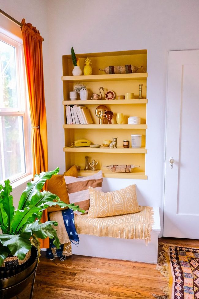
Buttercup yellow walls make the biggest statement in this reading nook, and you don't need to commit to painting entire rooms to get this bold effect.
Starting with just one accent wall gives your space dimension without overwhelming it, and pairing it with monochromatic yellow decor keeps the focus on that gorgeous wall color rather than scattering attention across too many competing shades.
If you're hesitant about going all-in with a dramatic hue, this method lets you test drive the color and see how you feel about living with it every day You can gather pieces in different textures and tones of yellow-think cushions, artwork, or small furniture-to add layers while staying cohesive.
It's a smart way to refresh your room and feel like you've made a significant change without the commitment of painting multiple walls or an entire space.
Yellow Daffodil Prints Transform Neutral Rooms
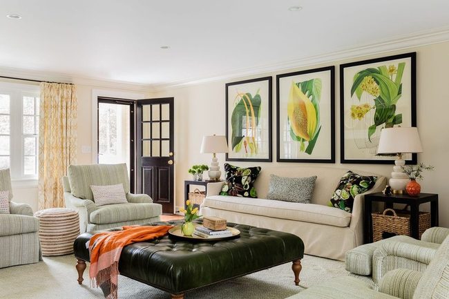
Bold daffodil prints and colorful patterned curtains stand out as your first opportunity to introduce yellow into a neutral living room, and this combination brings instant character to the space.
Artwork acts as your quickest tool for adding vibrant hues without needing a complete redesign.
You can hang a striking yellow print above your sofa or anchor wall that immediately catches attention and sets the tone for the room.
Patterned curtains in warm tones frame your windows and echo the same energy as your wall art.
Since you're working with a natural, understated backdrop, these bold choices won't feel overwhelming.
I recommend starting with one or two statement pieces rather than scattered yellows throughout, so the space feels balanced.
This approach lets you layer in more yellow accents later if you want them.
You'll find that a few well-placed items can transform how your whole room feels and looks.
Creamy Off-White With Amber Whispers
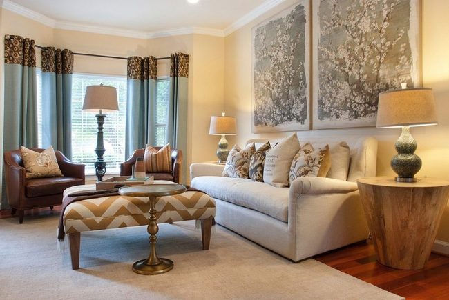
If you want to dial back the intensity of yellow, a creamy off-white base with just hints of yellow offers a grounded, natural feel for your living room.
Deep amber and marigold accents layered throughout the space add richness and prevent the room from feeling flat.
You can introduce these warmer tones through throw pillows, wall art, or a statement chair without overwhelming the space.
Wood furniture in honey or caramel shades pairs beautifully with this palette and reinforces that earthy vibe.
Smaller accessories like lamps, ceramics, or woven baskets in these deeper tones help build dimension as you move through the room.
This approach keeps things calm and sophisticated while still giving you that warm, welcoming quality yellow brings to a home.
Sunny Yellow Pillows And Rug
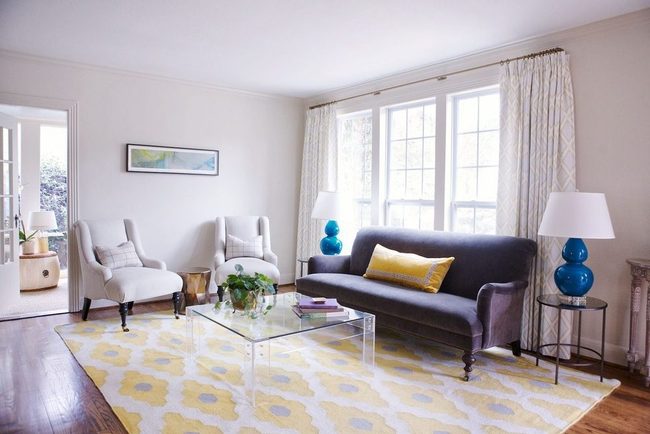
Bright yellow throw pillows and a plush rug can completely transform a bland room into something that catches attention right away.
If your space feels plain and dull, these pieces work fast to inject energy into the space.
You can scatter fuzzy pillows across your couch or chairs to add texture and warmth all at once.
A yellow rug grounds the room and ties the whole look together nicely.
Even just one or two of these items will make a noticeable difference in how your room feels You don't need to overhaul everything to see real change in your space.
Plush Yellow Sofa Statement
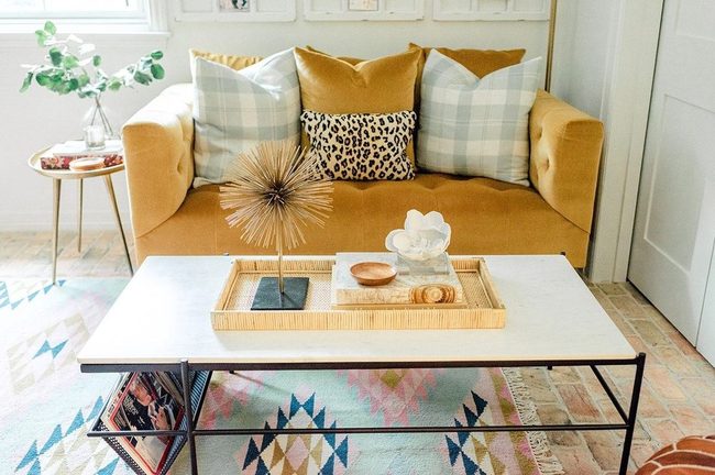
Swapping out your neutral furniture for bold colors like a plush yellow sofa can completely refresh your space, and the key is picking the right shade to match your room's vibe.
A pale buttery yellow works wonderfully as a wall color alternative to plain white, while mustard or deeper yellow tones shine when you use them on furniture or decorative pieces.
Moving away from typical gray, beige, and brown seating opens up so many design possibilities.
You don't need to stick with what feels safe or expected.
Deep jewel tones or warm saturated hues can anchor a room just as well as muted neutrals.
If you're hesitant about committing to a bold sofa, you could start by introducing color through accent chairs or cushions instead.
Once you see how a colorful piece livens up your space, you might find yourself wanting to be even bolder with your next furniture choice.
Goldenrod Walls Command Attention
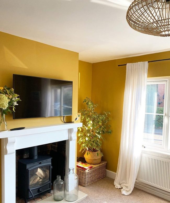
Goldenrod walls give your room that warm, honey-toned glow that makes any space feel like home, and this rich color choice does all the heavy lifting in your design.
You can let the walls shine by keeping everything else light and open, so your eye stays on that beautiful wall color without anything else pulling focus.
Paired with bright, airy furnishings and decor, this approach keeps the room from feeling heavy or overwhelming.
It's one of those paint colors that instantly sets a relaxed mood without being loud or distracting.
When you stick with this golden warmth as your main statement, you don't need to do much else to make the room feel lived-in and comfortable.
I love how this color works for people who want their space to feel both special and peaceful at the same time.
Cheerful Yellow Accent Pieces
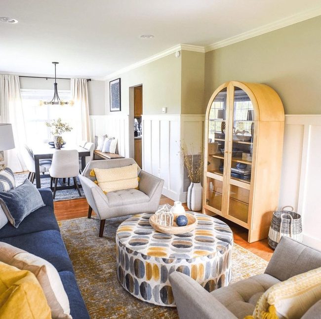
If you want to bring cheerful yellow into your space without overwhelming it, consider using smaller pieces like an accent chair, artwork, or pillows and throws to introduce the color.
Small furniture and decor items work well because they let you experiment with yellow while keeping everything balanced and easy to change out if you want a fresh look later.
This approach fits naturally with design styles like mid-century modern and transitional, where yellow accents complement clean lines and timeless pieces.
You can move these items around or swap them seasonally, which gives you flexibility in how much yellow you want on any given day.
Adding yellow through accessories means the color enhances your room without dominating it.
Wood pieces, neutral walls, and other furnishings stay grounded while these pops of yellow add warmth and personality.
This method works especially well if you're unsure about committing to a bold color, since you can test how yellow feels in your home before making bigger changes.
Creamy Yellow For Refined Spaces
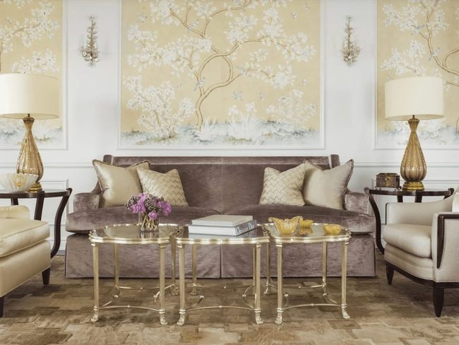
Buttery light yellow works well if you want to avoid that overly bright feeling in your space, and Elliott recommends leaning toward creamy tones rather than anything too lemony, especially when you're decorating formal areas like a living room.
Yellow can shift toward green depending on your lighting conditions, so picking the right shade matters more than you might think.
Sticking with a softer, warmer yellow keeps things calm and refined without feeling harsh or artificial.
You'll notice the difference between a pale cream-based yellow and a sharp citrus tone right away.
It's one of those cases where a small adjustment in undertone changes everything about how the room feels.
Going with creamy over lemony is really the safest bet when you're working in more sophisticated spaces.
Light yellow done right gives you that gentle warmth without the jarring effect of brighter shades.
Rust Gold And White Harmony
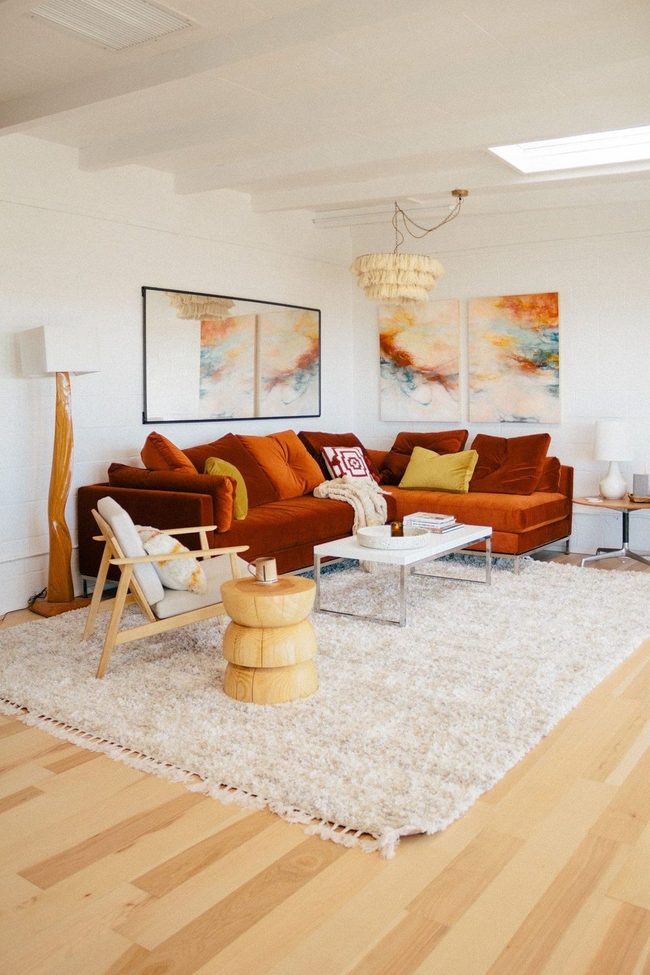
If you want to bring warmth into your living room without slathering on bright yellow paint, consider borrowing from a sunset palette instead.
A white room becomes the perfect backdrop for layering rust, red, and gold tones that complement each other rather than clash.
We've seen how these warm hues can feel both grounded and uplifting at the same time.
Gold accent pillows scattered across your seating add richness and tie the color story together nicely.
You don't need to match everything perfectly-the beauty is in how these shades naturally harmonize when you let them breathe.
This approach keeps things simple while still giving your space that warm, enveloping feeling you're after.
Starting with white walls gives you flexibility to swap out pillows and accessories as seasons change or your taste shifts.
Sandy Yellow Walls With Dark Wood
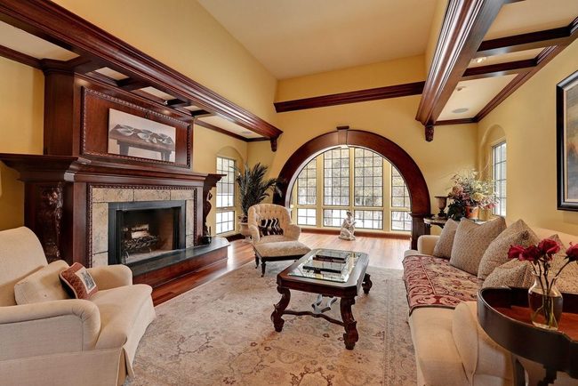
Citrusy yellow walls in a large living room can shrink the space and feel overwhelming, so I'd suggest going with a softer, sandy yellow instead to let the room breathe while keeping that warm feeling you want.
Dark wood pieces like beams, furniture, or paneling anchor the airy quality of the space and balance out all that light wall color.
You can bring in wooden shelving units, a statement bookcase, or even a wood ceiling detail to add weight and sophistication.
These darker elements ground the room and prevent it from feeling too bright or one-dimensional.
Wood tones also warm up a space without adding extra color, so your sandy yellow stays the star of the show.
Whether you choose rich walnut or classic oak, the contrast between the pale walls and deep wood keeps things interesting and makes the large area feel intentional rather than empty.
Scattered Gold Layers Richness
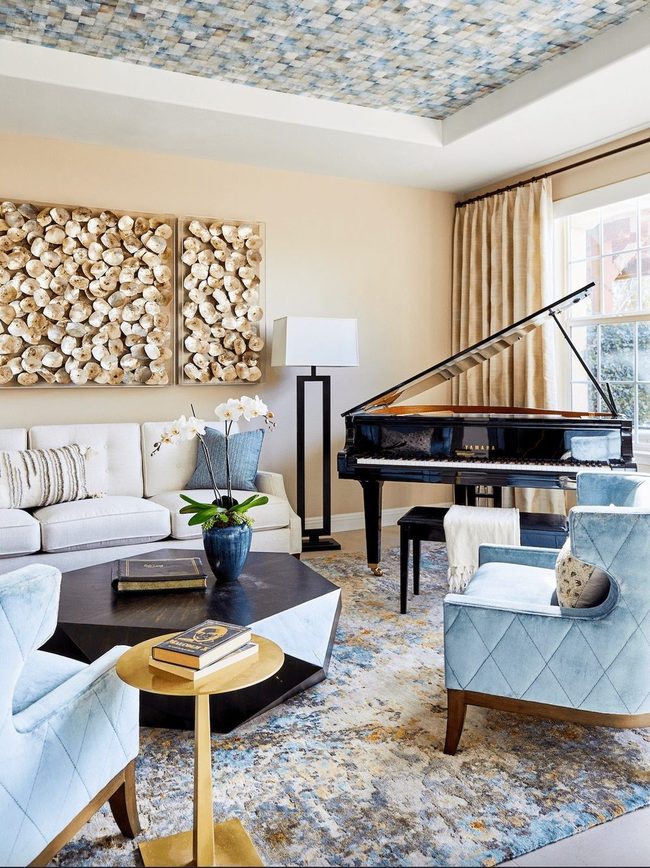
Gold touches scattered throughout your space don't need yellow to dominate the room to shine and stand out.
You can start by selecting a rug that hints at warm yellow tones rather than shouting them loud, and from there, layer in gleaming gold accents that echo those same warm shades.
Whether you pick a mirror with a gold frame, brass candlesticks on a shelf, or gold-trimmed artwork on the walls, these small glints of warm metallic tones boost the warmth already present in your rug It's really about weaving warm metallics throughout instead of relying on one big statement piece.
You'll notice how these scattered hints of gold and soft yellow work together to make a room feel richer and more layered than it actually is.
Even a few strategic placements can shift the whole mood of your space toward something warmer and more inviting.
Yellow Accent Wall Statement
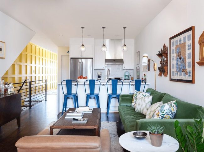
One bold wall in a warm yellow shade can completely shift the energy of a large open room, and this approach works especially well when you place it opposite your kitchen and living areas so the color becomes the first thing people notice when they walk in.
Yellow has this natural ability to spread warmth throughout a space without feeling heavy or overdone.
For an industrial home, painting just one wall in this cheerful tone adds personality and softness to all those exposed pipes and concrete surfaces.
You don't need to cover every wall-in fact, leaving the rest neutral lets the accent wall shine as your room's standout feature.
Board and batten styling on your accent wall also brings in texture and visual interest that flat paint alone can't achieve.
This simple change gives a contemporary update to spaces that might otherwise feel cold or plain.
If yellow feels too bold for your taste, any warm color you love will accomplish the same goal and make your space feel more intentional and lived-in.
Buttermilk Yellow Ceiling Transform
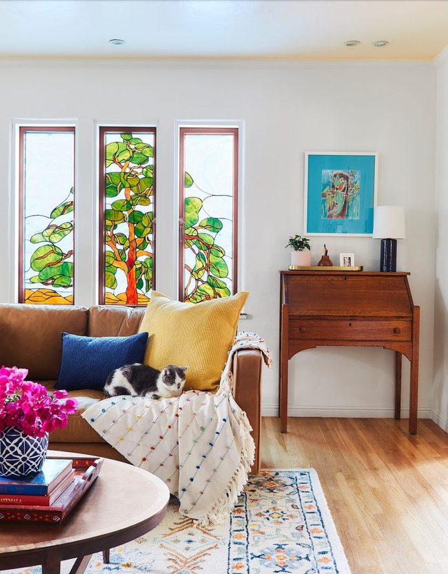
Paint your ceiling in a soft yellow tone and you'll instantly warm up plain white walls, which is exactly what happens when buttermilk yellow sits above creamy white paint in a room like this one.
Throw pillows, blankets, and area rugs in matching yellow shades scattered around the space echo that overhead color and tie the whole look together naturally.
Because your eyes naturally look up when you enter a room, a colored ceiling becomes the first thing you notice, making it a bold choice that doesn't require much effort.
Light yellow specifically feels fresh and approachable rather than heavy or dark, so it brightens the space without overwhelming it.
You don't need a professional painter or complicated techniques to pull this off either.
Starting with just one wall or testing a small area helps you decide if you love the shade before committing fully.
Soft furnishings in coordinating colors make the look feel complete and balanced throughout the room.
This simple technique shows how one unexpected design choice can shift the entire feeling of your space.
Egg-Yolk Yellow Walls Pop
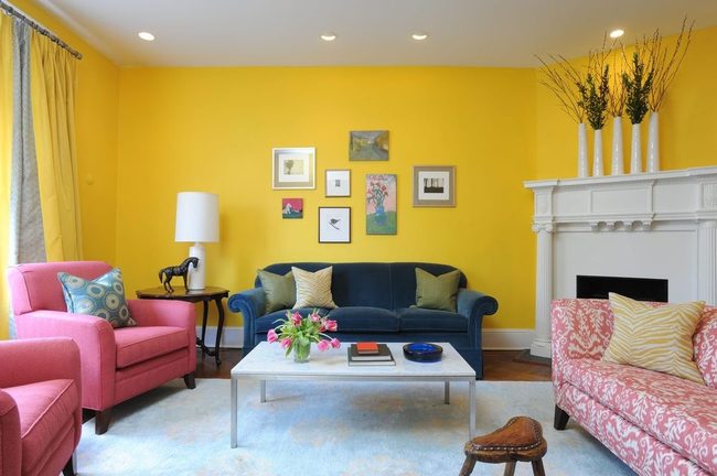
Painting all four walls in a bold egg-yolk yellow is where designer Annie Elliott makes her most striking statement, and the effect is impossible to ignore in her living room.
Crisp white baseboards and accents like the fireplace, lamp, coffee table, and rug stand out sharply against that electric yellow tone.
Colorful furniture pieces scattered throughout the space then reinforce the fun, unconventional feeling she's after.
When you walk in, the yellow hits you first and sets the entire mood.
White elements prevent the room from feeling overwhelming and give your eye somewhere calm to rest.
Adding furniture with personality and color keeps the space from feeling too simple or plain.
It's a setup where boldness really does pay off and transforms a typical living room into something totally unique.
Yellow Accents Transform Gray Blue Spaces
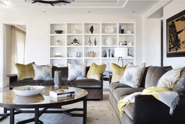
Bright yellow pillows sitting on gray and blue furniture stop you in your tracks with their warmth and energy, and this color combo happens to be a favorite among designers.
Gray pairs beautifully with blue, so adding soft yellow accent pieces gives your space an instant refresh that feels balanced and appealing.
You can place these pillows on your sofa or chairs to break up cool tones and guide attention right where you want it Mixing these three colors keeps things from feeling too serious or cold.
The result is a space that feels open and welcoming all at once.
Swapping out your pillow covers when you want a change is easy, making this one of the simplest ways to update your room's mood.
Try this combination and watch how much brighter your space becomes.
Gold Velvet Yellow Luxury
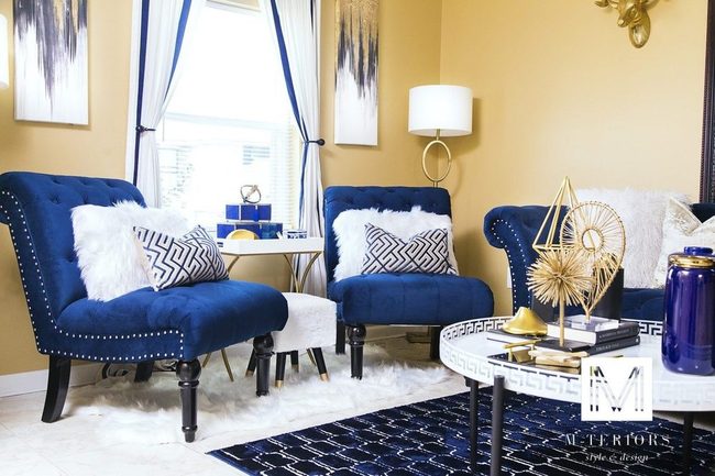
Pairing rich yellow-beige walls with gold accents, velvet textures, and white lacquer finishes brings a glamorous edge to any room, and these luxe materials amplify the warmth already present in the paint color.
Gold hardware and fixtures catch light beautifully and add that high-end feel you're after.
Velvet surfaces like pillows or chairs introduce soft luxury and depth against the walls.
White lacquer pieces, whether furniture or trim work, provide clean contrast and shine that balances the warmth of yellow-beige.
When you layer these finishes together, the room feels more refined and put-together.
We find that mixing matte and glossy surfaces keeps things from feeling one-note.
Quality materials don't have to break the bank either, since even smaller accents in gold or velvet shift how the whole space reads.
Your room becomes a space that feels both comfortable and polished at the same time.
Yellow With Purple And Blue Pairing
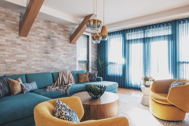
To decorate with yellow effectively, you'll want to turn to the color wheel as your guide, since this tool shows you exactly which shades work best alongside it.
Purple, blue, and green all pair beautifully with yellow and help balance its brightness.
If you prefer a more understated look, yellow works wonderfully against softer hues that tone down its intensity.
Designer Kalah Talancy of KTII Design Group emphasizes this color strategy as her main recommendation for anyone working with yellow in their spaces.
She points out that understanding these color relationships helps you avoid clashing combinations and instead build rooms that feel harmonious.
When you choose colors based on how they sit on the wheel, you're making decisions backed by design principles that actually work.
This method takes the guesswork out of what goes where and lets you decorate with confidence.
We all benefit from having a simple system to follow rather than just hoping colors will look good together.
Canary Yellow Accent Wall Energy
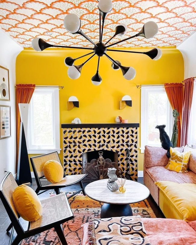
One accent wall in a warm, canary yellow with orange undertones delivers bold energy that would make any pop art piece proud, and black accents throughout the room keep things balanced and grounded.
Orange drapes add warmth and comfort to the space, making it feel alive and dynamic.
Finding the right yellow takes some thought because the color shifts dramatically depending on the time of day and how light moves across your walls.
We recommend painting a sample on a large piece of poster board and moving it around to different walls throughout the day so you can see how the undertones actually look in your specific space.
This simple trick helps you avoid choosing a yellow that might seem perfect in the store but looks totally different once it's on your wall at home.
You'll notice how morning light hits differently than afternoon or evening light, and this changes how warm or cool your yellow appears.
Taking time to test beforehand means you'll love your bold choice every time you walk into the room.
Yellow Paint Accent Walls
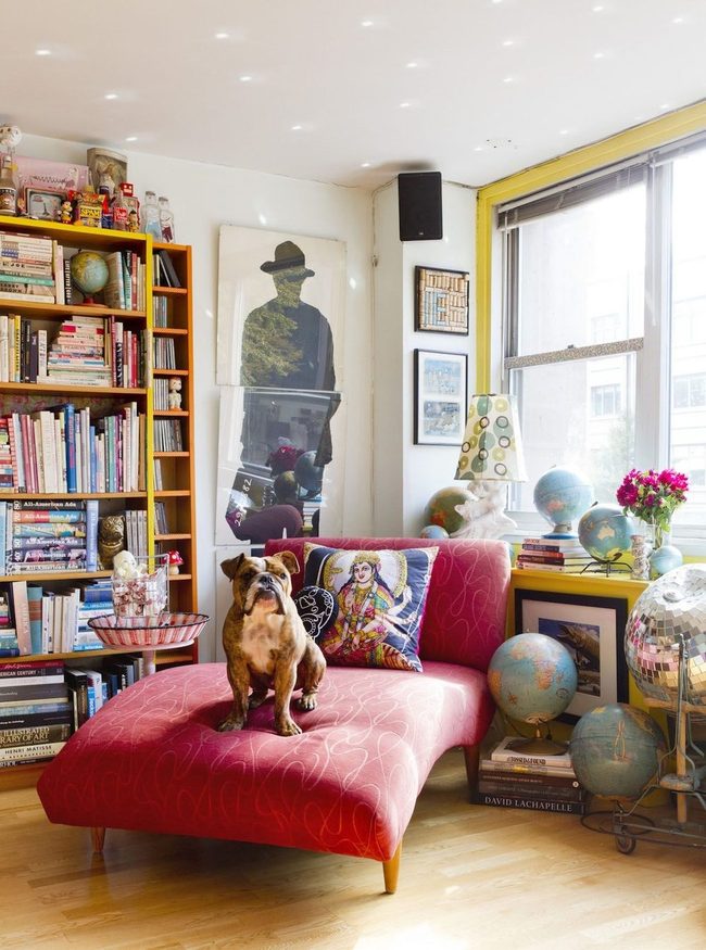
Bright yellow paint works like a life-sized highlighter on your walls and instantly grabs attention because of how much it stands out.
You can use this bold color on a window frame or built-in bookcase to make those spots pop and become something people notice right away.
One clever trick is to paint just the inside edges of shelving units in a sunny shade and let the books and objects sit in front of that background.
If you want something less intense, try painting the back wall of a bookcase instead of the frame itself.
Even a small accent wall in a hallway or bathroom painted in this cheerful tone transforms how the whole space feels.
You don't need to cover everything-sometimes one or two unexpected areas with this bold hue does more than painting an entire room would.
I've seen people use this technique to highlight architectural features that would otherwise blend right in with the rest of the house.
The energy and warmth this kind of color brings to forgotten corners really does change how you move through and enjoy your home.
Pale Yellow, Deep Blue, Cream Trio
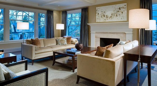
Warm, pale yellow walls paired with cream furniture and rich deep blue drapes create a cozy atmosphere that stands the test of time, and Rebecca Johnston of R.Johnston Interiors explains why this combination works so well.
Yellow serves as a flexible color choice that anchors your overall palette and makes it simple to decide on other elements throughout your space.
Once you establish yellow as your base, selecting complementary pieces becomes much easier because you have a clear direction to follow.
Heavy drapes in deep blue add weight and sophistication to the room while contrasting beautifully against lighter wall tones.
Cream-colored furniture softens the space and bridges the gap between your walls and window treatments without overwhelming the room.
We find that this trio of colors works because each shade supports the others and feels balanced rather than chaotic.
The pale yellow keeps things from feeling too dark or heavy, while the cream and blue tones prevent the space from becoming overly bright.
You can build the rest of your decoration decisions around these three anchors and feel confident about your choices.
Michael Thompson
Senior Content Editor
Expertise
Content Strategy Development, Editorial Team Leadership, Home Décor Trends & Style Curation, Digital Storytelling for Interior Design, Quality Assurance in Publishing
Education
University of Missouri, Columbia
University of Texas at Austin
Michael Thompson is the senior content editor at Decorrio, bringing over 12 years of experience in journalism and home décor writing. With a journalism degree from the University of Missouri and a master’s in English from UT Austin, he blends storytelling with expert design insights.
At Decorrio, Michael curates inspiring content that helps readers transform their spaces with style and ease. He’s passionate about home organization, DIY projects, and quality design ideas that make everyday living more enjoyable.
Outside of work, Michael enjoys exploring Austin’s culture, tackling home improvement projects, and mentoring aspiring writers.