
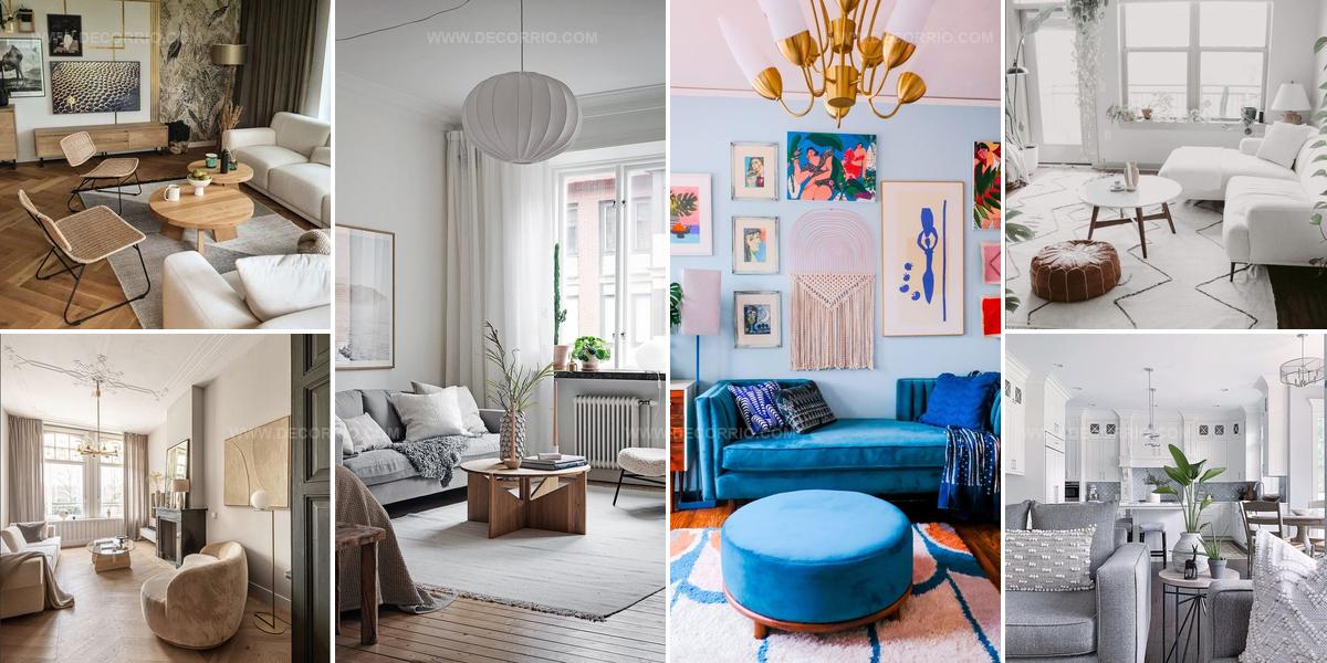
21 Monochromatic Living Room Ideas That Feel Fresh and Calm

A monochromatic living room offers an elegant design approach that relies on varying shades, textures, and tones within a single color family to build visual interest.
This decorating strategy proves surprisingly versatile because it works beautifully whether you prefer bold drama or subtle sophistication.
The beauty lies in how different materials and finishes can make one color feel completely fresh throughout a space.
Many homeowners worry that sticking to one hue might feel boring, but the opposite tends to be true when done thoughtfully.
Layering light and dark values creates natural depth without introducing competing colors that can overwhelm a room.
The technique actually simplifies decision-making since you focus on texture, pattern, and proportion rather than coordinating multiple palettes.
By the end, you will feel confident about creating a cohesive space that feels both calming and visually compelling.
Ivory Walls Light Wood Floors
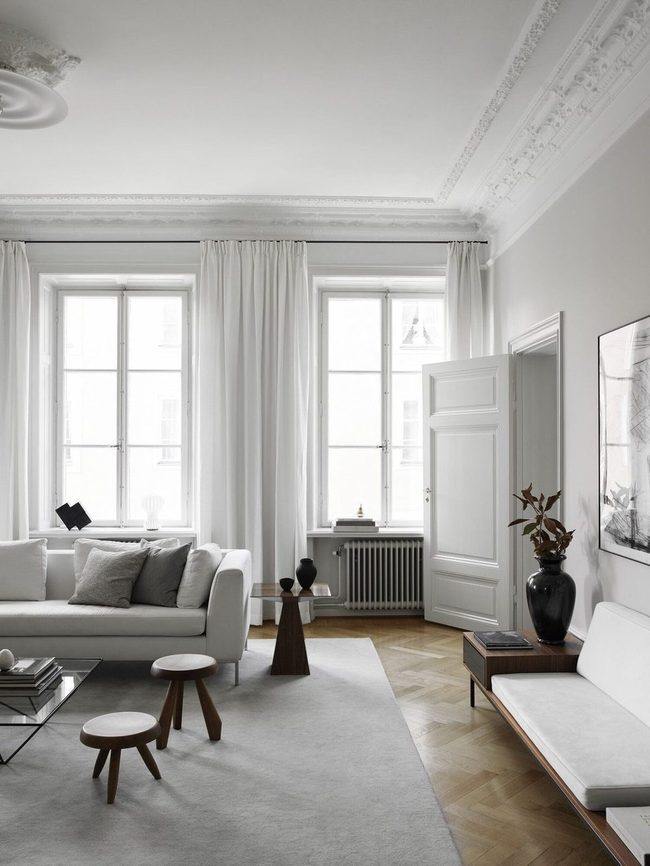
Cool-toned whites deserve a spot in your decorating toolkit just as much as warmer versions do, and this living room proves exactly why.
Everything from the walls to the window treatments, curtains, and door shares the same bright white shade, which lets your gaze drift smoothly across the room without any jarring breaks.
Light wood flooring adds just enough warmth to keep the space from feeling cold, but the ivory tones clearly own the show here.
You'll notice how this restrained color approach works without needing extra decorative elements to balance things out.
White walls and matching trim create a calm backdrop that feels open and airy.
Lighter wood tones ground the space and prevent it from looking sterile or unwelcoming.
This strategy shows that sometimes the most striking rooms come from limiting your palette rather than loading up on variety.
Deep Emerald Built-In Shelving Statement
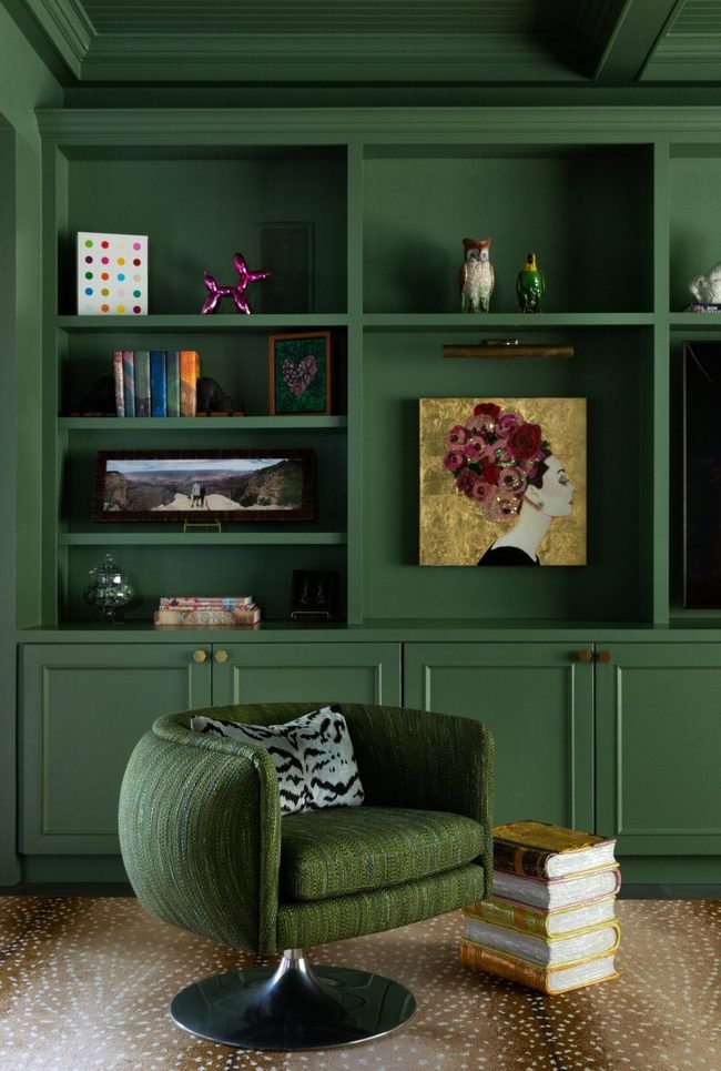
Painted built-in shelving in deep emerald makes an immediate statement in this room, and pairing it with a matching accent chair creates visual harmony throughout the space.
Green tones naturally calm the mind and draw attention across the entire room in a pleasing way.
You'll spot the color echoed through smaller accessories like framed artwork and ceramic vases scattered on shelves, which ties the design together without feeling forced.
Small decorative pieces in similar hues guide your gaze from one area to the next, so the room feels connected rather than random.
Rather than painting everything the same shade, mixing different items in that green palette keeps the room from feeling flat or one-note.
Your eyes naturally move through the space because there's enough repetition to feel planned and enough variety to hold interest.
Simple color coordination like this shows how powerful it can be when you let architectural features do the heavy lifting in your design scheme.
Cream Walls, Effortless Clarity
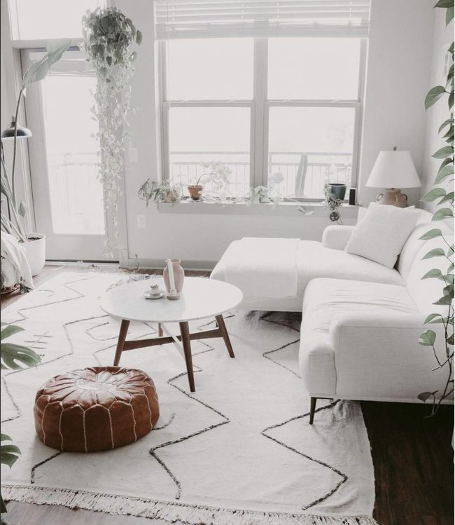
White walls in the right shade-somewhere between pure white and cream, avoiding anything too blue-give a room an instantly polished and effortless look.
You'll find that nailing this neutral tone makes everything else in your space feel more organized and intentional without much effort on your part.
Once you've painted those walls, the rest becomes a simple matter of maintenance and keeping things tidy.
I've learned that a truly clean room starts with this foundational color choice.
Open shelving, minimal clutter, and clear surfaces benefit tremendously from this backdrop.
It's not about perfection; it's about creating an environment where neatness feels natural and achievable Stick with your white walls and regular tidying, and you'll have a room that always looks fresh and well-maintained.
Seafoam Green With Living Plants
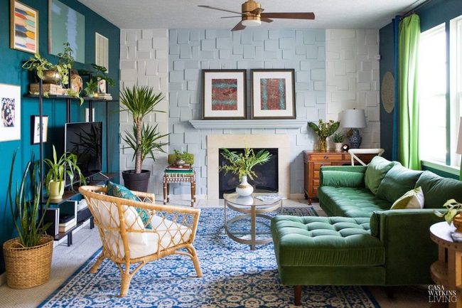
Seafoam sits at the perfect intersection of green and blue, and it's a color that immediately grabs your attention when used throughout a room.
If you want to lean into that lush underwater mood, layering in live plants and rich textures is the way to go and string lights overhead to add some shimmer to the space.
Plants in various heights will make the walls come alive and give depth to your design.
Draping fabric elements like curtains or wall hangings can enhance that water-inspired vibe without overwhelming the space.
Overhead lighting with a gentle glow keeps the whole room from feeling dark or moody.
You'll find that combining these elements makes the seafoam theme feel complete and cohesive in a natural way.
Olive Walls With Layered Greens
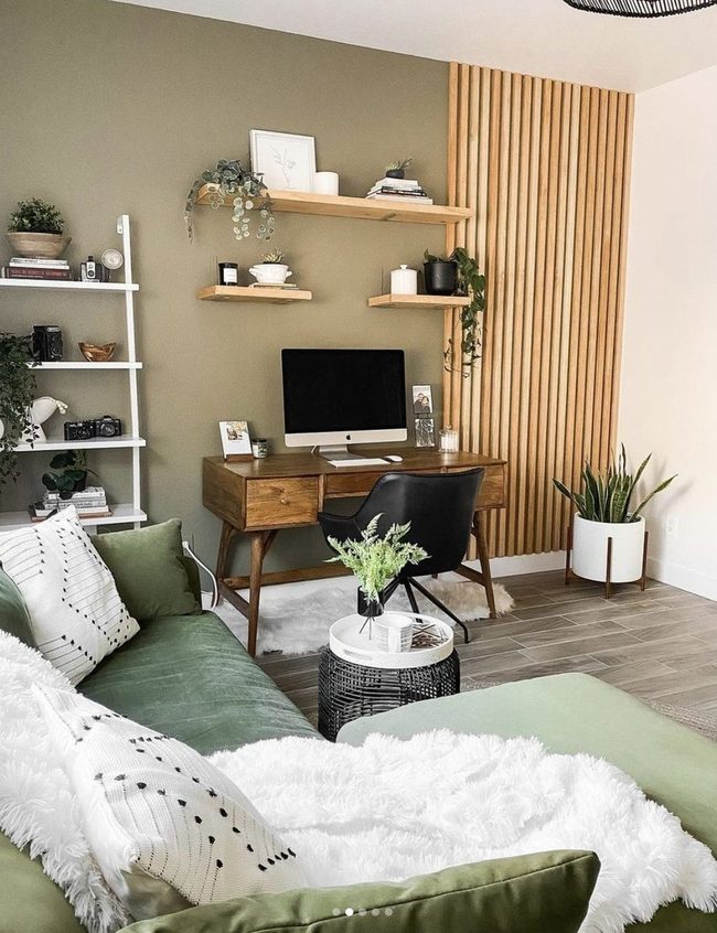
Green walls bring an instant sense of openness and connection to nature that few other colors can match, and choosing olive for your walls paired with a deeper shade on your couch creates a layered, grounded look.
Plants scattered throughout the room reinforce that natural aesthetic and make the space feel alive.
Wood furniture and accents complement these green tones perfectly and add warmth to the overall design.
Whether you lean toward sage, forest, or olive, green has this unique ability to make a room feel both calm and spacious at the same time.
I find myself drawn to how well plants and wooden pieces enhance the green color story without overwhelming the space.
You can mix different depths of green throughout your room and it all harmonizes beautifully together.
The combination of wall color, upholstery, botanical elements, and natural wood creates a refreshing environment that feels grounded in nature.
Cerulean Blue Midcentury Modern
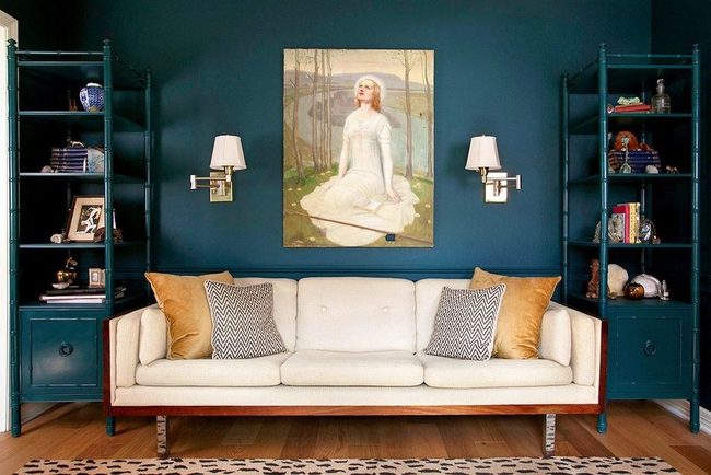
Walls painted in a rich cerulean blue immediately command attention and set the tone for your entire living room space, and you'll notice how this bold color choice pairs beautifully with white leather furniture and matching wall sconces that echo the clean lines of midcentury modern design.
Shelving in the same deep blue continues the color story and keeps the room feeling unified without relying on heavy ornamentation Simple white fixtures brighten up the space and balance out the darker walls, preventing the room from feeling too heavy or closed in.
If you're drawn to midcentury modern style, this color combination proves that you don't need dozens of accessories or trendy add-ons to make a space feel finished and sophisticated.
Mixing moody tones with crisp white accents creates a calm atmosphere where everything feels deliberate and grounded.
You can easily recreate this look by choosing one standout color for your walls, keeping your furniture minimal and functional, and letting quality lighting do the work of bringing brightness to darker shades.
Marble And Gold Living Room Elegance
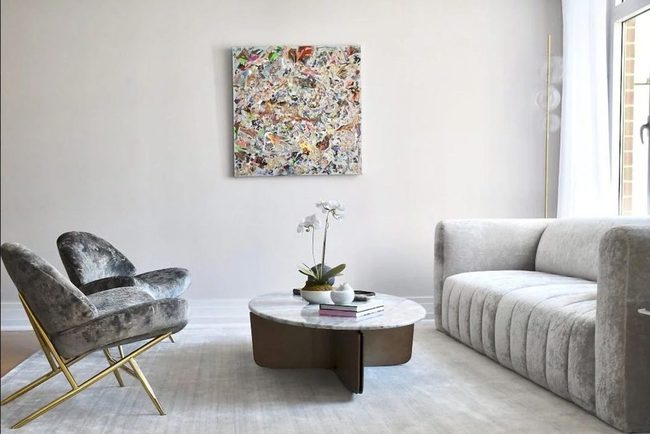
Gray tones paired with the right accents deliver real sophistication, and this apartment proves it through a setup that speaks volumes about style.
An upholstered sofa faces two plush chairs with a marble coffee table anchoring the middle of the room, and together they communicate modern luxury.
You don't need to live in a high-rise or spend a fortune to get this look in your own home.
Golden accents on the chairs bring in that upscale feel without breaking the bank.
Simple choices like these can shift how your whole living space feels.
Mixing neutral walls with warm metal touches keeps things balanced and interesting.
Your space can feel just as polished and put-together with thoughtful selections and a bit of planning.
Cream Whites With Layered Textures
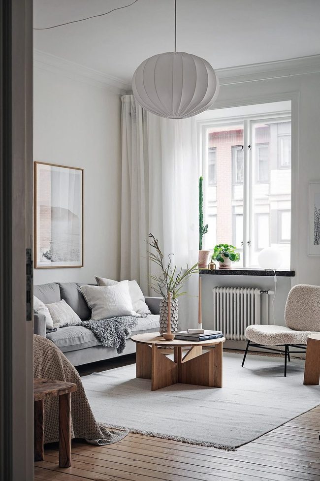
Soft, warm whites that have a hint of cream in them can give you a clean look without feeling cold or sterile, and if you're worried about the space seeming too plain, layering in different textures makes all the difference.
Sheer linens draped across windows or over furniture bring softness to the room and keep everything from looking harsh.
Cozy throws tossed over chairs or beds add warmth and comfort that makes the space feel like somewhere you actually want to spend time.
Mixing in woven baskets, linen cushions, and knit blankets keeps the palette light while building depth throughout the room.
Start by choosing whites with a slight warm undertone and then build up from there with different materials and weights of fabric.
You'll end up with a room that feels both clean and inviting without any effort at all.
Charcoal Walls With Geometric Details
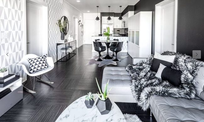
Charcoal walls make such a bold statement in any room, and when paired with a leather couch and soft throw blanket, you get a space that naturally draws people in and makes them want to linger Geometric patterns scattered across the walls and throughout the decor keep things from feeling dull or one-dimensional.
Mixing these playful shapes with the neutral backdrop means the space stays balanced and interesting to look at.
You can sit here for hours without the room feeling boring or monotonous.
Gray gets a lot of attention as a wall color, and for good reason-this particular shade shows exactly why it deserves the praise.
It's the kind of foundation that lets you build a room that's both comfortable and visually engaging without any extra effort.
Royal Blue Velvet Statement Room
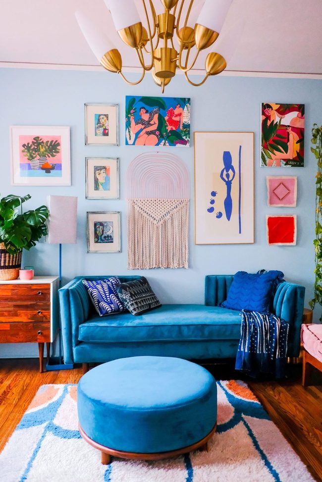
Deep royal blue walls make a bold statement in any space, and when you commit to this rich color throughout the room, it sets an undeniably powerful tone.
Large paintings hung at eye level anchor the room with visual weight, while heavy velvet drapes frame windows and add luxurious texture that feels substantial underfoot and to the touch.
Thick drapery in matching or complementary shades builds on this sense of grandeur, and velvet accents on furniture or cushions bring softness alongside the dramatic backdrop.
A classic chandelier overhead completes the look with warm light that bounces off the deep walls and makes everything feel more sophisticated.
You don't need to overthink the furnishings here because the color itself does most of the heavy lifting.
Simple pieces in neutral tones or gold accents let the blue remain the star without competing for attention.
This approach works well for bedrooms, libraries, or dining rooms where you want to feel both grounded and impressive.
Monochromatic Blue To Gray Gradient
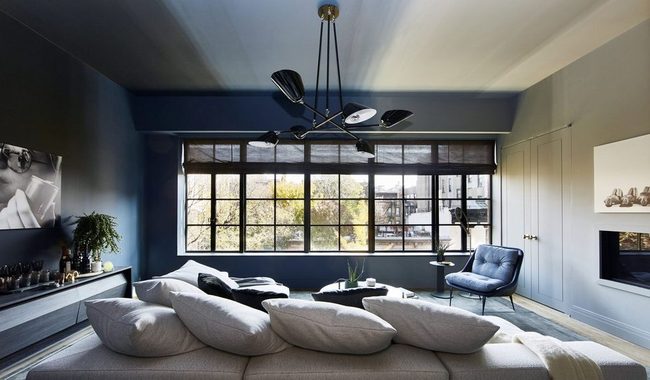
Dark blue walls on one side of your room transition smoothly into lighter shades and eventually soft gray tones on the other side, and this gradient effect creates something really striking as you move through the space.
Furniture pieces echo these wall colors while neutral statement lighting adds a contemporary edge to the whole setup.
Your eye naturally travels across the room and takes in how each shade relates to the next one.
Beyond just looking good, this approach actually makes the room feel larger and more thoughtful.
Sticking with one color family means you have freedom to experiment with different textures and materials since the color palette stays balanced.
If you want to try this in your own home, start with your favorite color and gather paint samples in several depths to see how they flow together.
Brown Texture Layering Masterclass
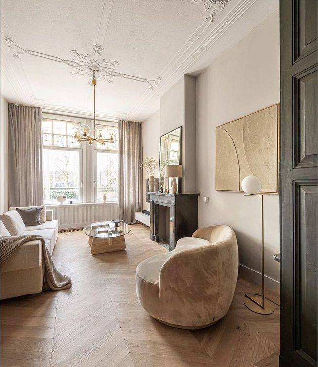
Brown gets a bad rap in the design world, but honestly it deserves a second look from anyone ready to embrace it.
What makes brown work so well is layering different textures and materials throughout your space-think bronzed metals sitting next to light woods and soft tan fabrics.
You can build a room that stays in one color family while still feeling dynamic and interesting.
Mixing matte finishes with shiny surfaces and rough textures with smooth ones keeps the eye engaged.
When you stack these elements thoughtfully, you end up with a space that feels rich and full of personality.
Brown rooms can be just as compelling as any other color scheme if you know how to layer them.
Cool Gray Meets Crisp White
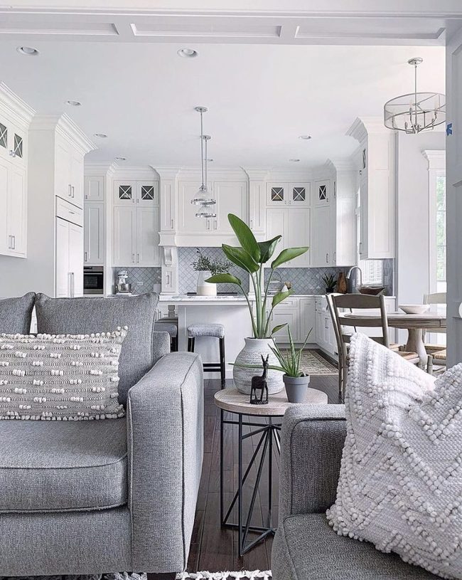
Cool-toned gray stands out as the superior choice for your space when you're deciding between warm and cool shades, and this slate palette proves it works beautifully.
Pairing cool gray with crisp white gives you a modern foundation that flows seamlessly through open layouts and complements white kitchen cabinetry without any clashing.
White and gray together feel fresh and uncluttered, making smaller spaces feel larger while keeping the aesthetic clean.
You can bring in different textures and materials to add depth without breaking the cool color scheme.
Lighter furniture pieces and stainless steel fixtures enhance the streamlined feel you're going for.
Wood accents in natural or whitewashed finishes warm things up just enough so the space doesn't feel cold Your home will feel calm and sophisticated with this palette as your foundation.
Gold Accents On Neutral Layers
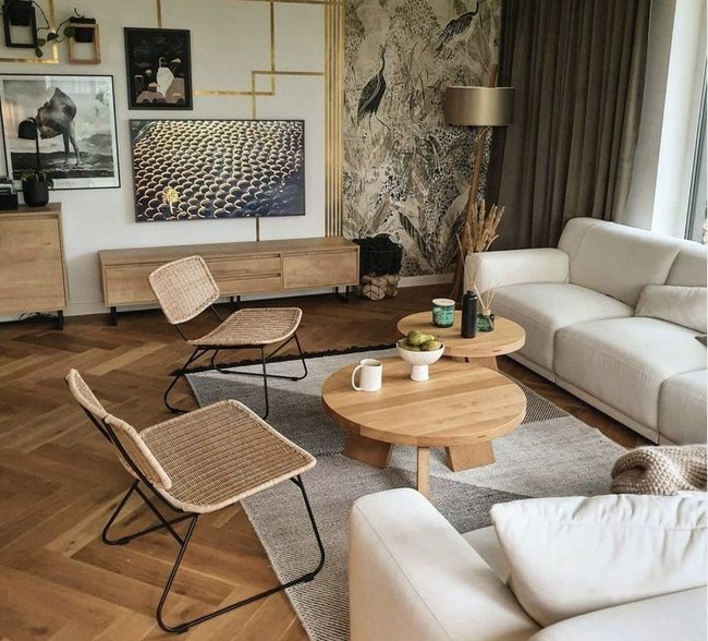
Neutral walls and furnishings become far more interesting when you layer in different textures and materials, and adding gold accents with geometric shapes brings dimension to the space.
Mixing smooth surfaces with rougher fabrics keeps the eye moving from one spot to another.
Wood elements paired with metal finishes prevent the space from feeling flat or one-note.
You don't need bold colors to make a room feel alive and thoughtful.
Simple styling choices like these show that neutrals can be just as dynamic as any other palette when you pay attention to what you combine.
Pink Sofa Foundation For Calm Spaces
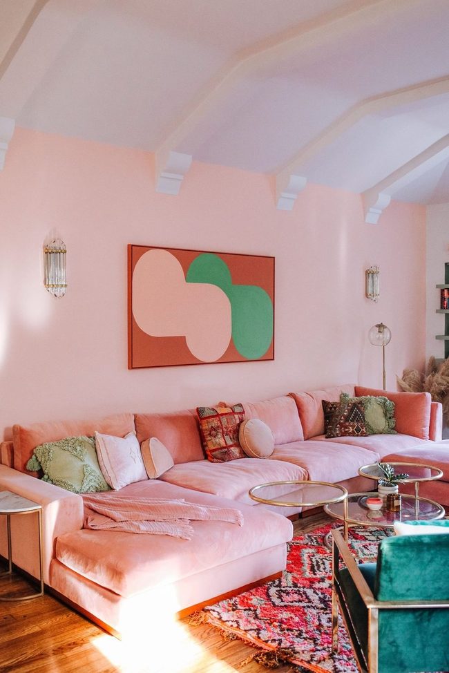
Dusty and blush pink shades function just like neutral beige, so you can treat them as foundational colors rather than bold accents.
A pink sectional sofa paired with flowing pink curtains delivers instant sophistication to any room.
Pink as a neutral gives you flexibility to layer in other colors and textures without things feeling chaotic.
You'll find that a monochromatic pink scheme feels polished and grown-up, not overdone or juvenile.
Consider how these soft pink tones anchor your space and allow other accessories to shine.
This neutral foundation lets your personality shine through without requiring the room to feel busy.
Beige Layered Textures With Sunlight
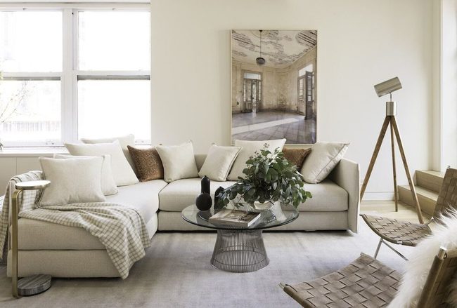
Beige tones dominate living rooms these days, and this space shows exactly why we're drawn to them.
Natural light pours through the windows and bathes the room in warmth, which is absolutely perfect when you're working with a neutral palette.
You'll notice the walls and sofa sit in nearly identical shades, bringing a sense of calm and flow to the whole space.
Beyond the color matching, there's plenty to look at here-wooden pieces, wicker textures, and wall art all add depth and visual richness without introducing competing hues.
It's amazing how much interest you can pack into a room without relying on bold colors.
The combination of these elements makes the space feel both restful and engaging at the same time.
Red Statement Furniture And Walls
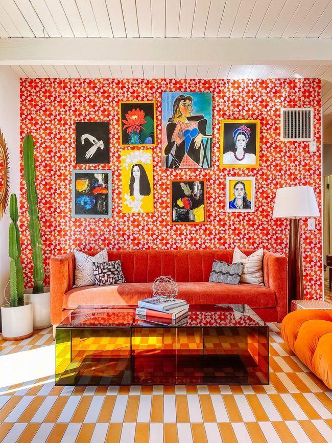
Red furniture and bold wallpaper can transform a space into something energetic and full of life, since this color naturally brings romance, excitement, drama, and power into any room you're decorating.
Rather than painting entire walls right away, we suggest starting with accent pieces like a striking sofa, patterned wallpaper on one wall, or vibrant accessories scattered throughout.
Lamps with red shades, throw pillows, artwork, and decorative objects all give you flexibility to adjust the intensity without a major commitment.
You can layer these elements gradually and see what feels right for your space.
A red accent wall works wonderfully if you want something bolder, and it pairs well with neutral furniture that lets the color shine.
If you prefer a gentler approach, red accessories and smaller furniture pieces give you room to experiment.
Both methods flood your space with energy and personality while keeping things manageable and fun to update later.
Gray Walls Gold Accents Shine
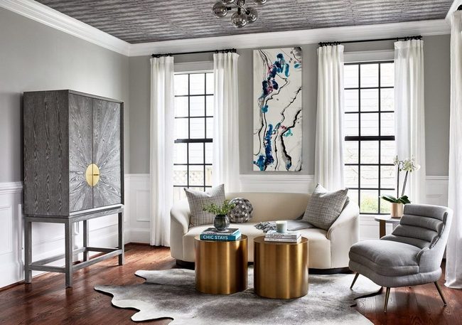
Light gray walls and ceilings might sound dull at first, but this living room shows just how wrong that assumption can be.
You can apply the same gray tone across multiple surfaces like a chest, accent chair, and rug to build a unified look without any monotony.
Gold accents scattered throughout the space-perhaps on lamps, frames, or decorative objects-prevent the room from feeling flat or dreary The warmth of the gold pieces lifts the entire space and adds sophistication that makes gray feel anything but boring.
Neutral tones like these give you a blank canvas where you can swap out accessories and change the mood whenever you want.
Gray and gold together create a calm environment that feels both modern and inviting in a natural way.
Cream Walls Calm Mind
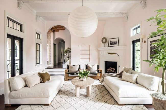
Off-white and cream rooms deserve just as much love as pure white spaces, and honestly, we think they might even be better for how they make you feel.
Soft cream tones on your walls instantly calm your mind and wash away tension the moment you sink into a comfortable couch.
Your neutral palette keeps things peaceful without feeling cold or sterile like some all-white rooms can.
Cream shades work wonderfully because they're easy on the eyes and don't demand attention, letting you actually relax instead of staying on edge.
Many people overlook how powerful a simple warm neutral can be for mood and comfort.
You get that serene quality people chase without needing to add bold colors or busy patterns.
Simple and calming spaces often beat elaborate designs because they let your mind settle down.
Greige Neutral Hybrid Wall
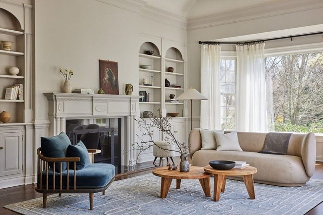
Greige stands out as a remarkable neutral that merges the best qualities of both gray and beige, and when this shade dominates an entire room by itself, you get something truly special.
If you're deciding between gray and beige for your home, this hybrid option offers the flattering qualities of each without forcing you to choose just one.
Greige works well whether you're using it as a background for bolder accents or letting it shine as your room's main color story.
You can keep things simple by using greige alone, or you can experiment with pairing it alongside other understated shades to build depth and interest.
Many people overlook this shade in favor of the classics, yet it deserves a spot in your decorating toolkit.
Whether you go minimal or add layers, greige gives you flexibility and elegance that both gray and beige struggle to deliver on their own.
Cornflower Blue Built-Ins With Gray Accents
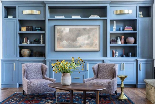
Blue is a wonderful color choice for any space, and going monochromatic with different shades keeps things interesting rather than flat and boring.
Consider painting your built-in shelving or cabinetry in a crisp cornflower blue while leaving the walls neutral or a lighter shade, and this approach gives you depth without overwhelming the room.
Pairing these blue elements with gray accent chairs grounds the space and prevents it from feeling too cool or sterile.
A floral rug in a darker blue tone ties the color palette together and adds warmth alongside pattern.
You don't need to cover every surface in the same hue-mixing lighter and darker blue tones creates visual interest that a single shade simply can't achieve.
This balanced approach to blue decoration feels fresh and sophisticated without requiring you to commit to an all-blue room.
Isabella Martinez
Founder & Lead Design Enthusiast
Expertise
Seasonal Home Décor, Interior Styling, Space Planning, DIY Home Projects, Sustainable Design Solutions
Education
Savannah College of Art and Design (SCAD)
Pratt Institute, School of Design
Isabella Martinez is the founder of Decorrio, where she shares her love for seasonal home décor and creative design. With a background in interior design from SCAD and a master’s from Pratt Institute, she specializes in stylish, functional, and sustainable spaces.
With over 10 years of experience, Isabella helps homeowners bring warmth and personality into their homes. She loves DIY projects, festive decorating, and collaborating with local artisans to create unique designs.
When she’s not designing, Isabella enjoys exploring Austin’s arts scene, crafting, and hosting gatherings filled with seasonal charm.